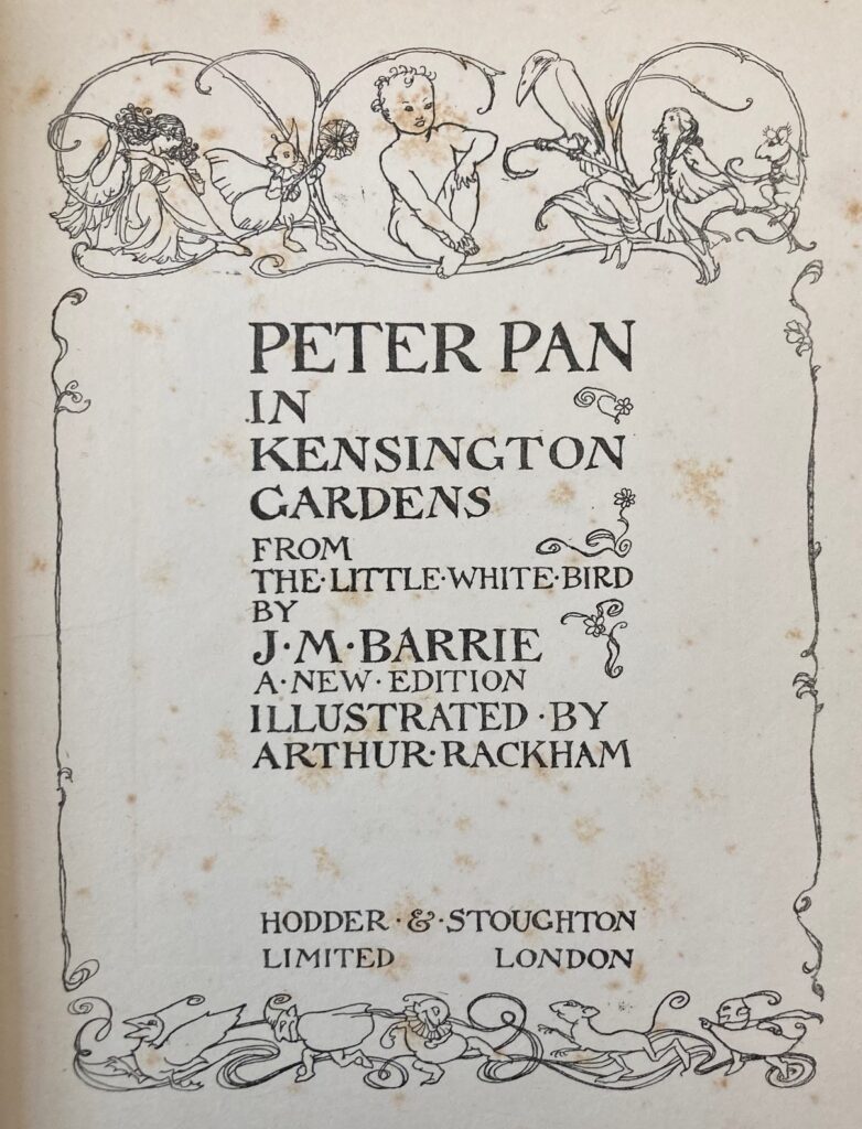
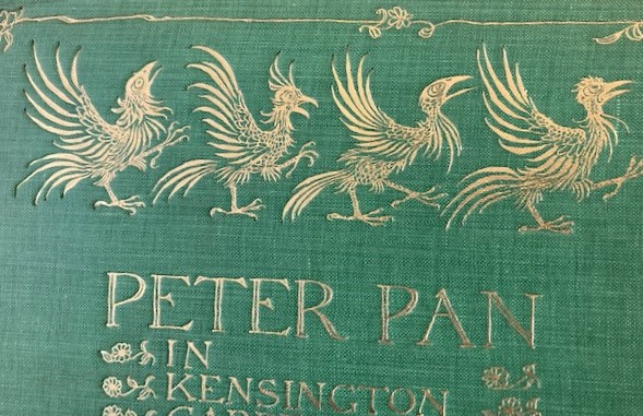
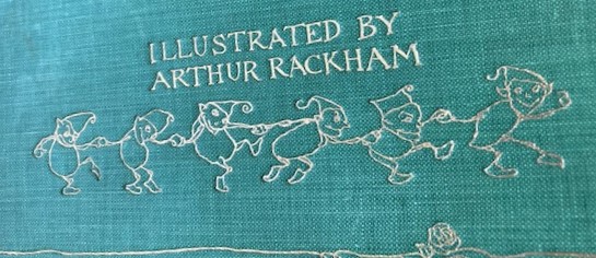
Rackham’s illustrations in Peter Pan in Kensington Gardens embrace a spectrum of what otherworldliness can be – breathtakingly beautiful, ghostly, and goofy. For example, the frontispiece takes ‘high-brow’ and ‘low-brow’ literally. At the top, elegant line drawings of cherub-like Peter Pan, flanked on either side by a sober-faced entourage that includes renaissance-inspired ladies. At the bottom, crude elf doodles with silly smiley faces. The same blend emerges on the front cover, which has gilt engravings of haunting, skeleton-like birds, and more doodles of silly guys dancing. This pairing of “serious” elaborate art with more childlike doodles is a way of making this picture book more approachable, promising refinement but also fun.
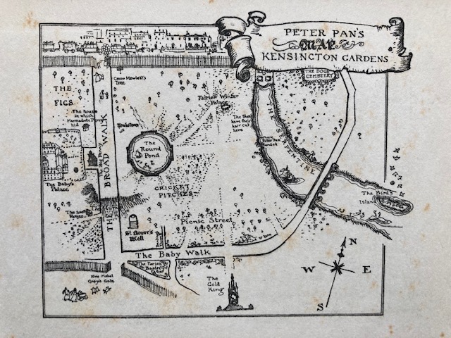
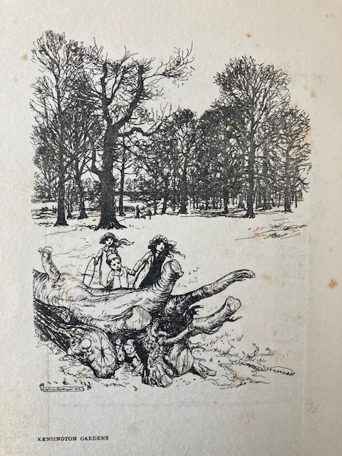
Twenty-two illustrations (including the frontispiece) were made via a woodblock relief process that impressed black ink onto the page. The lines are crooked and you can see the points where lines were re-traced, where one stops and the next starts. On this map, you can see how the lines vary in thickness, likely due to the diamond-shaped tip of the burin that could produce different lines depending on how it’s wielded. Regardless, the asymmetry helps the images embody a handcrafted fluidity. This is not a glossy, mass-produced map – it’s a secret page taken out of somebody’s diary.
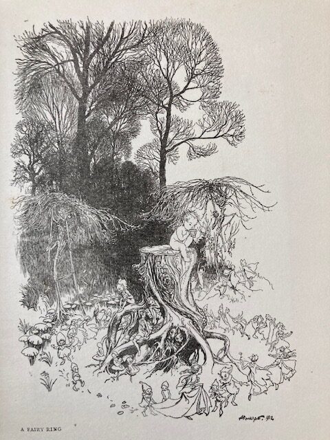
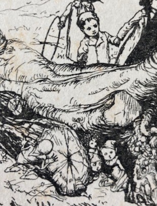
Similarly, the other woodcuts relish in the contrast between outlines, darkness, and negative space. The sprawling, elaborate scene draws the viewer’s eyes all over the page to drink in the different textures of the landscape and their hidden details, between deep shadows and fine lines. Just as the text promises, the illustrations deliver – fairies hide in plain sight.
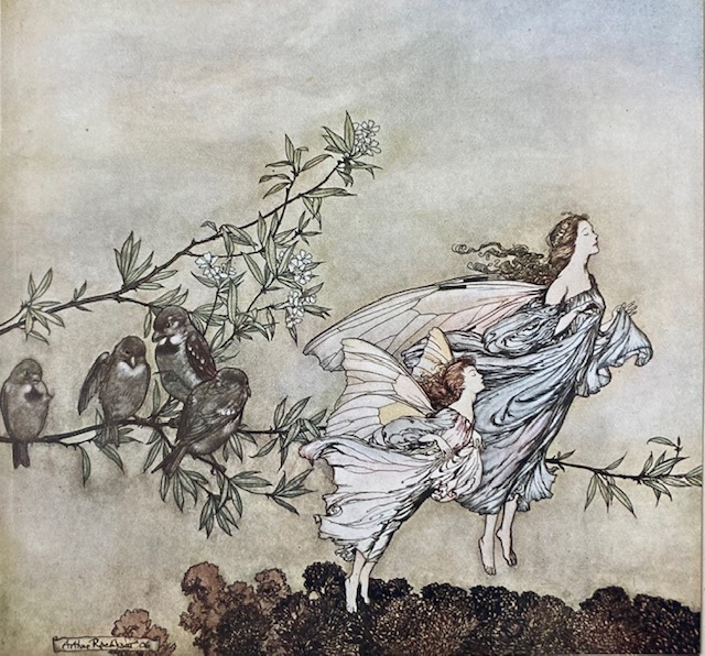
These woodcuts are outnumbered by 49 color illustrations, which are clearly the treasured golden-child of this edition of Peter Pan in Kensington Gardens. The book’s dedication page is immediately followed by a 4-page-long table-of-contents for these color illustrations; there isn’t even a table-of-contents for its chapters! Unlike the woodblock images printed onto the codex, the color illustrations were each created on a separate page that was then “turned in”, pasted to the codex just along one edge, easy to extract. (Probably because these illustrations are so beautiful, viewers may be tempted to re-home each illustration to where they can be displayed more prominently. Each illustration comes prepared with Rackham’s signature, for this very fate…)
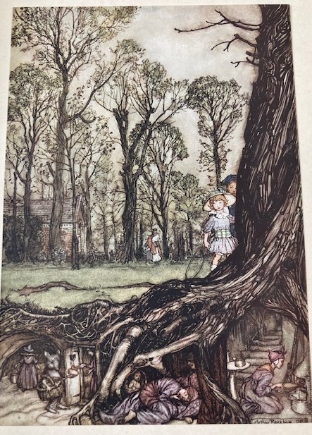
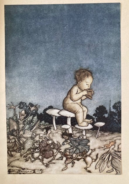
While these illustrations are outlined in black ink similarly to the woodcuts, they are filled in with a watercolor-inspired style and palette. The muted tones of reds/pinks, blues, greens, grays, browns, and yellows are likely drawn by pen and India inks, as was Rachkham’s M.O.
Noticeably, the most colorful illustrations are the ones that occur within the gardens, either depicting the fairy community and/or children in the park. Illustrations of the suburbs tend to be more subdued colors with white space, while shots of the city landscape appear more smoggy, gray, and grim.

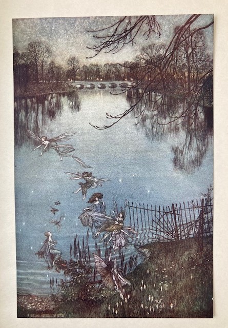
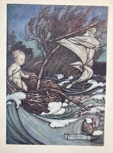
In contrast, illustrations of the gardens fill the paper with deep blue skies and rivers, rolling green fields, and occasionally menacing night-time trees. As the adventure heads deeper into the fairy-otherworld, color overflows and artistic technique blossoms, such as with the reflection of twinkling stars in this pond, or the motion and shadows invoked by this turbulent raft scene. In contrast, the illustration of the “crab-apple gentleman” (antithetical to the fairies) appears disconnected from his landscape, with the bell-tower in the background rubbed away.
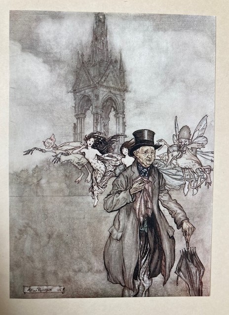
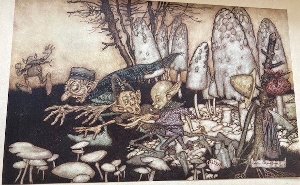
Each page that has one of these color illustrations is covered in a tissue paper with a caption, so that the viewer must first read the source material before revealing Rackham’s interpretation. I’m tickled by how the images diverge from their captions. At times, the text plays the role of ‘straight-man’ with its posh and conversational tone, so the illustrations work to add texture to otherwise understated descriptions. For example, Barrie describes some elves as “workmen”, but Rackham breathes life into these characters through their expressive textures – their wrinkles and gnarled fingers, their little teeth and bulbous heads.
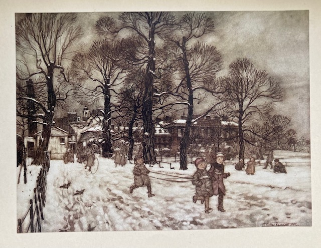
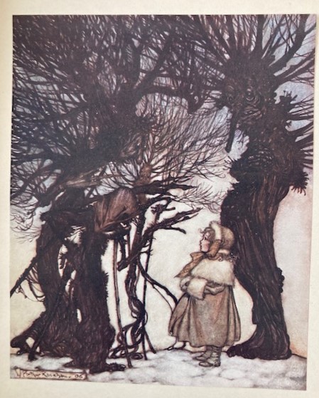
Or another example, Barrie draws attention to the “Gardens white with snow” in one scene, but Rackham instead plays up the darkness of the surrounding environment – a stormy sky, muddled landscape, and the muddy footprints left on the snow-covered ground. The illustrations perform the busy details taken for granted in exposition – the consequences of these scenes being filled with life, because snow at a popular park doesn’t stay white when you account for children (and fairies). Overall, the illustrations heighten the feeling behind the text, such as with this comically creepy illustration of Slenderman-like anthropomorphic trees, with the caption: “They warned her”.
On the other hand, sometimes the text develops its own vocabulary relevant to the world of PPKG, such as the term “Baby Walk” meaning the park route, so the illustrations perform a translation of the content into realistic visuals. Interestingly, the color illustrations are usually NOT next to the page of text their captions reference. Many of these illustrations arrive 5-20 pages after the text invokes them – sometimes even after the chapter has ended – or even 2-5 pages before they are ever invoked. Some scenes are depicted with several illustrations from different perspectives, lingering on the same event that has long passed in the text. For example, page 97 of the text features fairies dancing, then one fairy feeling “undancey”. There are 2 color illustrations depicting this one moment, over ten pages later. In this way, Rackham’s illustrations happily dawdle on the moments that embody the story’s magical – sometimes regal, sometimes grimy – setting.
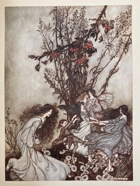
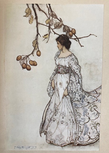
The illustrations care less for moving plot forward; after all, the illustrations don’t tell a continuous narrative and are sometimes out of chronological order. Instead, the illustrations embody the most vivid moments within this fantastical world, the moments that deserve to live on in the reader’s imagination, regardless of that moment’s contribution to the overall narrative arc. While these illustrations do directly relate to the words written, they are more emblematic of the emotions that the story attempts to cultivate – namely, being whimsically whisked away to a delightful daydream.
In fact, there is one scene that is reprised in two different styles: Peter playing the pan-flute for dancing fairies. At first, this is depicted on page 63 in the woodcut style, and then it is later reprised in watercolor on page 83. The gag is – text-wise, this scene was just on page 66! The illustrations were both housed next to random pages describing other plot-points, and yet this image was such an epic scene it needed to be invoked TWICE.
