Pet Blog Post #3: Word and Image
Illustrations appear frequently throughout Winnie-The-Pooh. On average, it seems illustrations are present on about every other page, and a reader will not encounter more than two pages of full text before seeing the next illustration. The illustrations work with the text and take on a more narrative role, as each image appears to perform the story in agreement with what the text says. Both the frequency and function of the illustrations enhance a reader’s experience of the story being told. I have not found a time in the book where the illustration tells a different story than the text. As I mentioned in my last blog post, the text consists of rather simple sentence structures, and, being a children’s book, the storylines are not riddled with complexity. These forms of simplicity in the narrative accordingly do not require a complex illustrative style in accompaniment.
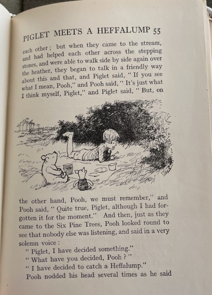
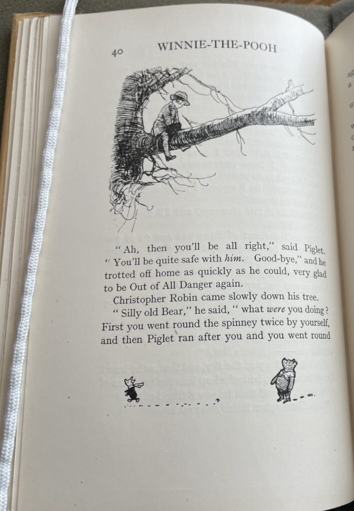
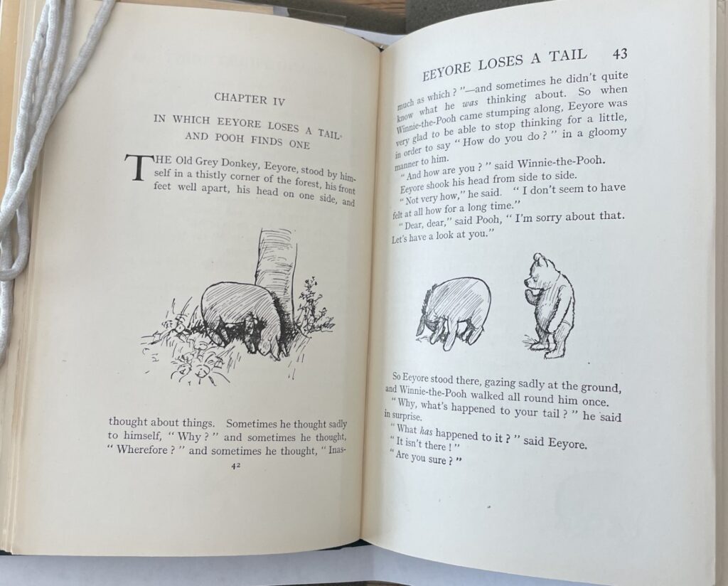
E. H. Shepard’s illustrations remind me of sketches or freehand drawings. They are colorless, utilize varying degrees of shading for depth and dimension, and are quite simple. There is not exquisite detail in an illustrated scene or in characters’ facial expressions. The illustrations are not bound by frames, rather exist more freely on a page.
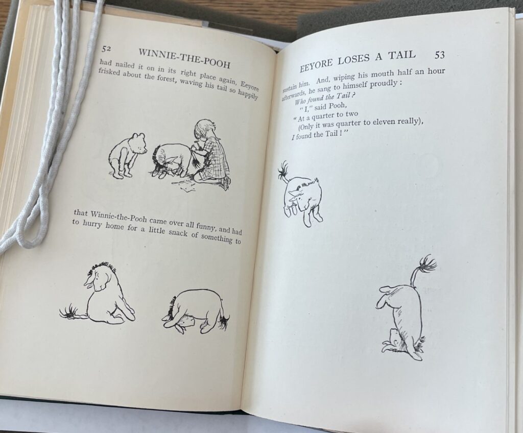
In developing my prior post on materials and construction, I had noticed that as I glide my fingers along the pages of the book, I can slightly feel the text and illustrations as they sit on a page. Certainly, this is not to a dramatic degree, as nothing is quite literally popping off the page, but it makes me think the illustrations were a product of intaglio printing, particularly etching. However, because I can feel the text, too, I wonder if this sensation is simply a result of the printing press, which might be due to an offset print? Still working this one out!
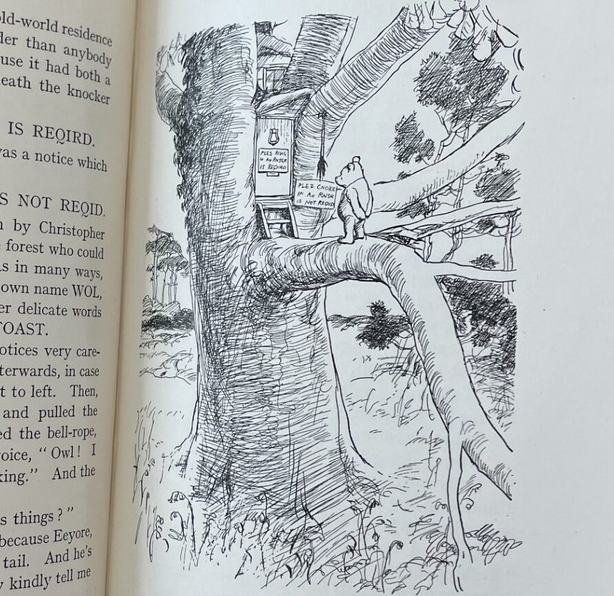
At times, an illustration may be of an event being described in the text, such as Pooh visiting Owl on pages 46-47 below, and include more context into the setting of the event. Other times, the illustration may be of just the character being described by the text, drawn isolated from context. Regardless, the illustrations seem, to me, to offer a visual glimpse into what the text is discussing without being all too encapsulating. It feels as though the illustrations encourage a reader to use a bit more imagination as they read. Winnie-The-Pooh is a piece of children’s literature, and our class conversation on November 2nd reminded me to think about the purpose of literature for its readers. As we looked at nineteenth century children’s books that sought only to delight the reader, in opposition to imposing moral and/or religious ideologies, I thought that contemporary fiction reading, whether for children or for adult readers, largely aims, too, to engage and entertain. For many, when they read fiction, they can imagine the characters, settings, and plot in their minds and visualize what is happening as they read about it. With simple drawings, like those in Winnie-The-Pooh, which look like raw visualizations straight from the mind of E.H. Shepard, there is room and perhaps encouragement for the reader to utilize the illustrations as jumping points to the imaginary, or as inspiration for the world they create in their minds as they absorb the book. This is perhaps a sort of benefit to an image not being all too detailed or all too encapsulating. I think Shepard’s illustrations further propel the childlike wonder of its readers.
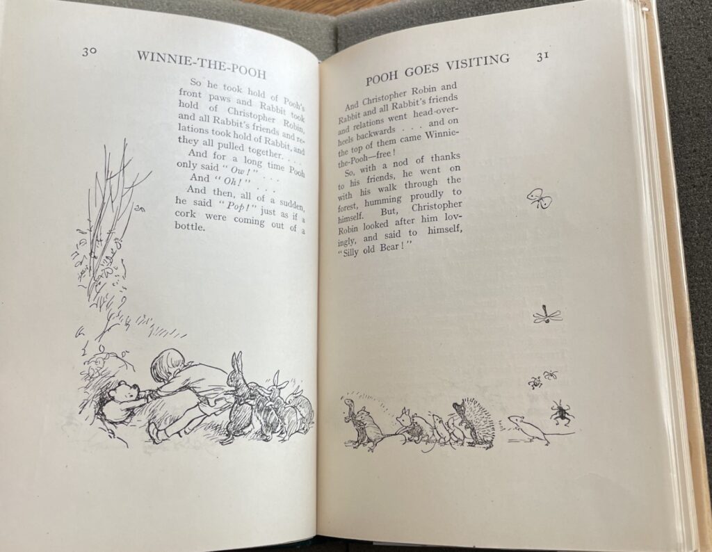
What fascinates me most about the book’s illustrations is the collaboration between text and image that makes many of the illustrated pages unique in their mise-en-page. Rather than an image being placed in the same location on a page in relation to the text, the pages accommodate images in various ways. It seems as though the text exists in its 29-line, 13cm by 8.5cm block until an image is introduced, in which case, the text makes room for the image. At times, a text block may only be adjusted slightly, and at other times, the text block takes on a dramatic shift!
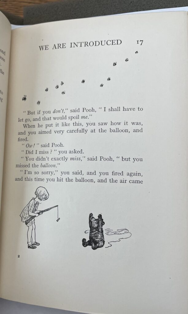
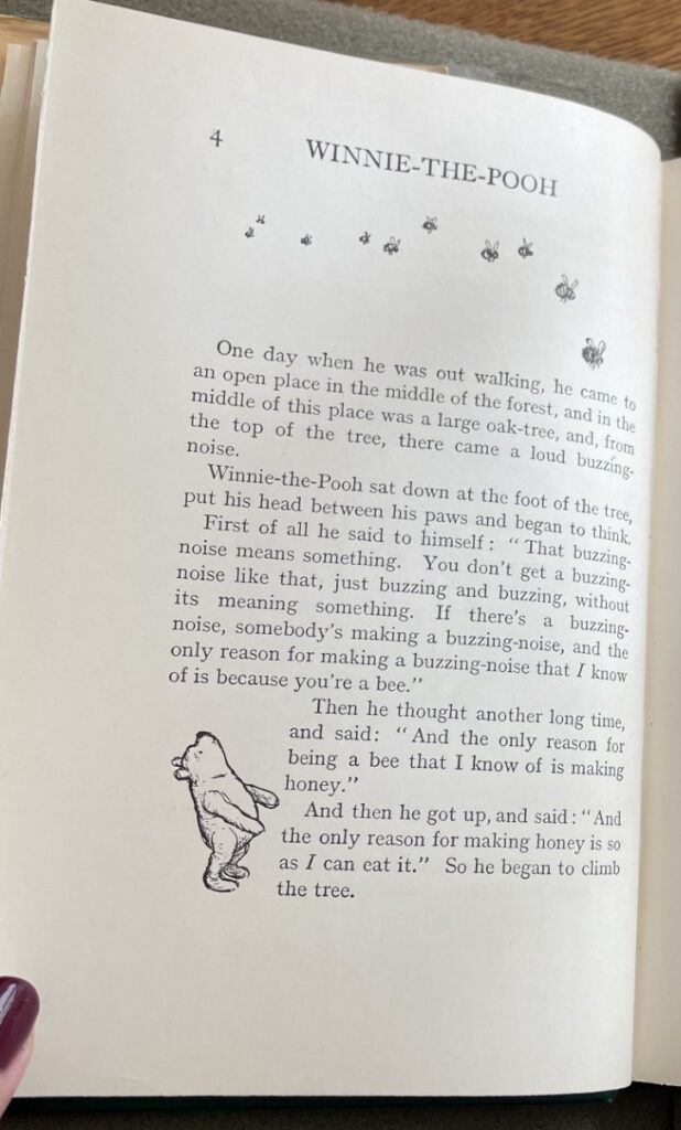
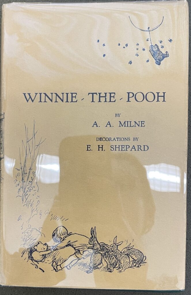
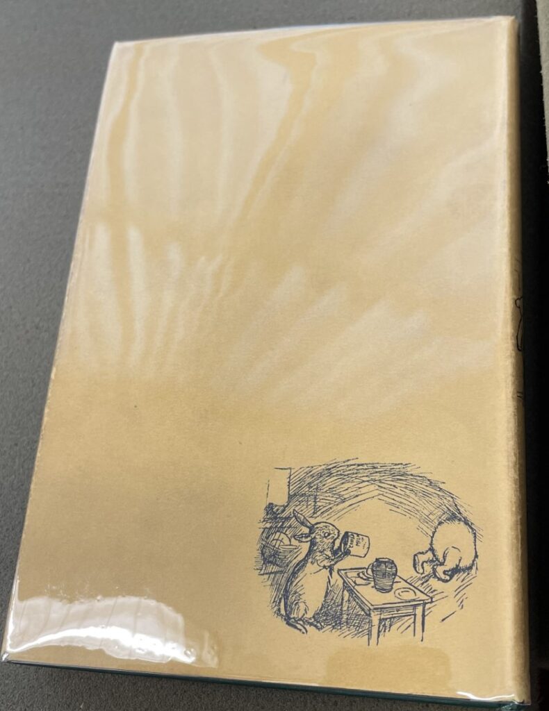
Word and image interact creatively and harmoniously, and how the image is incorporated onto the page serves to further enhance meaning when the text aims to be descriptive or highlight a particular idea. Page 4 below I find especially cool, as Pooh at the bottom of the page is seemingly looking through the text block at the bees flying by above the text block. This suggested transparency of the text block has me rather dumbfounded over what it means for the word and image relationship, but it seems to imply that the text block is not impenetrable, that it does not act as a rigid, guarded space on the page, rather a space that invites the creativity, playfulness, and space of an image. This alive or animated quality of the images we can see in a few other places throughout the book, including its jacket, where Christopher Robin and friends are pulling Pooh out of a hole in the ground on the front cover and where Rabit has a view of Pooh’s behind as he’s being pulled away on the back cover.
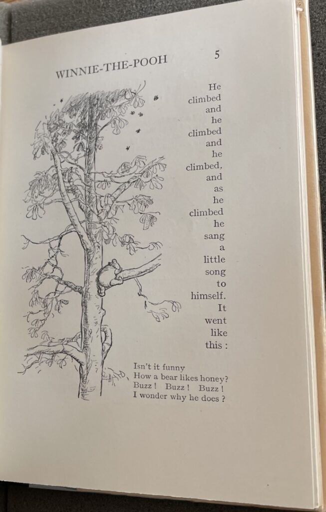
Turning to page 5, we see another fantastic example of word and image interacting with one another quite innovatively. The text is narrowly concentrated at the very edge of the text block to allow the illustration more space. As such, only one word of text can fit on each line. In thinking about how a reader might absorb this page, certainly, the large illustration of Pooh climbing a tree is eye-catching, but, even further, a reader’s eyes are directed from one line of text to the next in a rapid manner. Quick eye movement in reading, for me at least, makes all the more evident that a reader is making progress down the page, and this coupled with the text’s repetition of “he climbed” altogether may work to emphasize the tall height of the illustrated tree, thereby framing Pooh’s climb as all the more an impressive feat.
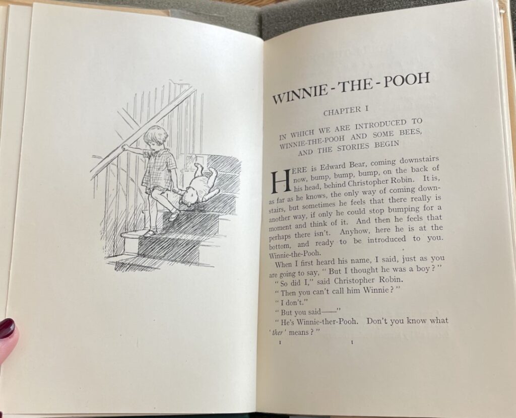
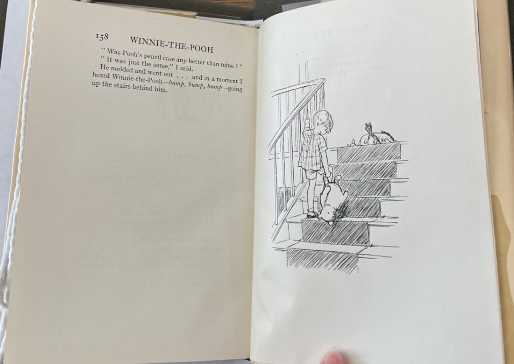
Winnie-The-Pooh is a book that begins and ends with images. Opening to Chapter I, “In Which We Are Introduced to Winnie-the-Pooh and Some Bees, and the Stories Begin,” the first line of text explains that Edward Bear is coming down the stairs with Christopher Robin. The frontispiece facing the chapter shows readers exactly that. Similarly, the last line of the book describes Christopher Robin and Pooh Bear heading back up the stairs, now that the stories have come to a close, and the final illustration of the book again shows the pair walking along the staircase now in the opposite direction. It is quickly apparent to a reader that illustrations and text work together in telling us Pooh’s stories. The playful ways that word and image engage with each other not only enhance the stories’ narrations, but they make the book all the more exciting to read. I truly believe the book would not be the same without the images providing readers with joy and fueling their imaginations.
Here are some more fun illustrations to look at:
