Death Masks, Deneberg (1997)
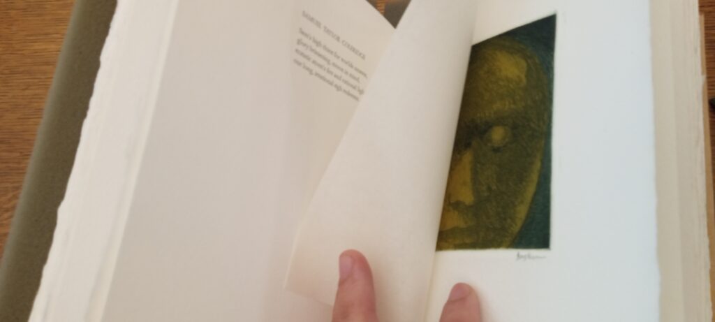
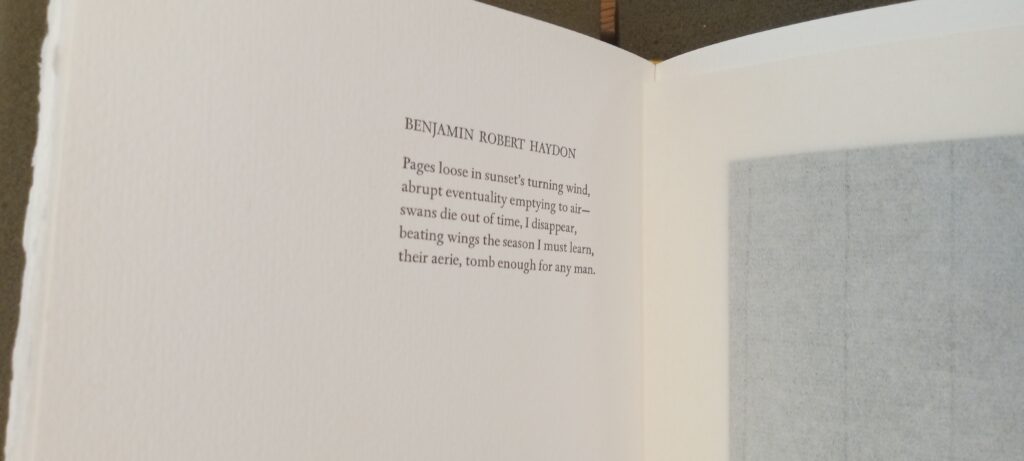
There are 21 poems in this book. Each is positioned on the verso, the left side. Some poems are as few as four lines of text grouped into a single column paragraph. There is a huge amount of bottom margin as well as left side. The text is grouped in the right top corner. It starts off from the center of the page and runs off less than an inch from the gutter. The columns are not justified.
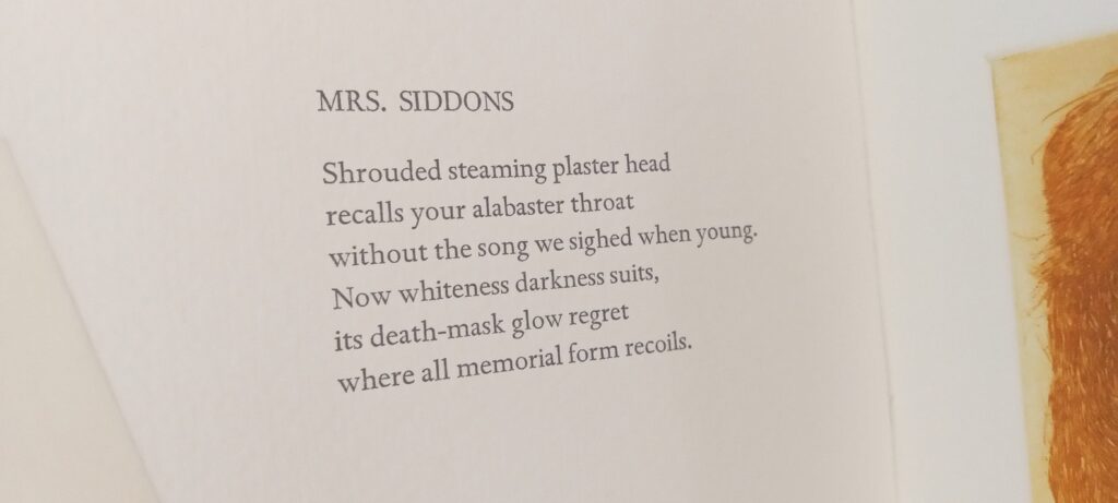
The title of each poem is the name of the person who the poem is dedicated to. It is printed in all capital letters. The poem however is not in all caps, just the title. The margins on the page create the impression that the few words printed there are very important. The poem is neatly packaged and easily digestible.
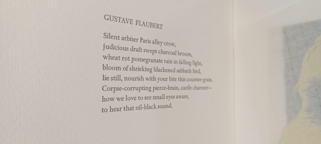
All of the text in Death Masks is black. The font is Helvetica. This font was developed in 1957 by a Swiss artist, graphic designer, and typesetter, Max Miedinger, hired by Hohhmann. Its original name, “Neue Hass Grotesk”
It is a respectable and coherent shaped font for the topic in this book. It seems appropriate. It does fit with the larger structure that positions the text neatly and gracefully on one section of the page, uniformly.
The opposite side, recto, is hidden behind a leaf which is not attached to the book. The leaf itself is ghost like. transparent. It floats off the page if you blow on it. It is almost weightless like a spirit.
I wonder how it would feel if the lines of the text were given greater margins. The spaciousness between the lines in the column would allow more opportunity to reflect on the nothingness that is left once a life has become dead. But then again, it is a mask. This book is called Death Masks. It makes the attempt to mask the nothingness with meaning via poetry. It’s a poem of a person’s flash of life packaged neatly in this space at the top right side of the page.
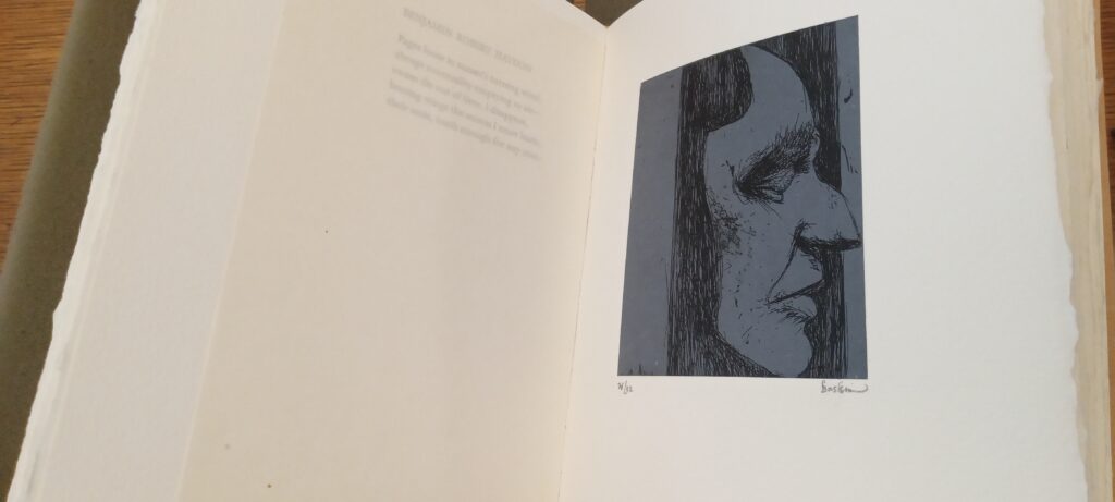
The illustrations are impressed on the top left side of the page. The bigger the image, the more centered on the page they appear.
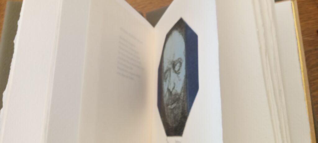
When the pages are folded together, the image and the word align to meet together. But they are separated by the transparent loose leaf.
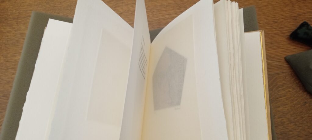
There are as many illustrations as there are poems, 21.
The illustrations look like a drawing or watercolor sketch that is then etched on the paper. They are beautifully done. I love the colors. Some are monochrome. Each portrait has its own unique combination of colors. The choice of color, I do not believe, are based on the natural color of the subject.
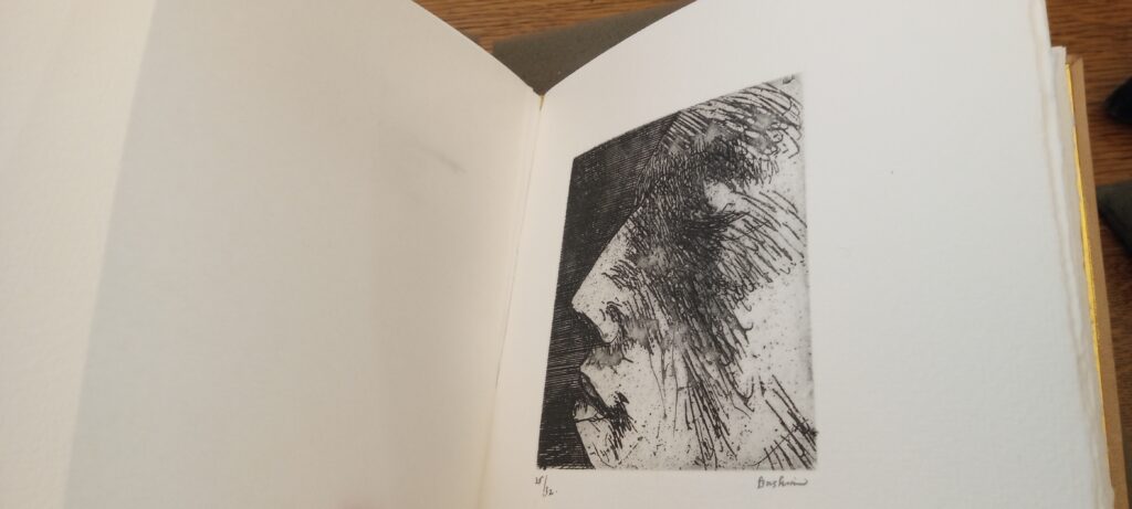
On the bottom left corner of each illustration, there is hand written 26/32. On the other end, the bottom right corner of the image, there is the signature of the artist, Baskin.
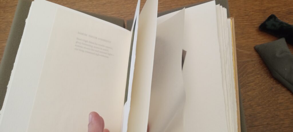
There are a lot of blank pages in this book. There are large sections that are not marked by word nor image. Negative space. White space.
In psychology the term ‘white space’ refers to those precious moments where we can find time to take a break by pausing, going for a walk, doing breathing meditation, etc (this is something that cigaret smokers enjoy so much other than that awful tobacco smoke) This term, white space, in psychology means time for reflection so to allow us to center ourselves and allow a fuller understanding of our being there. This meaning is very useful in adopting a book to study. White space in a book helps the reader pause. Reflect on the section that came prior. It helps focus the reader by distinguishing different sections of information.
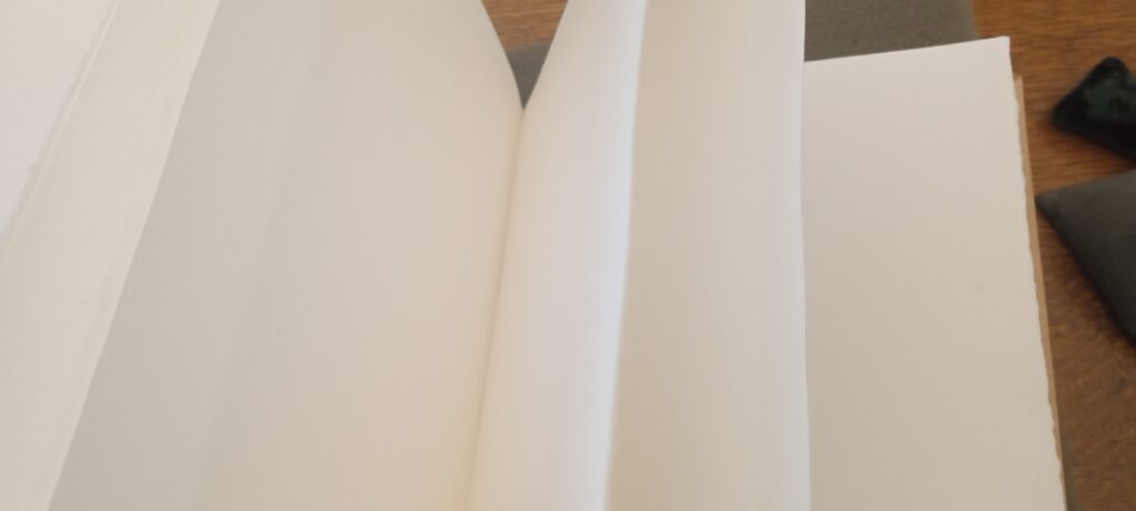
In this course we have seen letters written without any spacing between words. There had to be radical inventions such as commas and periods. Who knew?
In my pet book, Death Masks, I’d like to think that the empty spaces on the dinner table can be reflected on the areas of the page where words and images are not there. The white space allows a moment of silence. It takes courage to bring to mind those we have lost in our personal lives because of how disorientating it can makes us feel. The unmarked pages give enough space to breathe out the tension, to empty out the information taken in when studying the last image of a dead being.
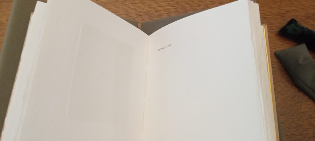
Another consideration of why the author decided to leave so much space, especially when introducing the next subject, title, name. This is typically how ‘heaven’ is depicted, as a vast space of clouds. The left side of page, verso, the backside of the image is empty. Recto, the right side, opposite of verso we are introduced to a name. It sits there alone on the top left corner. Needs no other introduction. We are asked to sit with this vast reflective space in silence. My eyes seek to get distracted by some image or letters to create sound as an escape route from the discomfort. But there is nothing. There is nothing accompanying George Eliot in these blank pages. It’s just me and him.
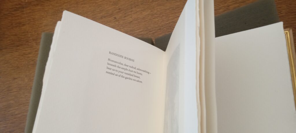
As we turn the page, the top right corner states the title of the poem dedicated to the subject. In this case Randolph Bourne is the subject. And as per every poem on the book, the title of the poem is the person it is dedicated to.
There are wide margins from on the right of page. There’s less margins from the top but plenty. The name is typed in all capital letters. The title. There is a single line separating the column that is the poem.
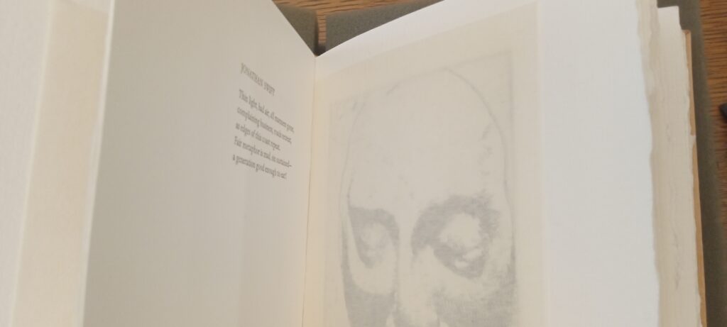
This loose leaf of see-through paper gives the feeling of ghost. It allows some separation from the living by a thin layer. The seeing eye can not visualize clearly what is in the other side. But there is definitely something on the other side of this transparent paper.
