Greg’s Second Blog Post
October 17, 2023
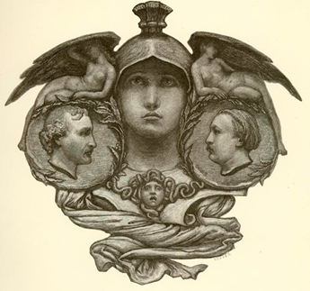
Edgar Allan Poe was author of the poem in my pet book. Gustave Dore´ illustrated the poem and put together the book many years after the death of Poe. I believe the illustration above depicts both Poe and Dore´, with other elements to be discussed at a later time. Dore´ died before the book was even printed, so both never held or viewed the final product. Poe was born January 19, 1809, and died October 7, 1849 just a few years after The Raven Poem was published. Compared to today’s average life expectancy, a relatively shore life. Poe, was known to be a manic depressive, a dope addict, and an alcoholic. This I believe greatly contributed to the content of his poem, but that’s a discussion for another blog post. Let me share what I discovered about the page and text structures from the Gustave Dore´ 1884 book I have been studying.
Mise-en-page
The poem is 108 lines of text grouped into short paragraphs or groupings referred to as stanzas. There are 18 of these groupings that make up the poem with over 1000 words in total.
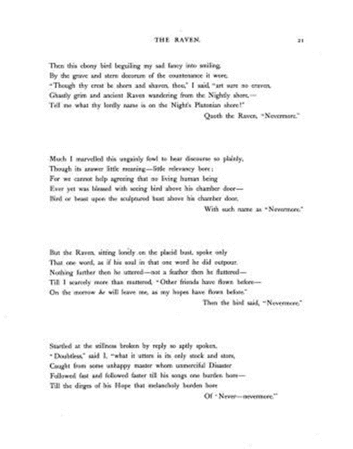
Each grouping of words contains 6 lines each…..6 x 18 = the 108 lines of text I mentioned earlier. The book is laid out so that the poem in its entirety uses on 5 of the 76 pages in the book, each measuring about 18”x14”. After the complete poem is printed in the book, the illustrations are shown.
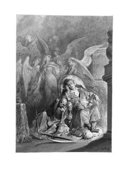
The illustrations use an entire page, always the right side. The text that goes with each illustration is only one or two lines of text from the stanza to which the illustration is for. Each of the 18 stanzas in the poem has 1 illustration dedicated to it.

On the 5 pages that contain the complete poem the pages are only 1 column, left justified, and contain space for 4 stanzas per page. Text on the last line of the stanza is offset, as it seems to linger and provide an introduction to the next stanza.
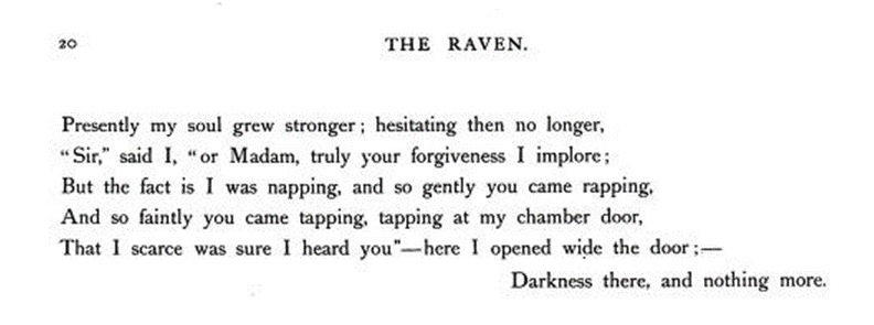
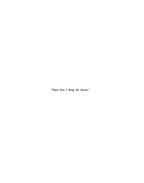
Text in the illustrated section of the book is only 1 or 2 lines from each stanza centered and always on the left side page with the associated illustration on the right side. The text in the illustrated section of the book uses only a small percentage of the paper space leaving open space as a small hint to the illustration giving space to the reader to fill the blank space with their own thoughts and interpretations. The open space around the text gives the reader room to enter into the image as if they were part of the poem and experience the story of the illustration rather than the written word.
Mise-en-texte
The text format for this book I find rather plain or basic. The text is similar to that of the Times New Roman I am using now for this blow. The text is printed entirely of black ink and each stanza in the poem is left aligned. Each of the six lines in the 18 stanzas starts with a capital letter and no real sentence structure that would necessitate a period and then the start of a new sentence.

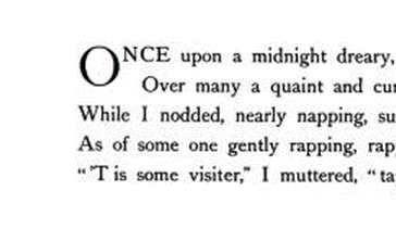
All of the punctuations that we know now are used throughout the poem including commas, quotation marks, periods, use of italics, and semicolon. I also notice that a dash is used throughout the poem most always at the end of a line within the stanza. The dash shows a pause, or break in meaning. It can also represent missing words or letters. The start of the poem begins with an oversized letter O, nothing to fancy here
Page numbers mostly occur in the upper right side of the right page in the book, the numbering is also sporadic.
