In Common Threads, each unnumbered page is roughly 24.1 cm l x 17.8 cm w with one inch inner margins that are marked by the distinct, red line that is found in most traditional composition notebooks. The upper margin is also one inch. I’m not sure if I would describe this text as having a lower margin at all. The thin, blue, embroidered lines of the page serve as a sort of unpredictable margin, as the last line on some pages is left black due to lack of space.
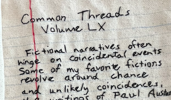
The only notable line of text that is center aligned is the the title on the first page, “Common Threads Volume LX”
I can’t really place what the alignment on the rest of the pages are. I guess you could say that they are out of alignment altogether, which I believe was intentional on Hick’s part, as it further creates the illusion that this text is hand written, almost in a rushed manner as though the author was quickly journaling their thoughts so as not to forget them.
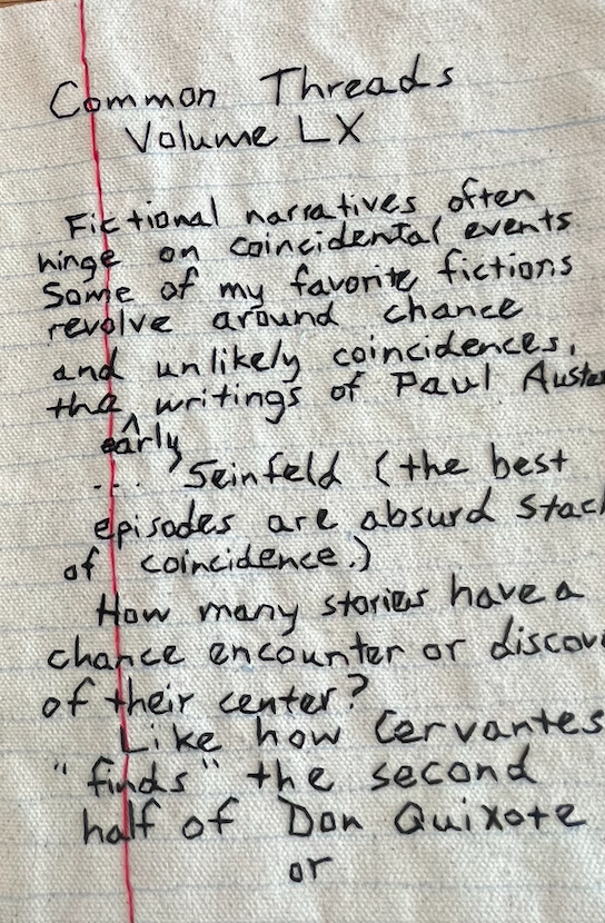
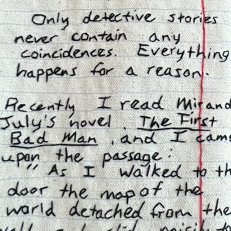
The messy alignment of the text reminds me of when you’re writing something by hand, whether it be notes in class or a journal entry, and you think you’re writing extremely orderly as you focus on writing each word neatly, but once you finish and take a look at the page as whole you see that you were writing at a slant and nowhere near as tidily as you imagined.
From afar, the black “text” that was embroidered to appear as though it were handwritten with a ballpoint pen on top of the canvas designed to look like composition notebook paper. The text in Common Threads is also punctuated, but it’s a bit sporadic in nature. Some lines have periods and commas, and some simply do not.
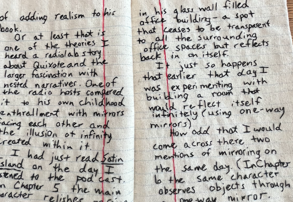
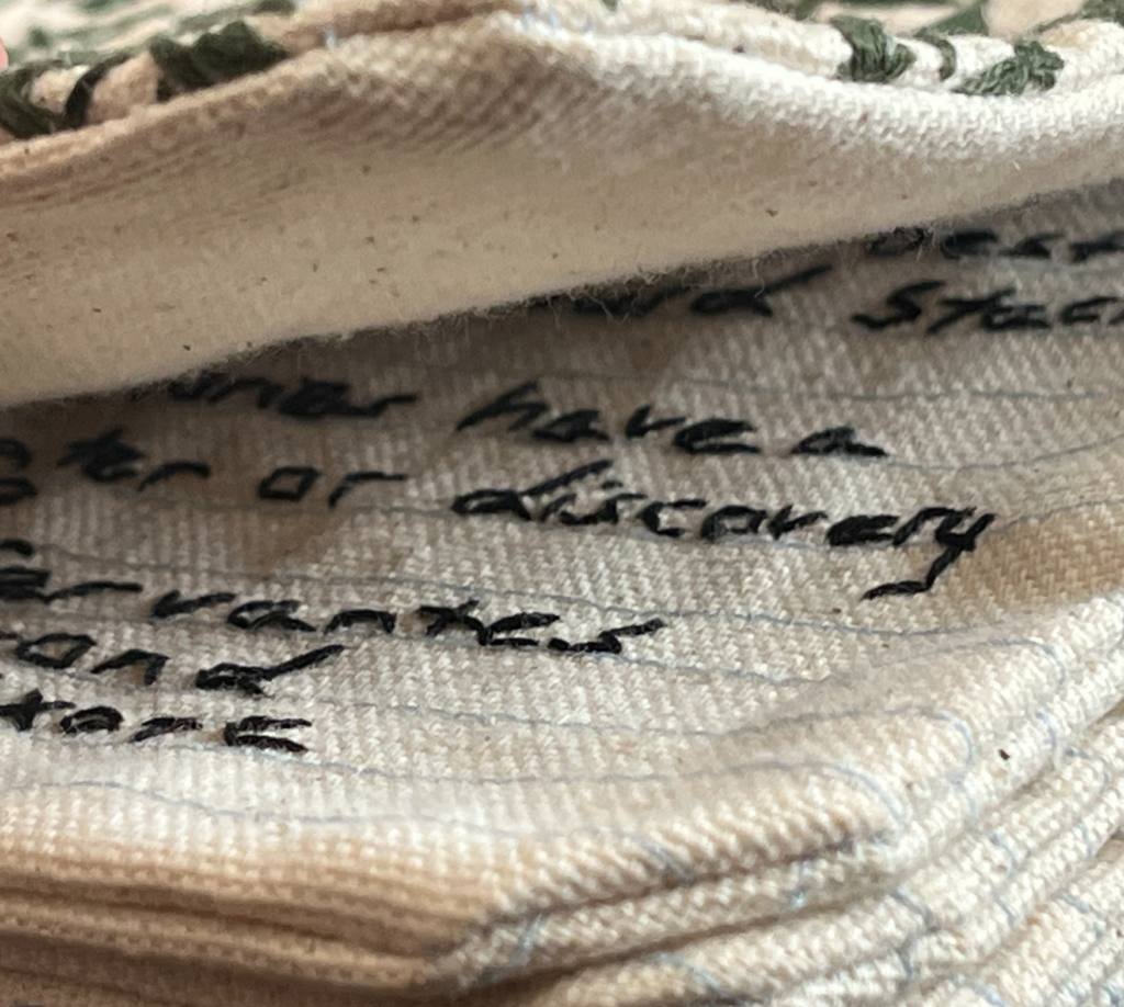
There are also a few fun, more casual elements that remind us that we are taking a peek in someone’s notebook.
There is only one column per page, but each page is peppered with unique paragraph breaks, indentations, and run off sentences that bleed into the margins. Some paragraphs also have arrows that leap around the page to point to ideas in other paragraphs. Other than to further sell readers on the illusion of the text being written by hand, I can’t seem to figure out why Hicks wouldn’t include consistent punctuation. Surprisingly I haven’t come across any noticeable typos, which I believe would make sense in this context.
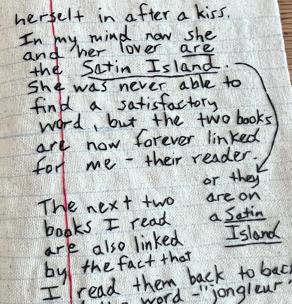
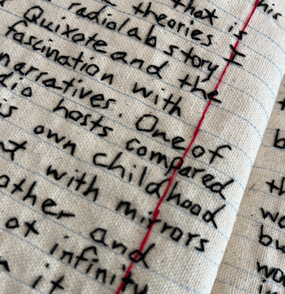
This textual format, in my opinion, interferes with the text’s readability to some degree, but in a way that feels natural and authentic. Whenever reading something that someone has handwritten, I personally always struggle a bit to read with ease. I think this is due to the fact that everyone’s handwriting is so unique, which makes reading the handwritten text of someone who you may not be familiar with a bit jarring and distracting. It can take some getting used to, regardless of if that person has neat penmanship or not. I think this is definitely true of this book, because the “handwritten” text is actually embroidered thread on canvas. The fact that the text is embroidered, is even more distracting from the text.
When examining each page I found myself eyeing the individual stitches and craftsmanship more than the actual words themselves. While the mise-en-texte is distracting, it highlights the playfulness and artistry of the book itself, and further asks us to examine what makes a book a book.
1st line (Implicit): “Fictional narratives often hinge on coincidental events.”
Last line(Explicit): “I read Information doesn’t want to be free and read ‘I must become an itinerant jongleur who capers for others amusement?’ – referring to the emphasis on touring for musicians’ careers these days. Candance Hicks 2015”
