Pet Book Blog Post# 3
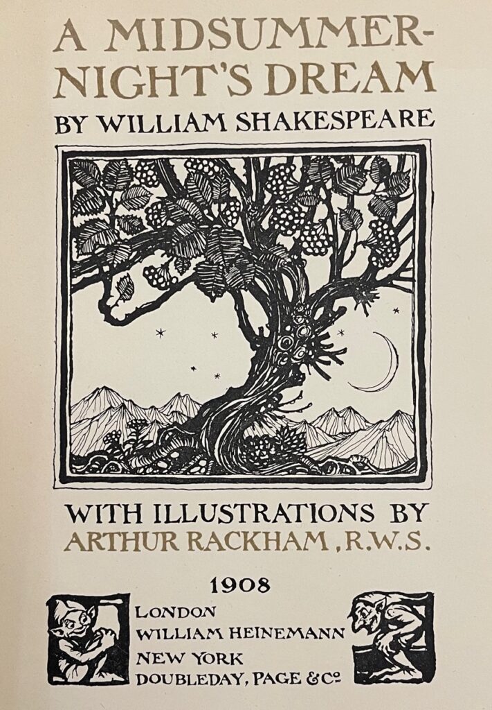
A Midsummer’s Night Dream by William Shakespeare with Illustrations by Arthur Rackham. London, Heinemann ; New York, Doubleday, Page & Co., 1908
As you may recall from my first blog post, the motivation for choosing this codex as my pet book was because of my fond childhood memories of Arthur Rackham’s illustrations. When I embarked on selecting a book from Wesleyan’s special collections, I recalled reading that A Midsummer Night’s Dream was the one story that Rackham chose to return to and illustrate repeatedly. I was intrigued, especially since I was unfamiliar with this particular piece of Rackham work. As soon as I turned the first page, I was hooked by this enchanting interpretation of Shakespeare’s play, and one which I think showcases why he is considered by many, to be the leading illustrator from the ‘Golden Age’ of British book illustration.
“Mr. Rackham stands apart from all the other illustrators of the day; his genius is so thoroughly original. Scores of others have depicted fairyland and wonderland, but who else has given us so absolutely individual and persuasively suggestive a vision of their marvels and allurements? Whose elves are so elfish, whose witches and gnomes are so convincingly of their kind, as Mr. Rackham’s?”
Salaman, M. C.; Holme, C. Geoffrey; Halton, Ernest G. (1894). “British Book Illustration”. Modern Book Illustrators and their work. London: The Studio Ltd. p. 7.
New-bent in heaven
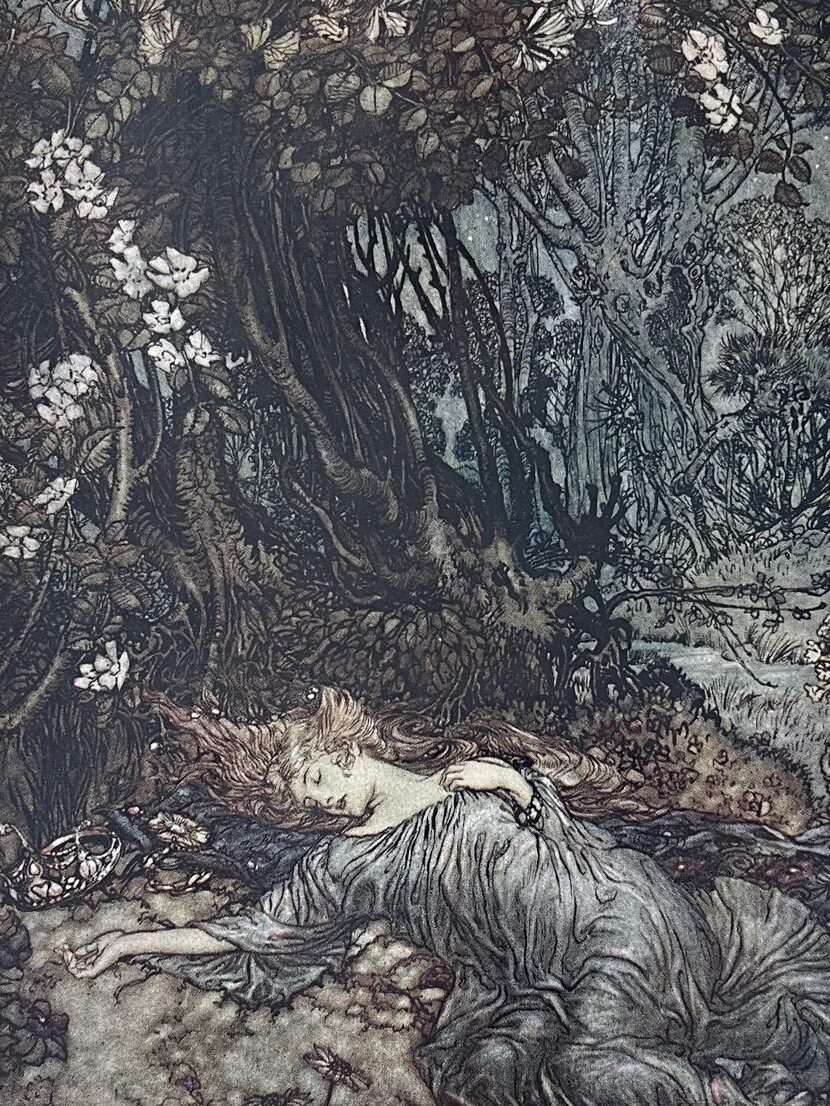
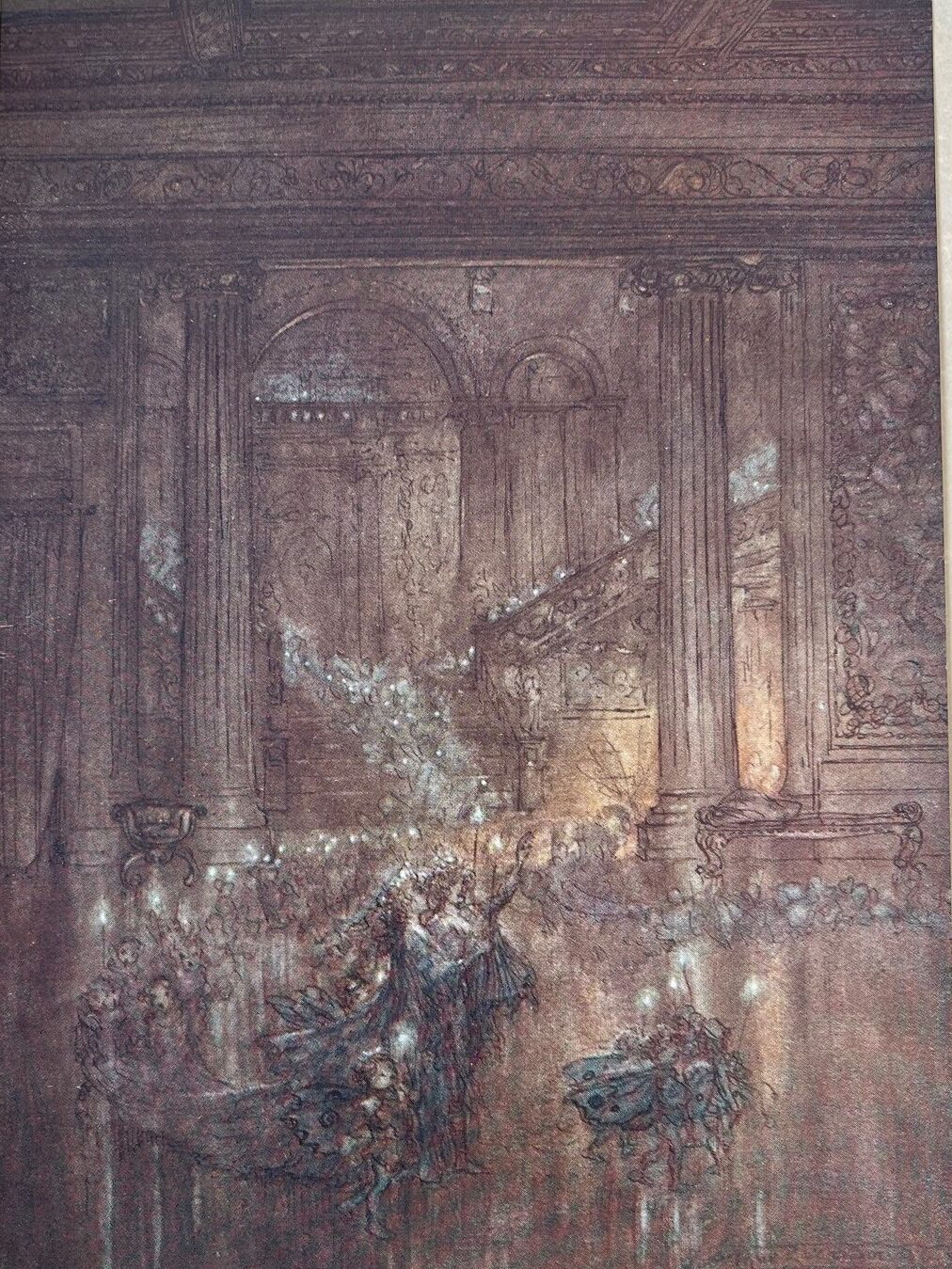
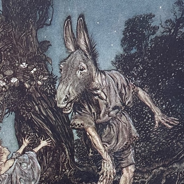
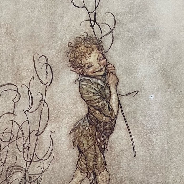
Shakespeare’s whimsical story of A Midsummer Night’s Dream is perfectly captured through a combination of robust ink and pen and dreamy watercolor washed drawings. He skillfully exploits the nature of the medium, creating strong visual dynamic on the page with highly contrasted dark and light compositions. Through his expressive line and beautiful application of translucent color, Rackham transports the reader into a magical world of spooky forests where they meet an array of unforgettable characters including the four Athenian lovers, the ridiculous donkey man Bottom and the mischievous forest fairy Puck.
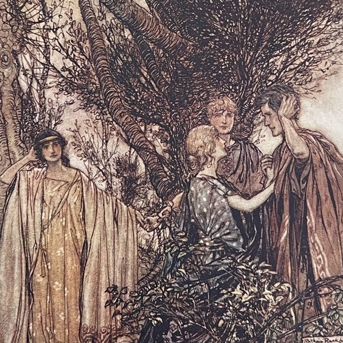
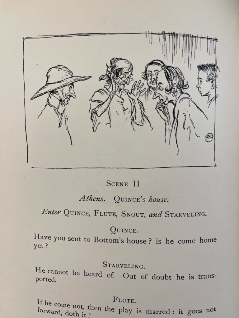
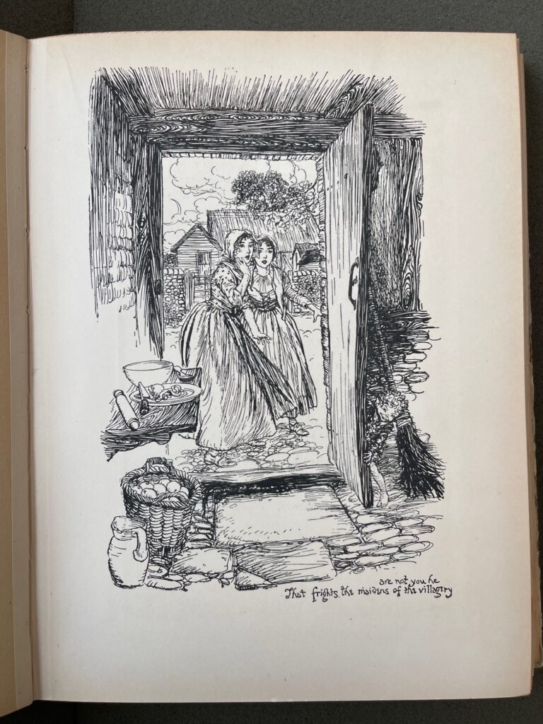
His monotone black ink drawings are printed directly onto the text page using a woodblock relief technique. Sometimes Rackham chooses to fill the entire page with a single drawing and other times he inserts subtle fine line and bold woodblock miniatures. Either way he has a keen sense mise-en-page of which both compliment and illuminate the text it is referencing.
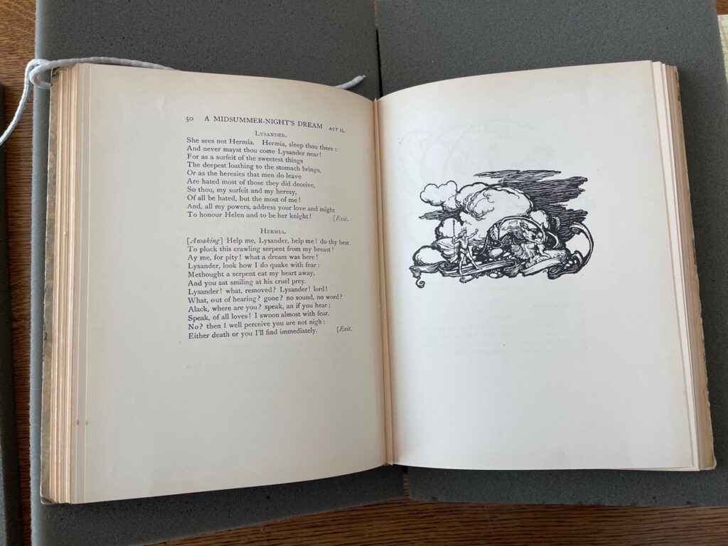
The 40 individual color plates are printed onto coated paper using the 3-color/trichromatic process and then (“tipped in”) pasted onto buff color sturdy card stock paper. Upon further research, I discovered that direct color printing onto the text page was technically impossible and not yet available to publishers yet. This would provide an explanation as to why the color illustrations are printed and inserted separately.
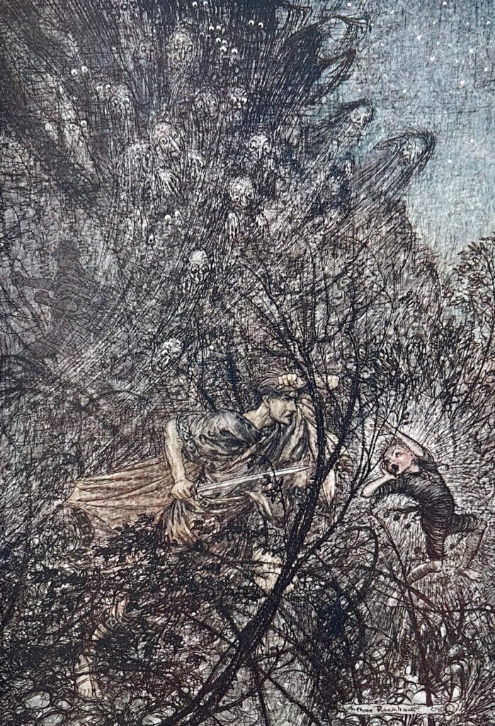
Goblin, lead them up & down
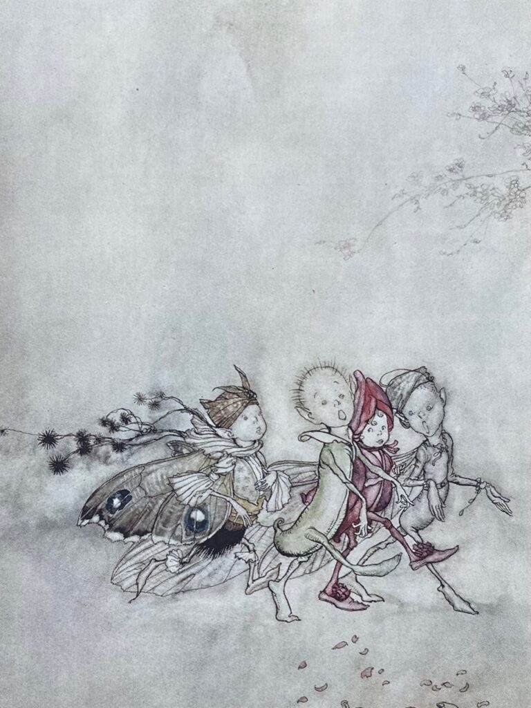
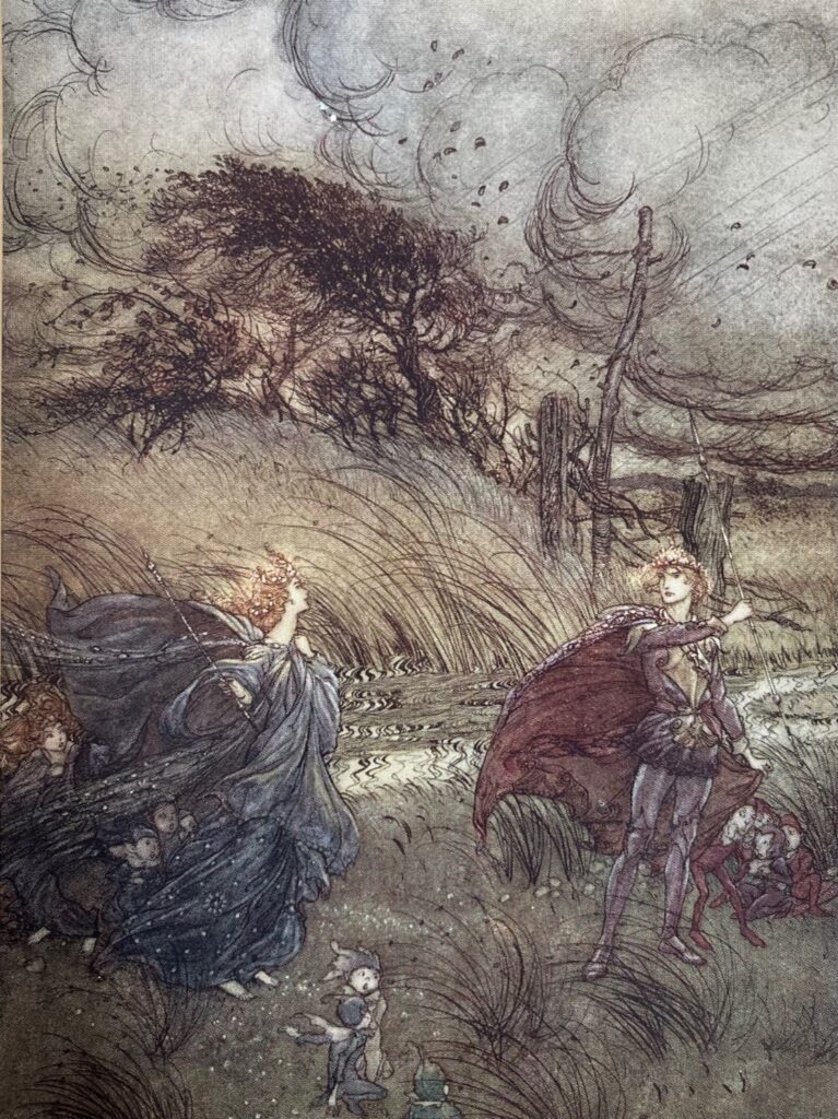
To achieve the colored image, Rackham first created the initial pencil/ink line drawing and then begin building up multiple thin washes of watercolor paint, creating translucent tints. The trichromatic printing technique on the coated paper would then result in the delicate halftone effects of photography. A layer of tissue interleaf is placed in front of each plate with a descriptive title, protecting the illustration but also masking the text from the picture. This results in the reader not being able to see the word/image together. While in some ways this could be experienced as a luxurious collection of images, I do feel like it hinders a natural and continuous flow of word and image in the book.
In 1931, he told N.Carroll, “My books are really to be regarded as bound up portfolios of pictures – rather than “books”. This is a pity, but I see no way out of it. They are ungainly books.“
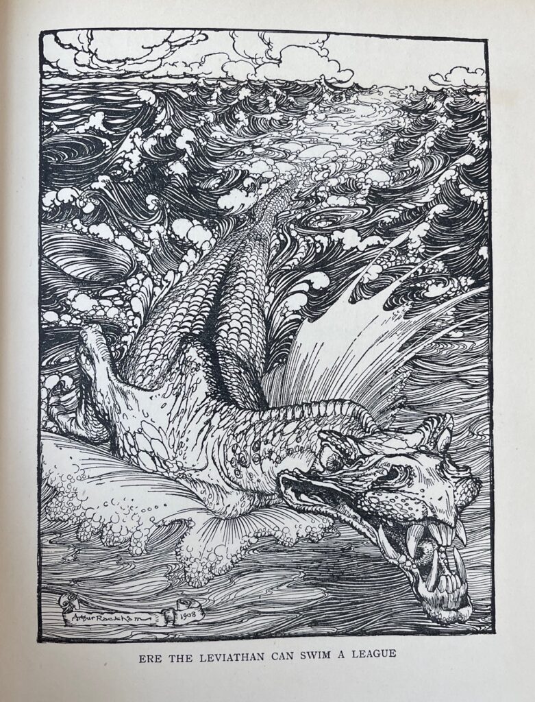
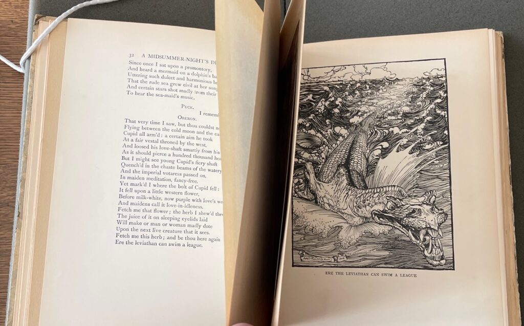
While there is a general attempt by Rackham to follow the narrative of the play with placing his black ink images next to relating text, there are also instances when he chooses to illustrate highly selective elements of the story which he considers should be of importance to the reader. As seen below with the full page pen ink drawing of the terrifying mythical sea creature ‘Leviathan’, which is literally mentioned briefly in a single sentence some three pages prior. This is an example of the disconnect word and image have from one other at numerous points during the book. Rackham clearly takes authorship of the book and this can contribute to an awkward flow when leafing through the book.
One of the most striking plates of the book is an image depicting a mermaid sitting on the back of a stylized dolphin. It illustrates a memory that Oberon, the king of the Fairies, recounts to the character of Puck;
My gentle Puck, come hither. Though rememberest
Since once I sat upon a promontory,
And heard a mermaid on a dolphin’s back
Uttering such dulcet and harmonious breath
That the rude sea grew civil at her song
And certain stars shot madly from their spheres,
To hear the sea-maid’s music.
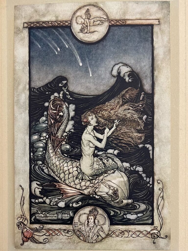
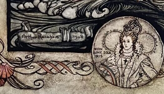
Rackham’s treatment of the lines is both stylized and literal. His ominous portrayal of the exotic seamaid set against the fierce dark waters evoke a feeling of excitement and danger. I also really like the quirky cameo of the Royal monarch, Queen Elizabeth 1st within a circular motif and note Rackham’s signature mark on the corner of the image.
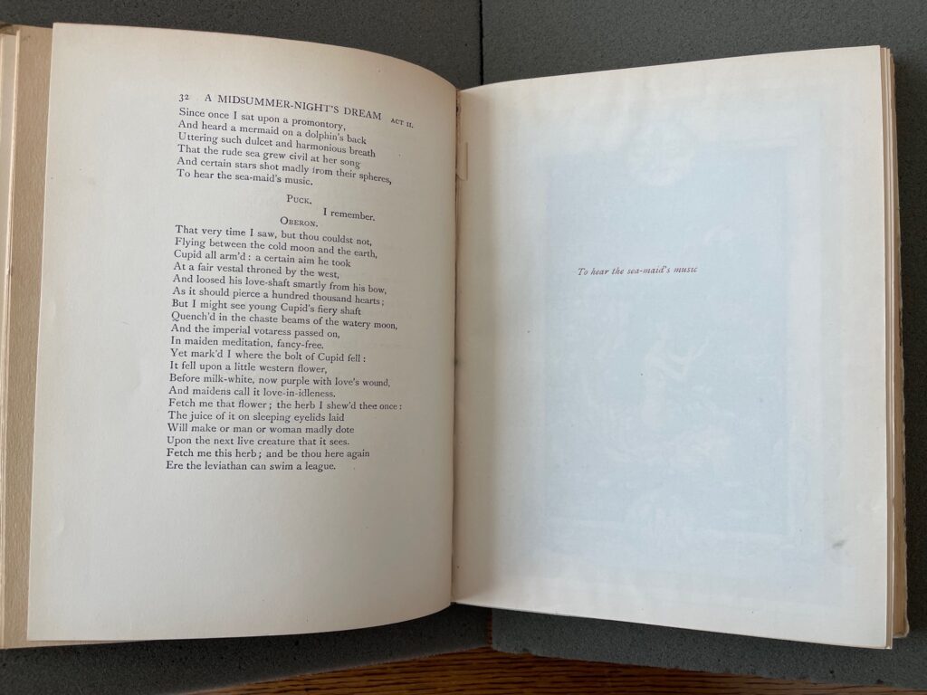
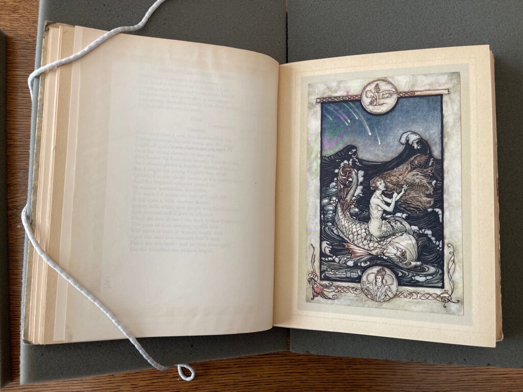
As mentioned before, the text that inspires this image cannot be viewed together with the printed plate. In my mind there is a noticeable retreat of word. Where the word and image have been printed together (such as the fairy song and title pages) in monotone woodcut print, I think a more unified and balanced narrative unfolds. Word and image compliment one another and there is flow to the story.
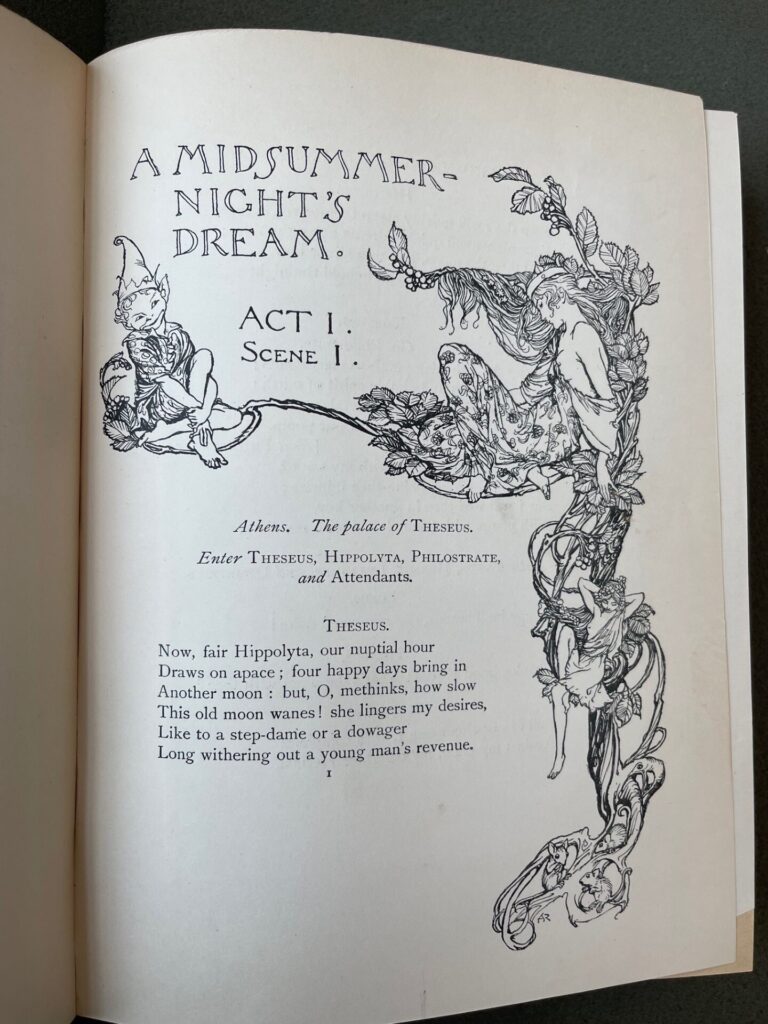
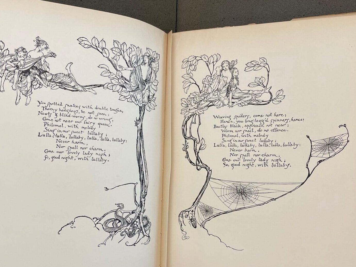
While I adore the quality of Rackham’s illustrations, one cannot deny that image is vehemently favored over word and this can make for a very unbalanced dynamic within the pages. However, I am starting to not feel as frustrated as I was initially with the overall experience of reading/viewing this book. I will explore the intended readership and motivation behind publishing this book in my final blog post.
As for the word/image relationship at hand, I would like to conclude with this thought. Rackham’s breath-taking interpretation of A Midsummer Night’s Dream although awkward at times, enables for the story to be told twice. Once through Shakespeare’s words, and once again, image by image, through Rackham’s’ beautifully crafted pictures, and that, is “such stuff as dreams are made on”.

