Mise-en-page
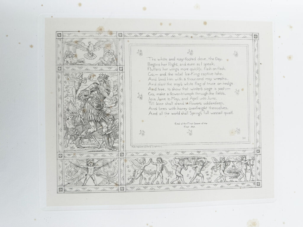
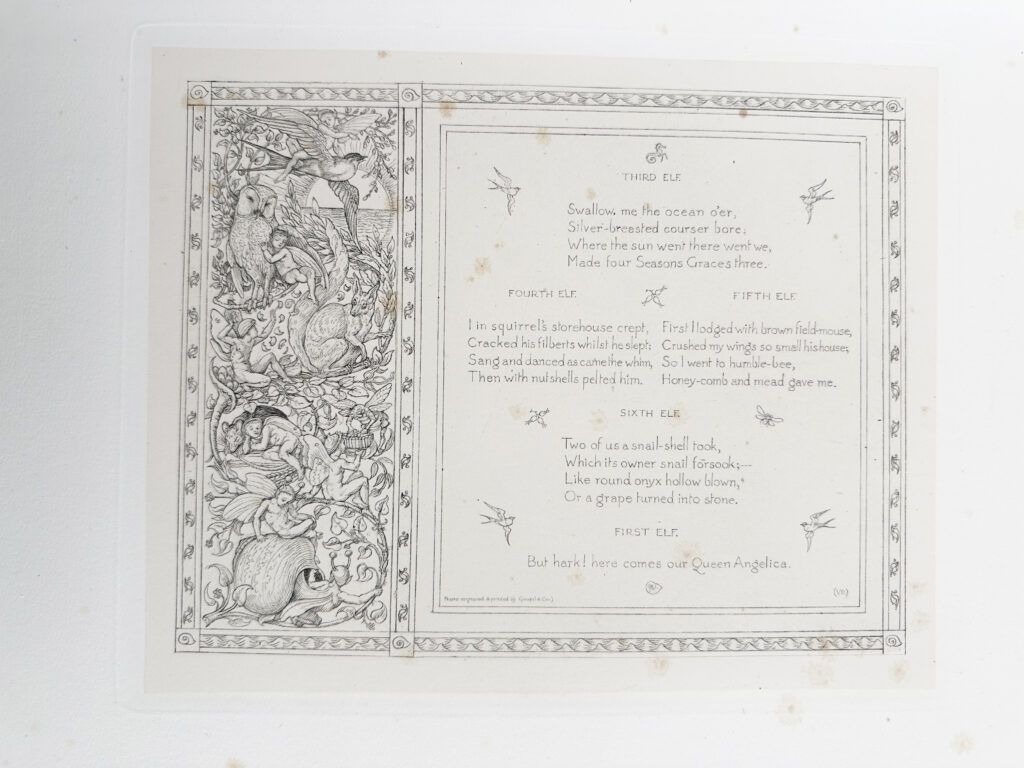
The First of May is nothing like your everyday book. It is not portable (in fact I can only imagine this book being used on a table). Each right page has a photogravure where the text sits inside a frame within a decorated frame. The left side of the page is always blank. Leaf is measured 39 cm X 48 cm and all photogravures are the same size, about 24 cm X 29 cm. Images are printed in a different paper and then mounted onto the page. The border around the photogravure is embossed. This is the “standard” for all the pages, and the play is divided into fifty-two prints.
Margins are also pretty large: 7.5 cm top and bottom and 9.5 cm left and right – creating a lot of blank space. In fact, the margin is what makes this book huge, without it the experience in reading (or even holding) this book would be very different.
Images are black (maybe dark gray) and cream (the color of the paper). The contrast in combination with the embossed frame pulls you directly to the illustration at the center of the page.
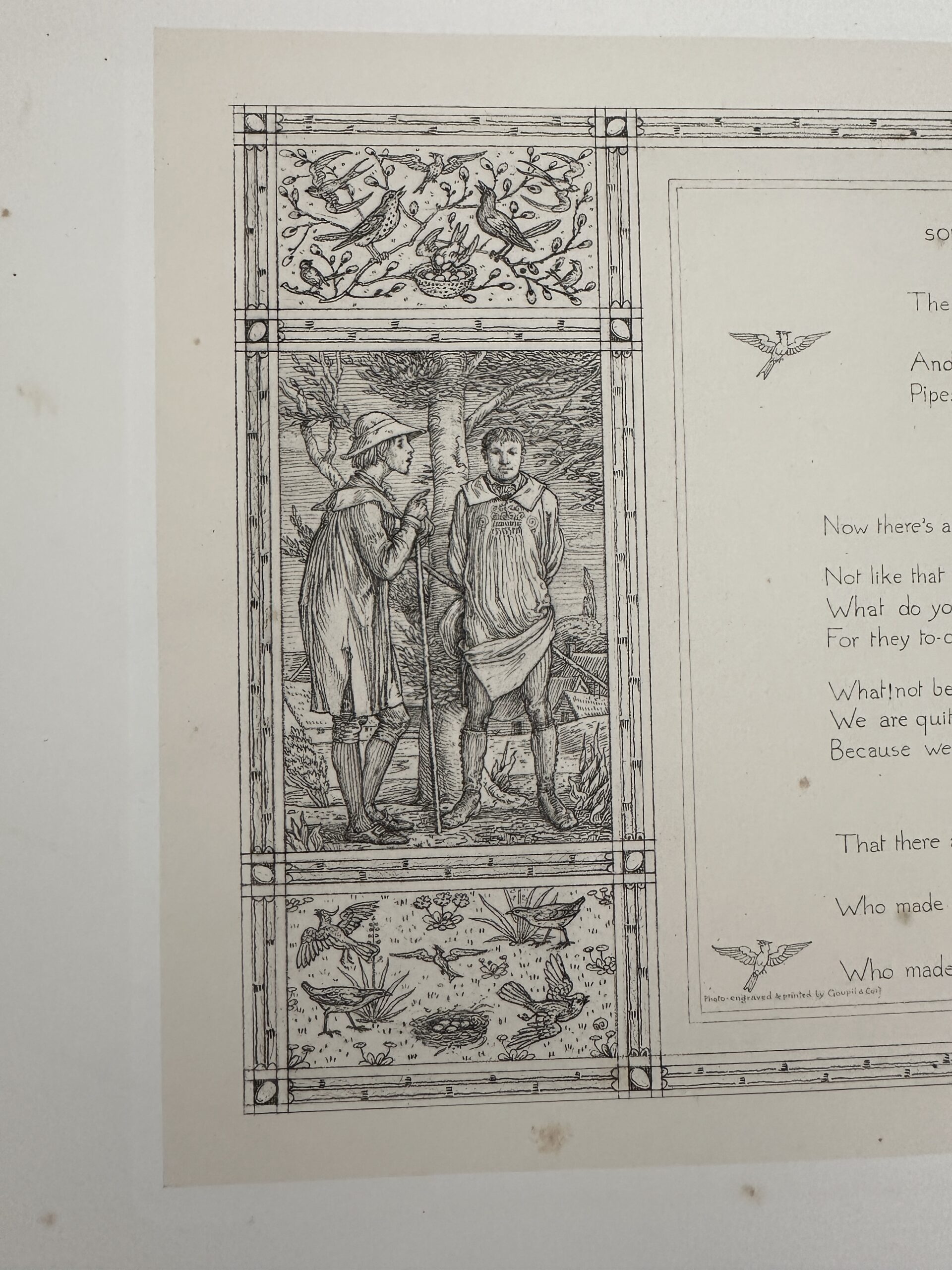
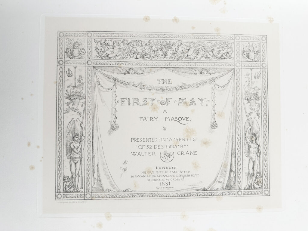
I like to think that the shape and size of this book contributes to a feeling similar to actually watching a play. Even the decorative frames make it look like a theater stage. The variation of number of illustrations and placement also contributes to this experience.
The text block is within the image and another frame, varying in size and justification. Text is throughout between 6 to 25 lines, making it a third to two thirds of the print (most pages have a large text that takes most of the space). The majority of them are left aligned with a couple of instances where it’s center aligned. The placement of the dialogues varies, creating an interesting text flow.
It’s interesting that Crane chose to make titles (act and scenes) part of decorated frames in all caps. Decorations are all different from one another, which makes you pay attention to it in the next page.
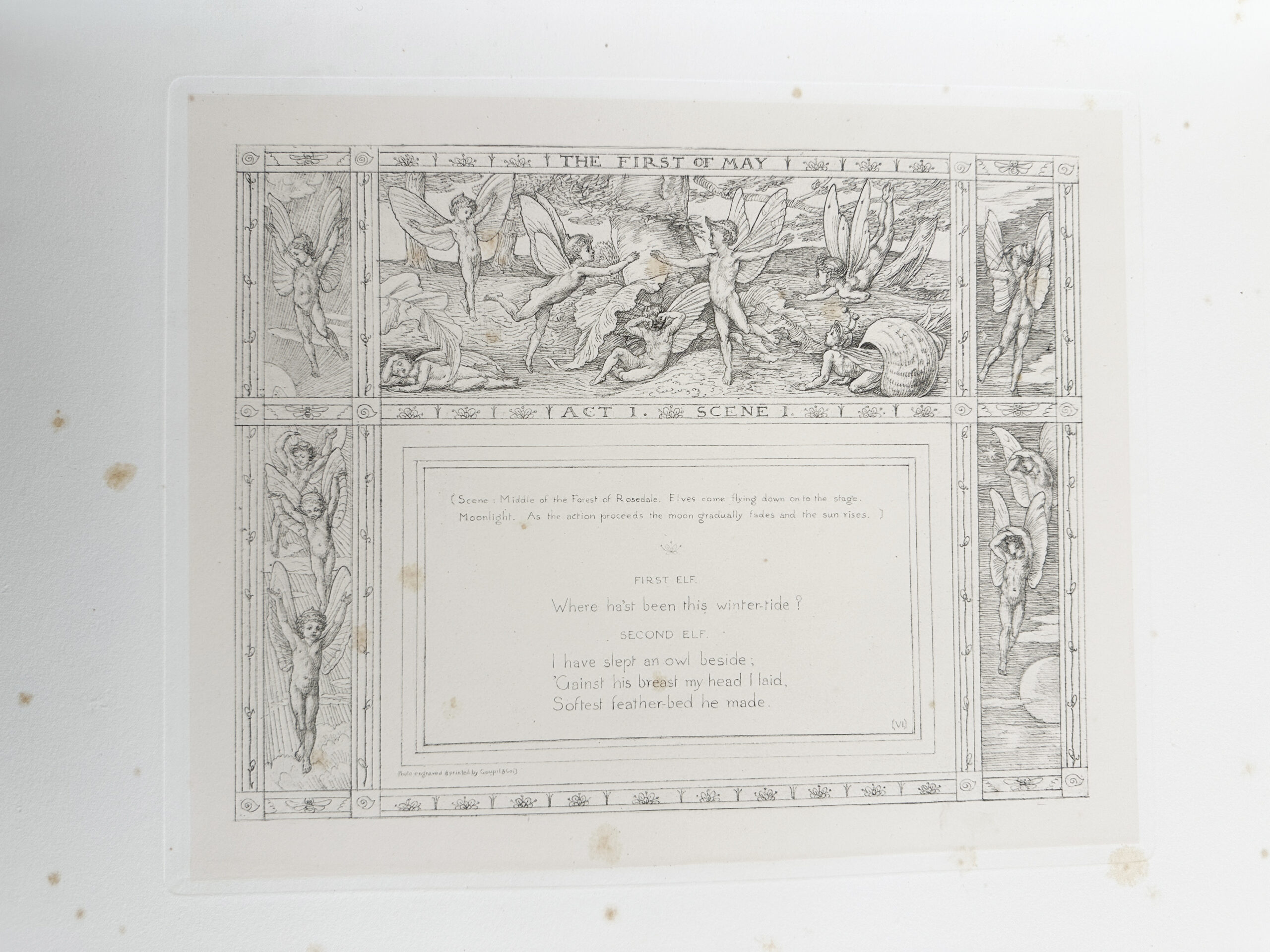
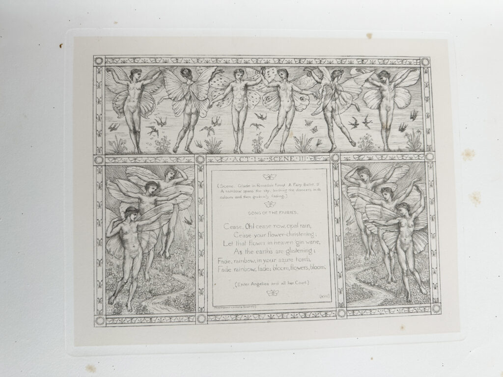
Prints are organized by roman numerals on the lower right corner of the text block, the last one being LVI (56). On every lower left corner is the information about the printing process: “Photo-engraved & printed by Goupil & Co.”. Only on the last page below the roman numeral you’ll see information about the illustrator (“Designed & drawn by Walter Crane”). Most illustrations are a triptych, in fact thirty-one of all of them. About sixteen of them are single panels, two of them are double and one of 4 and 5 panels.
Mise-en-texte

The font used in these prints is actually hand-drawn by Crane himself. In his book Line and Form, he cites Albrecht Dürer’s method of drawing the Roman capitals, which I believe is the design used by Crane in The First of May.
Walter Crane was part of the Arts and Crafts movement which stood for the highly decorative and fine art, and the value of craftsmanship in the arts. The pencil markings are sometimes visible for rule lines and for the text. Scene headings and transitions are written in a smaller font between parentheses. Character names are in all caps at the center before each dialogue. Those choices support the readability of the book as a play. I can imagine a family gathering around this book, having fun looking at the illustrations and playing theater.
Incipit
(Scene: Middle of the Forest of Rosedale. Elves come flying down onto the stage. Moonlight. As the action proceeds the moon gradually fades and the sun rises.)
Explicit
(A grand Fairy ballet, during which falls a snow of may blossoms. At the conclusion Angelica ascends into the sky, followed by all her Court of Fairies singing as they fly “LOVE IS CROWNED THE QUEEN OF MAY.”)

