Mise-en-page and mise-en-texte is really the reason that I chose Yoko Ono’s Acorn as my Pet Book Project. There is a fluidity and simplicity to the way that the text and page is presented that lends itself to a peaceful experience while reading this book.
The general step up of the book is that the text is on the left page and the illustration is on the right side. However, occasionally this pattern will be disrupted. Sometimes the text continues from the left page underneath the illustration.
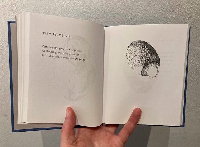
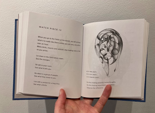
Starting with the bare bones; the pages are white, made from paper, and the text is black. But if I look really closely at the text, the type almost looks gray. A very dark gray. Not quite as black as the text I’m writing in now but slightly lighter. The illustrations also have this dark gray color to them. Partially perhaps because of line weight? The illustrations are made up of various line and mark-making techniques, mostly stippling and hatching. The layering of the marks make some areas of the illustrations look darker.
Again, this is a book of conceptual instructions that invites the reader to take part in the art piece. At the start of each instruction,the title is written in ALL CAPS on its own line and the main text follows sentence structure rules starting out with a Capital letter and lowercase letters through the remainder of the sentence. The all caps title divides each set of instructions as well as the general rhythm of instructions/text, illustration, repeated throughout. So the reader can easily tell when one set of instructions ends and another begins. The kerning or spacing between each letter and word appears very uniform and typical, nothing unusual or out of ordinary type.
The font looks contemporary and by that I mean it’s very clean and legible. Looking at the Common modern type faces, it looks closest to a Sans type font. The front of the book indicates the text design is by Courtney Andujar. As I will discuss further the rhythm of the text changes throughout the book. The cleanliness and simplicity of the text allows for the space needed to digest the conceptual instructions given in the content of the words presented.
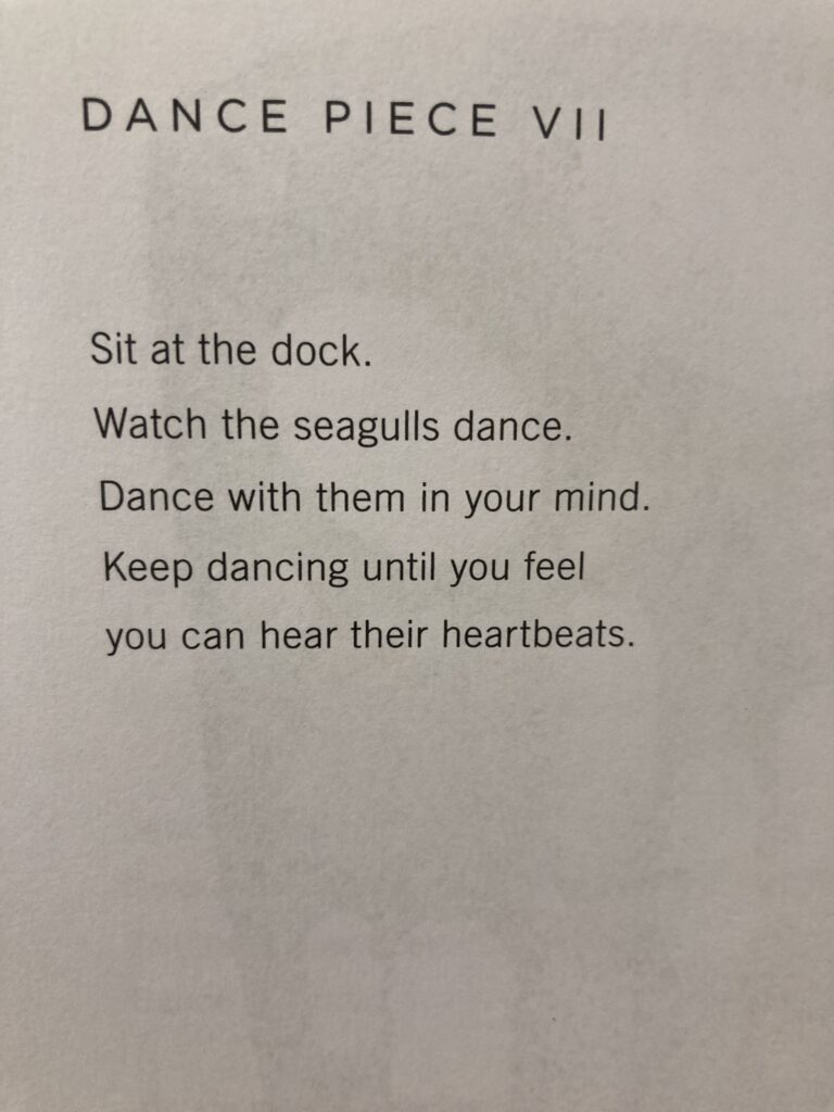
One of the most delightful things about the book is that the placement of the text varies slightly on each page. Not so much with the rule of each page; each one is left aligned. But the placement of the text on each page changes throughout.
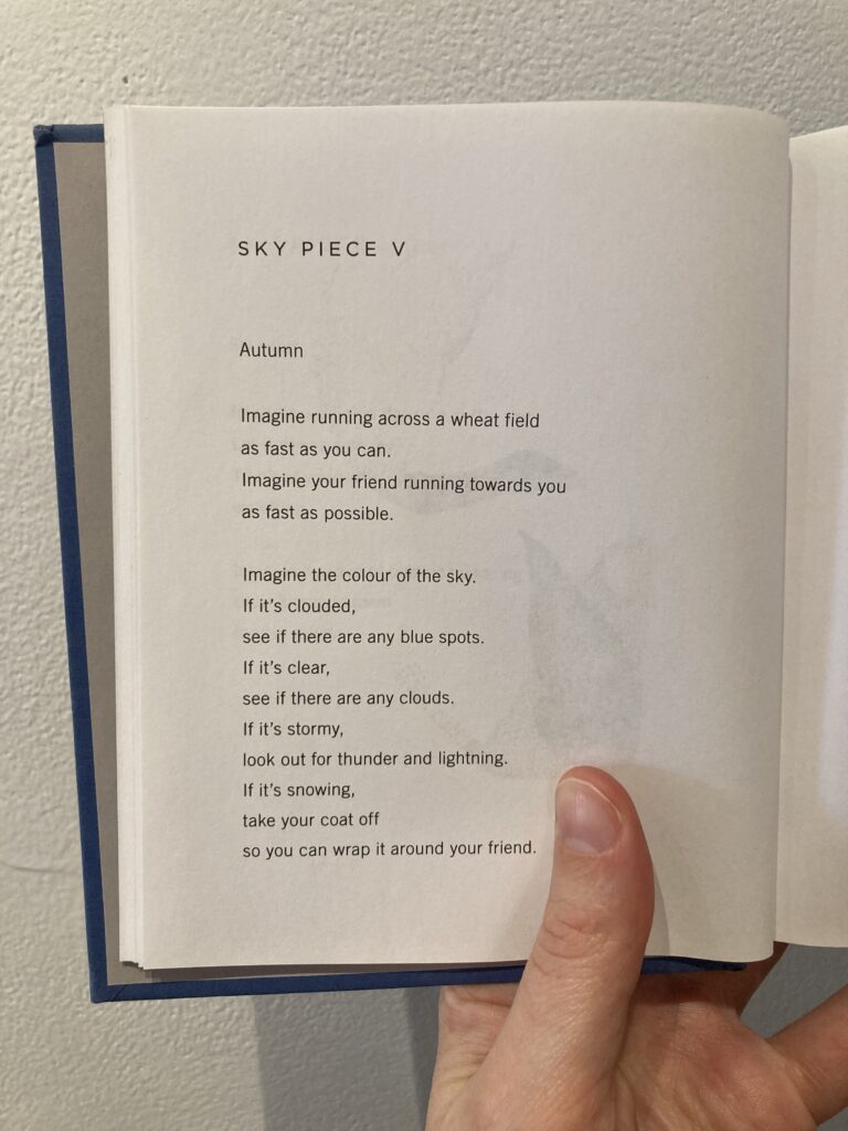
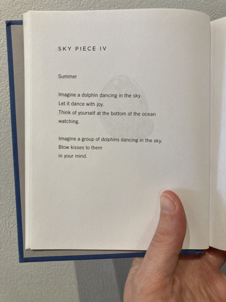
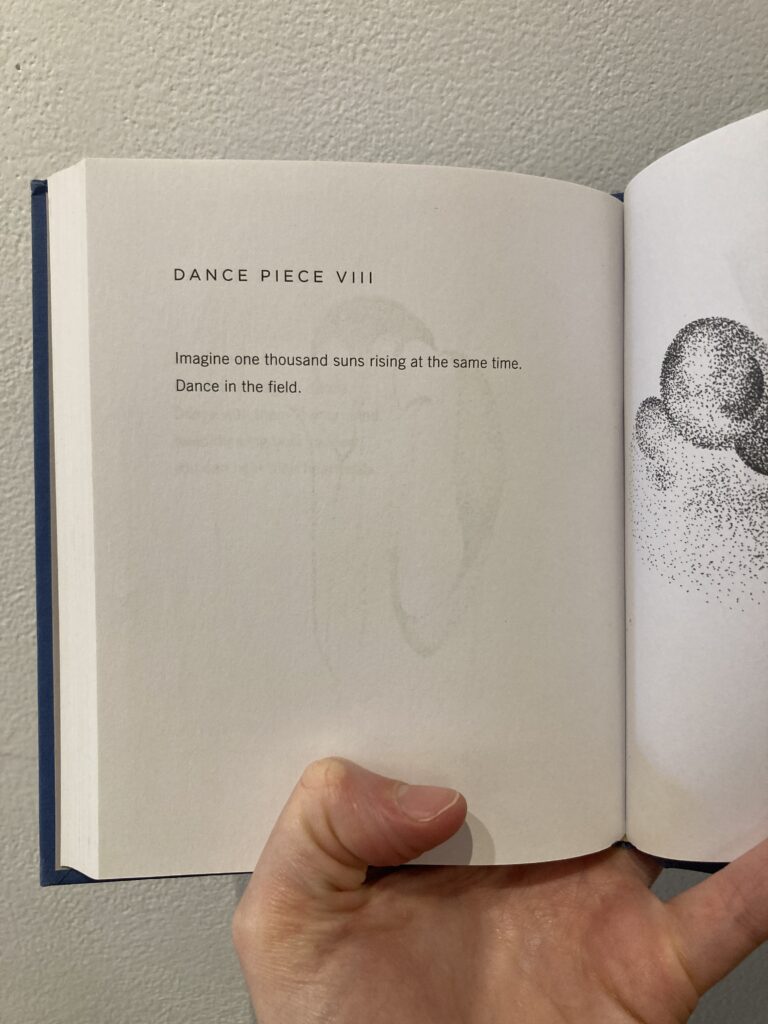
The text appears in one column. There is usually a good amount of space between one “paragraph” (they’re quite small paragraphs and are sometimes just a sentence) and the next.
The margins are approximately one inch on the left hand side. Sometimes the text will extend a couple of inches but other times it will be shortened, each word its own line. The text itself has a very illustrative quality to it how it’s laid out. It is very intentional and read almost like a poem would.
There is generally quite a bit of space on each page. Despite the small book and page size, there’s a lot of space for the text and illustration to exist and therefore space to look and breath.

As was explored in the previous blog post, this is a contemporary book and has been manufactured by a printing press. So much of the print and page is very clean and orderly looking. It doesn’t appear handmade in any way. It also doesn’t attempt to appear hand made. It looks like a machine made book.
In somewhat of a contrast the illustrations are very organic. They don’t appear hand drawn, as in hand drawn on each page, rather they are drawings that have been printed using the same contemporary techniques as the text was produced from. As I mentioned the illustrations are made through mark-making techniques using that repetitive movement of stippling and hatching. You can see the movement and/or gesture in the stroke of each mark. The marks vary in size, weight, length. No mark is the same.
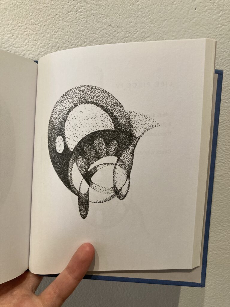
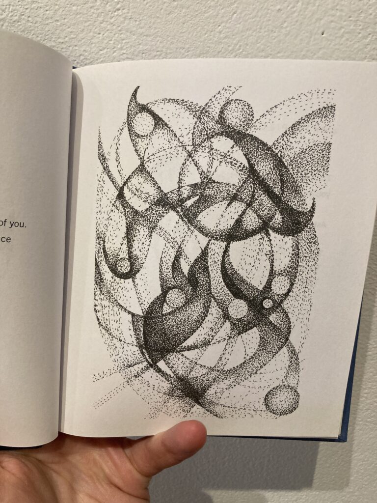
The illustrations are organic, non-objective illustrations. They are often swirling lines and marks that make up varying shapes. Sometimes they are broken up by negative space within each shape. Sometimes there is overlap between shapes. Sometimes the illustration fills up the majority of the page, but there are still margins when this happens. And sometimes the illustrations are floating in the center or top half of the page.
Sometimes the text and the illustration relate to one another directly and other times they may just allude to what’s going on in the text.
It’s interesting to think about the idea that these illustrations were drawn by Yoko Ono, on paper, using a pen or pencil (or some other medium but it does appear to be either ink or graphite) and then placed in the book through a very mechanical process. Especially since the drawings are very ethereal and organic and detailed. If you look really closely at the print of each of them I feel like as the reader the viewer it removes some of the materiality-ness to the illustrations. As if they almost become more pixelated and machine printed in appearance. And the only way I feel like I can describe that well enough is to say that if I stare at one of the illustrations and look very closely there’s this dynamic between the gesture of the mark-making and the cleanliness of the printing process that takes away from the gestural quality of the drawing.
As I explored in the previous post, the book itself is quite small, for me this lends itself to the overall experience of reading the book. The content of the text itself is asking the viewer to participate. And I think this is one of the reasons why the text length, but not placement (it is always one column, same font, etc), changes throughout the book. I think the artist is thinking of the text with as much attention as the illustrations and she wants to influence the viewer’s experience. The instructions themselves are often dreamy, for example: “Dream Earth. Dream you. Dream eternity.” These are such simple yet lofty ideas. How does one Dream Earth or Dream you or Dream eternity? Those are big conceptual questions that causes the reader to pause and consider. And yet the simplicity of the font, the rhythm of the left aligned text gives us something to ground onto.
The conceptual nature of the text lends itself nicely to the placement of the text and image on the page which is often different as the reader moves through the book. The fluidity and space of the text and illustrations leaves room for the viewer to pause and consider what is being asked of them.
The incipit and explicit of the book are as follows:
Incipit:
“Introduction
It’s been nearly 50 years since my book of conceptual instructions, Grapefruit, was first published.
Some years ago, I picked up from where I left off, and wrote Acorn for a website event.
Now it’s being published i¹n book form. I’m riding a time machine that’s going back to the old ways! Great!
I added my dot drawings to give you further brain work.
I’m just planting seeds. Have fun.”
Explicit
“End Piece
Each planet has its own orbit agenda.
This of people close to you as planets.
Sometimes it’s nice to just watch them
orbit and shine.”
