Alan Alexander Milne and Sir Ernest Howard Shepard generated opportunities for their readers and their read-to’s (or their read-along-withs) to transcend the printed page altogether and to enter that fantastical realm — some of them for life, or longer in the memories of others.
~
The endpapers at the front and back of The House at Pooh Corner, published in London in 1928, contain an elaborate two-page spread of pen-and-ink drawing of trees and clouds and birds, along with silhouettes of Christopher Robin leading his entourage — Pooh, Piglet, Owl, Rabbit, Kanga and her baby, Roo, Tigger, and the ever-dispirited Eeyore — through the woods. It is a bold statement that impresses the deep-black silhouettes of Christopher Robin’s menagerie on the paper and on the minds of youngsters in the audience.
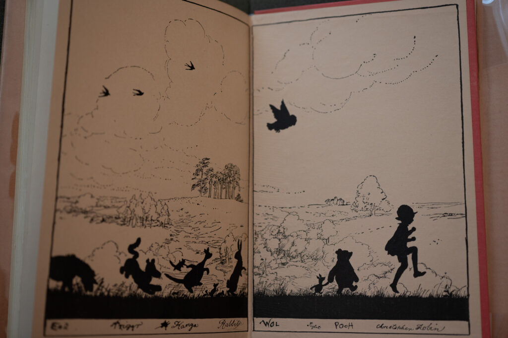
There is no added color in the endpaper illustrations, but the drawings themselves are full of the “color” of the characters. They are animated, and their names are written in a child’s inexperienced scrawl (using something like a fountain pen or quill), a rustic feeling reinforced by ink “blots” and smudges and cross-outs.
Throughout the volume — beginning with the three-line drop-cap that opens Chapter I — Milne’s symbolic, iconic words on the printed page* reinforce those ink-drawn characters and personalities, and vice versa, in a lively, visual, humorous symbiosis.
At one point, Milne presents Pooh as easily confused when he searches for his pal Piglet:
“It was still snowing as he stumped over the white forest track, and he expected to find Piglet warming his toes in front of his fire, but to his surprise he saw that the … more he looked inside the more Piglet wasn’t there. ‘He’s out,’ said Pooh sadly.” (1)
Pooh recites some poetry, now famous, about his toes growing colder as it snows, “(Tiddley pom),” and then returns home to find Piglet sitting in the bear’s own armchair.
“‘Hallo, Piglet,’ he said. ‘I thought you were out.’
“‘No,’ said Piglet, ‘it’s you who were out, Pooh.’
“‘So it was,’ said Pooh. ‘I knew one of us was.’” (2)
The monochrome, pen-and-ink illustration that accompanies that exchange is simple and domestic, visually incomplete but still evocative — a bit of a door, part of a wall panel, a small fireplace with a candle burning on the mantle, a wall clock we soon learn is stuck at 5 minutes to 11, and Piglet relaxing in Pooh’s armchair as Pooh takes in the scene that (predictably) baffles him. (3)
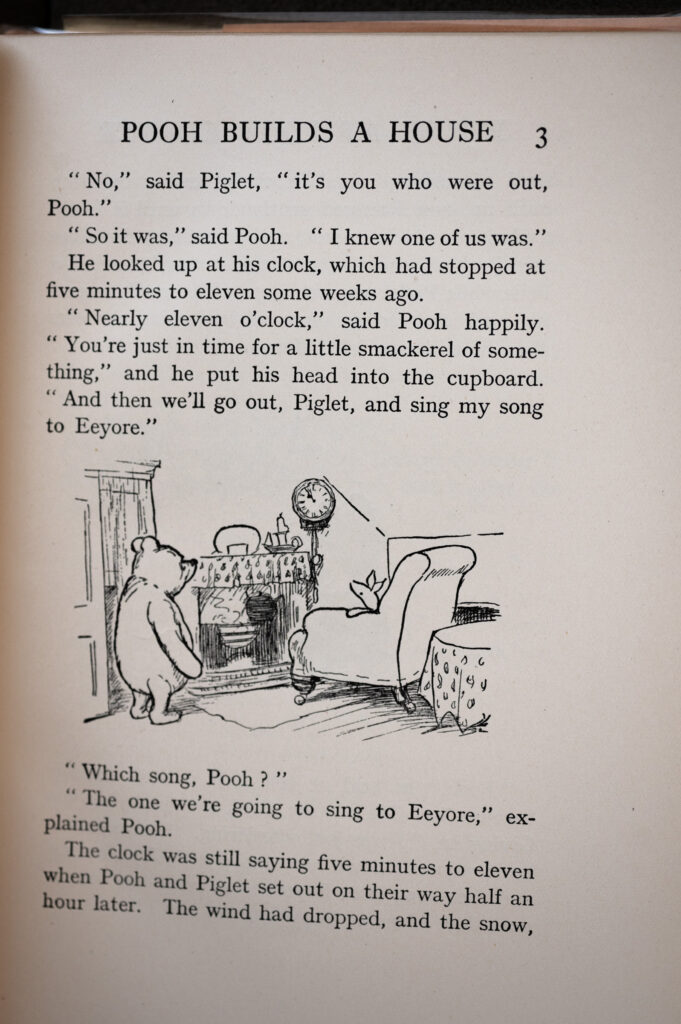
The inked drawing is unframed, unanchored, floating in the middle third of the page with text above and below and white space to either side. The drawing and text form an eccentric narrative told in a place of transition for Pooh and Piglet, who are trading their sovereign domestic spaces, and for the children who are the audience, who are likewise “trading” the stations of childhood, chaperoned by an experienced reader.
It is the relationship between the reader and the read-to (or the read-along) that establishes the primary dynamic between drawn image (i.e., the pen-and-ink illustration) and typographical image (i.e., the printed letters that form the words of the text). This book’s young audience is meant to be guided through the experience by the thoughtful reader, much the way Christopher Robin guides his stuffed-animal charges through the Hundred Acre Wood. Even children who have some capacity to read along would benefit from the “animated” performance — and performance it is, a reading-aloud of the interacting words and images, complete with intonation and emotion.
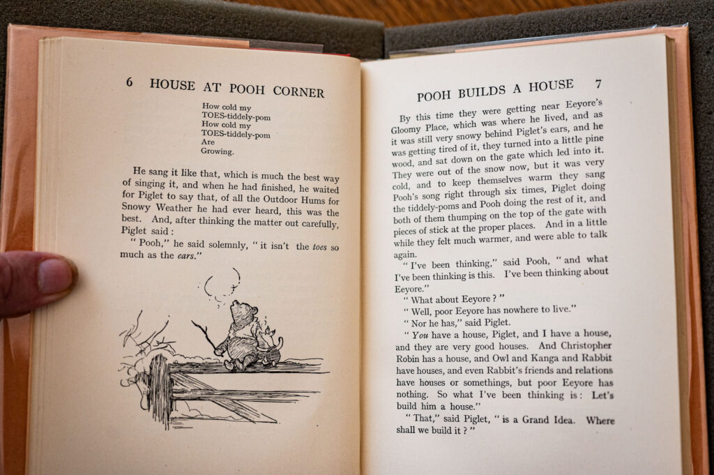
That “experience” — an out-loud bedtime story — might seem as simple and domestic as the drawing of Pooh’s parlor I mentioned above. Prima facie, it’s a “simple” tale about “simple” characters befuddled in “simple” circumstances, and presented in a simple way. But subtle verbal game-playing instead shows a complexity — xxx typographical design of the passages of poetry and songs, unorthodox capitalization, musical repetition of words, and ideas that may seem eye-opening to a youngster.
The images in Pooh Corner complement the words, bringing emotion and plot to the fore as would the music and “book” in a light-hearted comic opera. Each image draws from the same motivation: to bring life to what might otherwise be a straight-forward text in which the symbols — the letters — would be simple and predictable, unadorned.
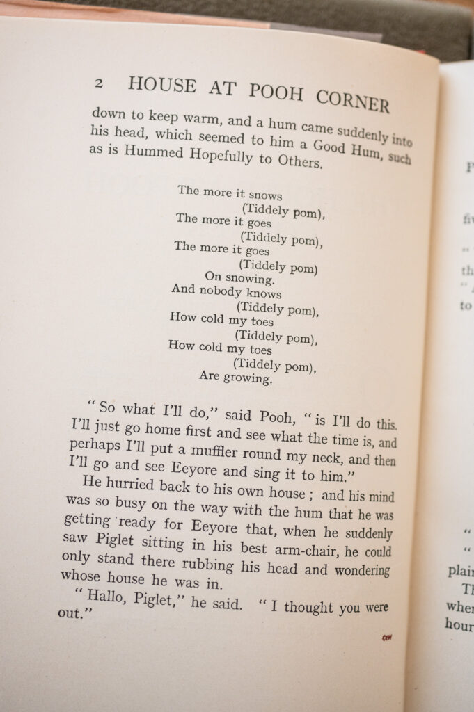
Of course, one of the adornments rife in this book entails the typographical presentation of “songs.” The “Tiddley Pom” song is offered on several pages in a typical visual language of poetry: a narrow and centered column, indented, with line breaks that help the reader understand the song’s meter. The song Pooh wants to sing to Eeyore in Chapter I is capitalized as “a special Outdoor Song which Has To Be Sung In The Snow,” which it soon is.
Unorthodox capitalization — its own variety of adornment that is very much a visual, graphic, image-y enhancement — is one of the devices used throughout the book. An example: A revised “Tiddley Pom” song is called among the finest of “all the Outdoor Hums for Snowy Weather.” Transforming printed letters into images is another example of the extraordinary collaboration between Milne and Shepard in the creation of this brilliant little book.
Words and images might work as a Deleuzean flow, made even more abstract and conceptual by being read aloud and by the acting-out of the characters’ traits — voices and personalities and quirks — in the comic operatic performance that arises whenever the book is performed.
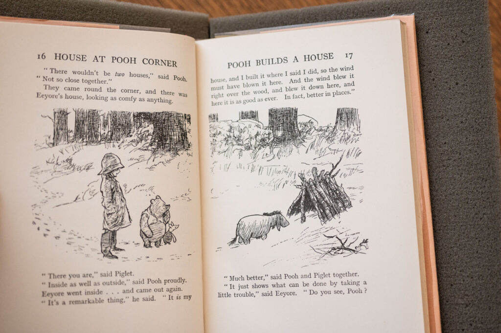
These magical dynamics between word and image have nearly erased the distinction between either, leaving us with a free-flowing collaboration among them: an experience of the entire page as performance. Unifying natural forces create the clouds on the endpapers at both ends of the book, in their presences as “Cloud” and as “cloud.” It is under the protection of those clouds that Christopher Robin’s characters rollick (or in Eeyore’s case, mope) about the Hundred Acre Wood, the home into which we as readers — as participants — have been invited.
_____
* Given that this book was printed in 1928 in London (and simultaneously in New York) and that there is no evidence of a physical “impression” of the paper that metal type could generate, it is likely the printing was done in the then-nascent offset process, which had been adapted for printing on paper about 25 years earlier in the United States.
