As we discussed in class, your third post is more open ended than the first two. Having built an impressive conceptual lexicon of critical and technical terms, it is now time to consider the dynamics of image and word within your pet picture book. I want you to let your creativity run free and explore issues of illustration that excite you, while also taking opportunities to engage with topics discussed in the classroom and our Word & Image presentations thus far.
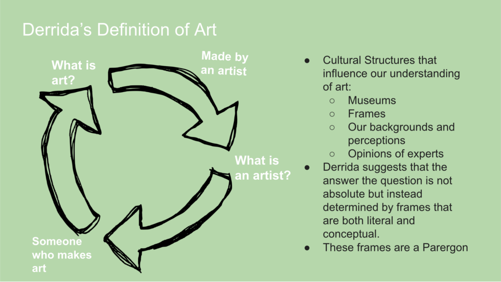
Your first step will be to determine what kind of pictorial matter is included in your book. As we have seen in reference to the Book of Kells and the philosophy of Tim Ingold, separating words from images is not so simple as it might seem at first.
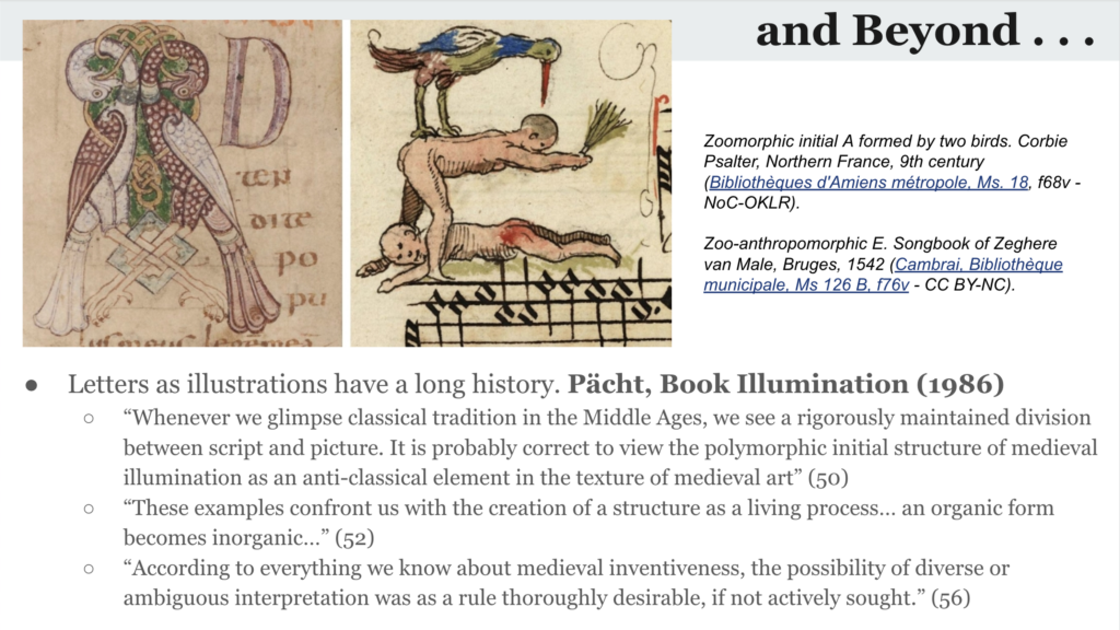
But identify the images, thinking critically about what definitions of image (however loose) you are bringing to your analysis of the book. An image might be a decorative initial, a framed miniature, a frontispiece, marginal illustration, particularly elegant or somatic caligraphy, etc. Once you determine what kinds of pictures your book includes, you can begin to describe them.
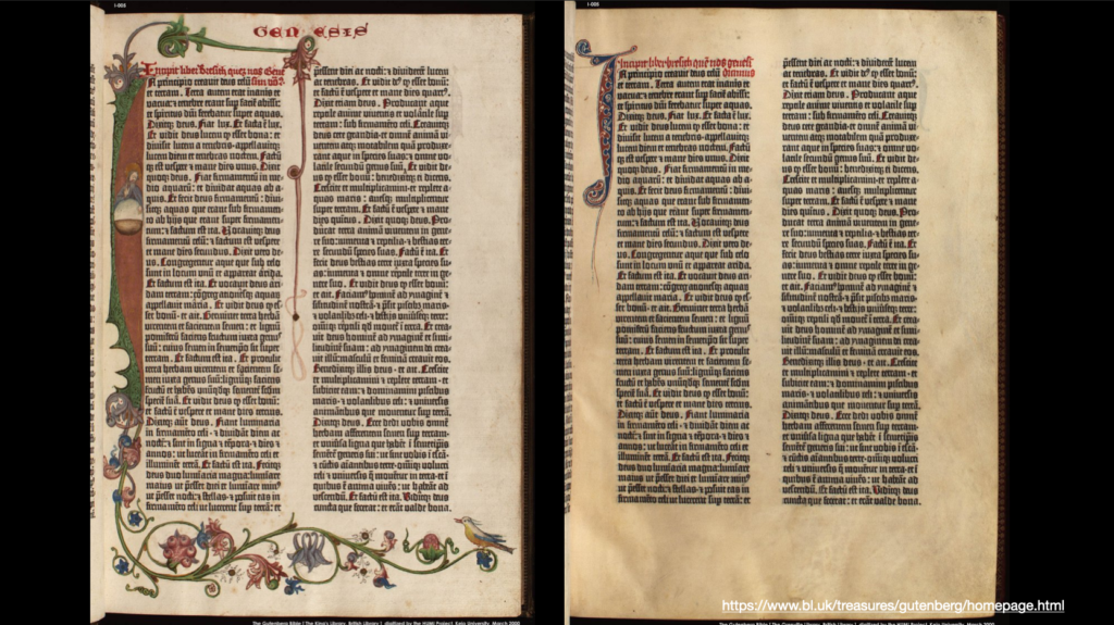
Now that you have tracked down your images, try to parse out the processes by which they were placed on the page. If your book is printed, Herritage and St. Onge can give you some clues about identifying print processes. As with earlier blogposts, I do not expect you to be an expert. I only expect that you look carefully and think about how you might determine process.
If you are able to look at your book in person or have photographed it carefully, look closely at the ink on the page (perhaps in raking light, from a cellphone flashlight). Is the ink sitting below the substrate, impressed? Then, you have a relief process. Is the ink sitting slightly above the substrate? Then, you have an intaglio process. Does the ink appear flush with the substrate? Then you have a planographic process and, in all likelihood, either a lithographic or photomechanical process. The following link gives some useful tips to identifying printing techniques.
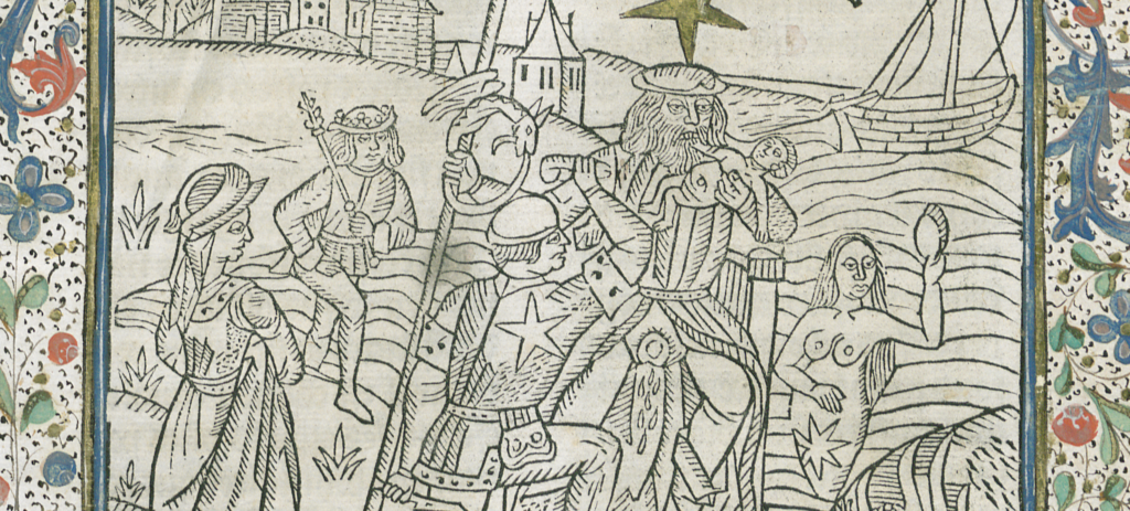
If you cannot determine what process created your images, you very likely can say something about what media they remediate and the effect of their particular style. What are the particular affordances of your medium? Undoubtedly, this castration of saturn woodblock is effective because the artist literally had to cut into the “flesh” of the wood matrix to produce it.
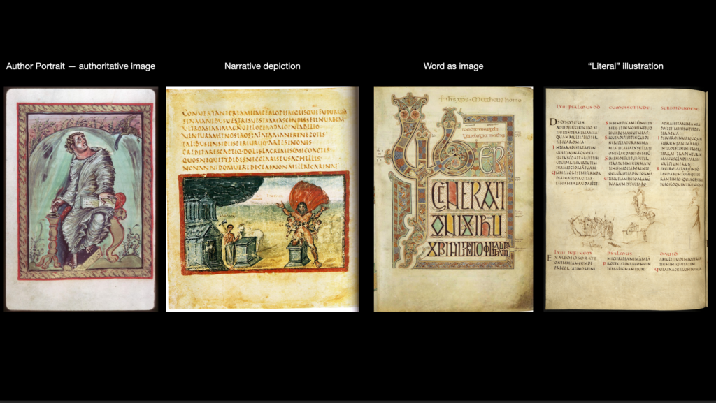
Once you have identified what the pictures “are,” you should proceed to discuss what the pictures “do.” This will be your main focus in your blogpost. How do they sculpt an abstract text into a particular, material text? Do they tell a narrative, or do they perform rather differently: creating authorial authority, “literally” illustratring the text, blurring the boundary of word and image completely?
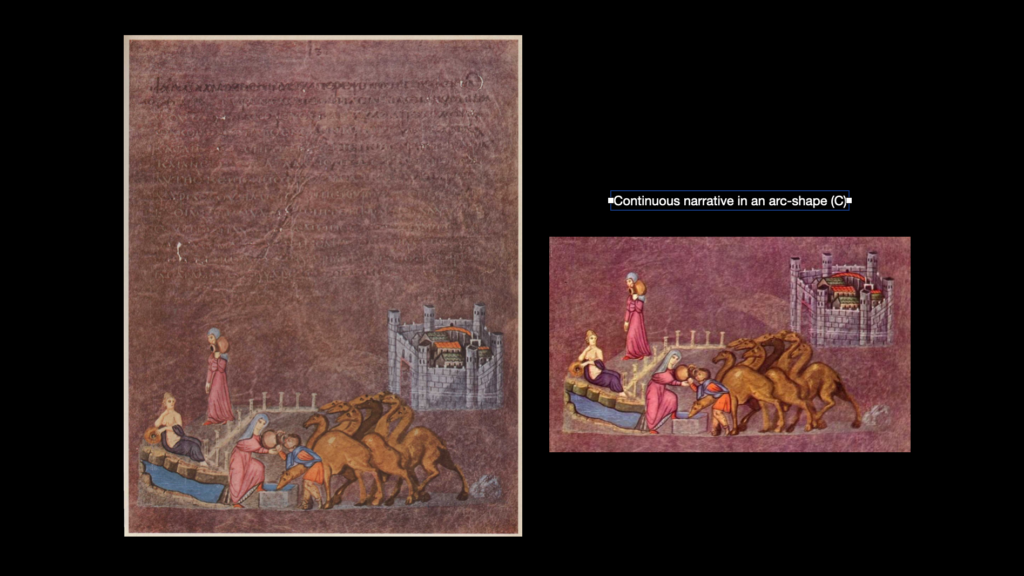
If they are narrative illustrations, do they tell a continuous narrative? Or do they tell an emblematic narrative? Or might they even say something the text does not say?
If this feels overwhelming, you might start with some basic facts in order to ground your analysis. How many pictures are there? What kind of pictures? How do they generally fit within the mise-en-page? Once you’ve addressed these basic questions, you will be more prepared to tackle more complex ones about the relationship between word and image and just what type of pictorial performances you’re seeing.
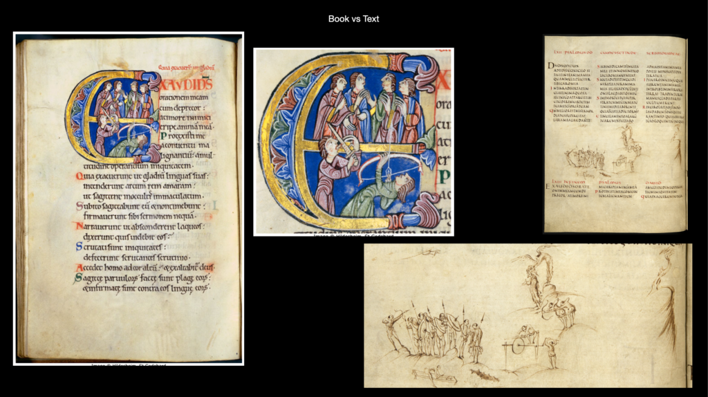
There are many ways to do this, but a thought exercise that I find helpful is to consider how you or an artist might illustrate your text differently. Are the Utrecht Psalter (literal illustration) and the St. Albans Psalter (narrative illustration) really the same book?
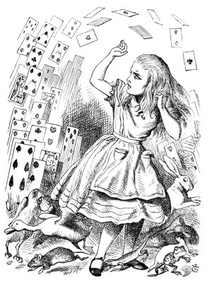
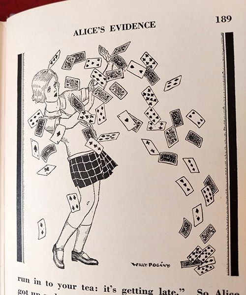
Both of these images are from illustrated copies of Wonderland. They even depict the same scene. But are these really the same book?
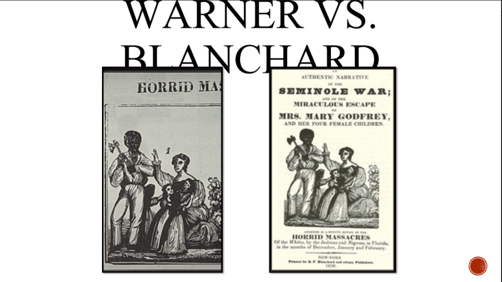
On the other hand, how are two different books with the same pictures (recall Mazzaferro’s Nat Turner imagery) really related?
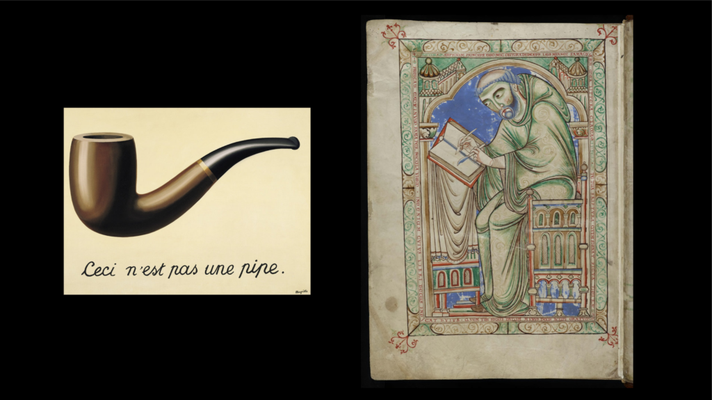
If your pictures carefully reproduce the text, what specific elements of the text do they reproduce? And be careful, you may find ceci n’est pas une pipe!
Indeed, if the the relationship between word and image is tight, surely the pictures omit things the text says and says things that the text does or cannot say. What? Is the relationship that of the parrergon? Is the relationship imaginary? Might they even queer the text? There is no need to answer all of these questions. But do think carefully and creatively as you work.
Thinking critically in this manner can reveal that even “tight” word/image dynamics are not necessarily “illustrative.” Your images might even attack your words.
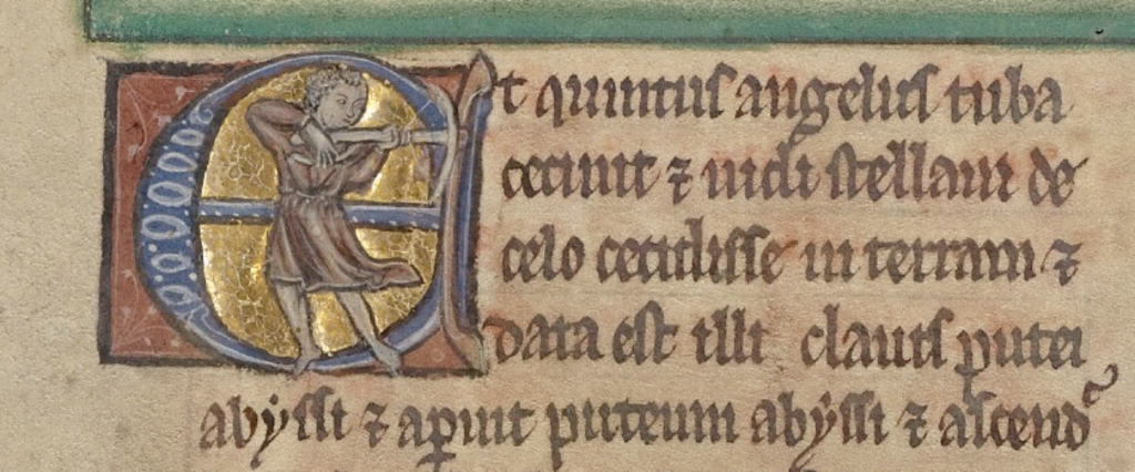
If your text is in a language that you do not read, do not despair. Think carefully about what type of book you are looking at. A geometry book? Well, what types of images would be helpful to a reader. Might they be plans or pictures?
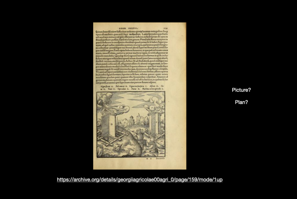
Latin prayerbook? What types of images do such books need, and why? How do they divide the text, how do they divide time? If you are ever totally stuck on your text, you can always fall back on your eye. Describe how the pictures look. Describe the effects of style and medium. Consider what effects the images have on you as a user of this book now.
Good luck and have fun. I invite you to follow your particular interest in the book’s pictures. Craft a post that will critically address the pictures but do so from whatever perspective you think can best explain the pictures to a reader and can best facilitate your own curiosity in this book.
