Mise En Page
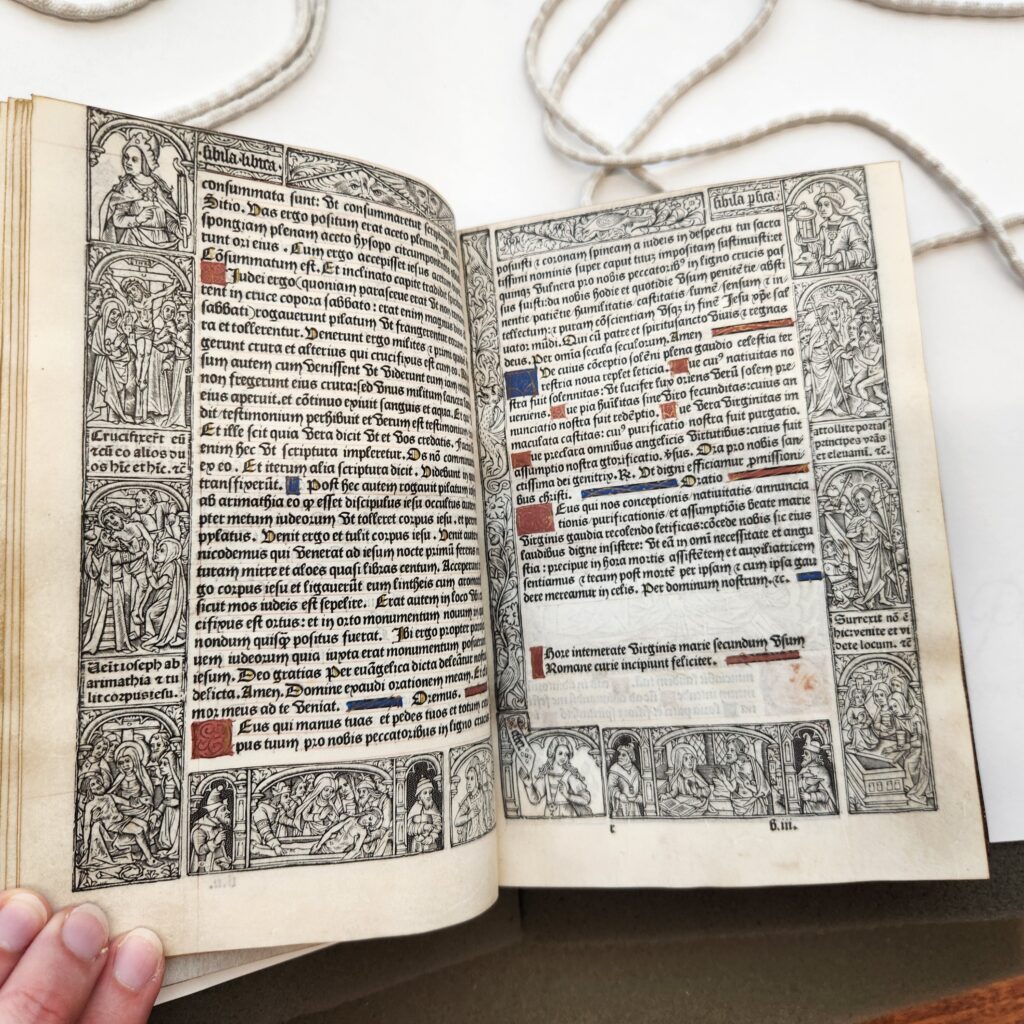
The photo above shows a fairly standard set of pages from this book of hours. Although I think the pages are broadly readable, at least compared with many religious texts we have seen, I would say that the intricacy of the pages and the visual awe they were intended to inspire ultimately took precedence over their accessibility. Each page or “leaf” is 13 cm x 18.5 cm. The text block is center aligned and composed of one column. Intriguingly, I noticed that on all pages that do not contain significant “gaps” between text, there are 33 lines of text per column. I suspect this was intentional, as 33 was the canonical age of Jesus when he died. While many leaves of the book feature charts, lists, and full-page illustrations, most are like the pages above, with illustrations sometimes integrated into the text itself.
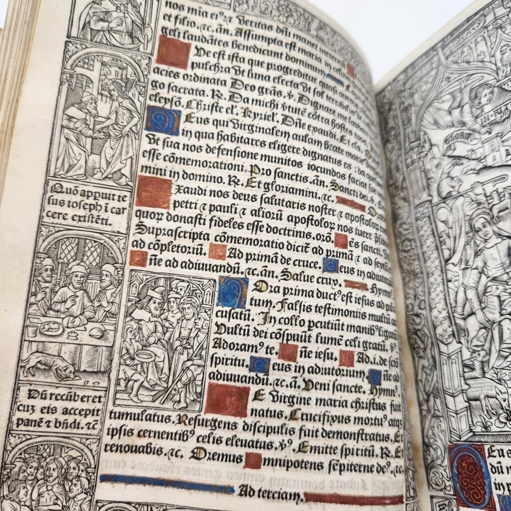
The columns of text are justified, beginning and ending in the same place on the page. In this case, the text block is actually framed by two sets of margins instead of one. The first set of margins are the illustrated panels which appear on every page. The dimensions of these panels reflect the dimensions of the page’s blank margins. The outer margin is significantly wider than either the gutter, which is quite small, or the upper margin, which is slim and almost nonexistent on certain pages. However, the bases-de-page are consistently the largest blank margin on every page in the volume. Lastly, the signature marking the end of a quire is consistently right aligned on the base-de-page of a recto page.
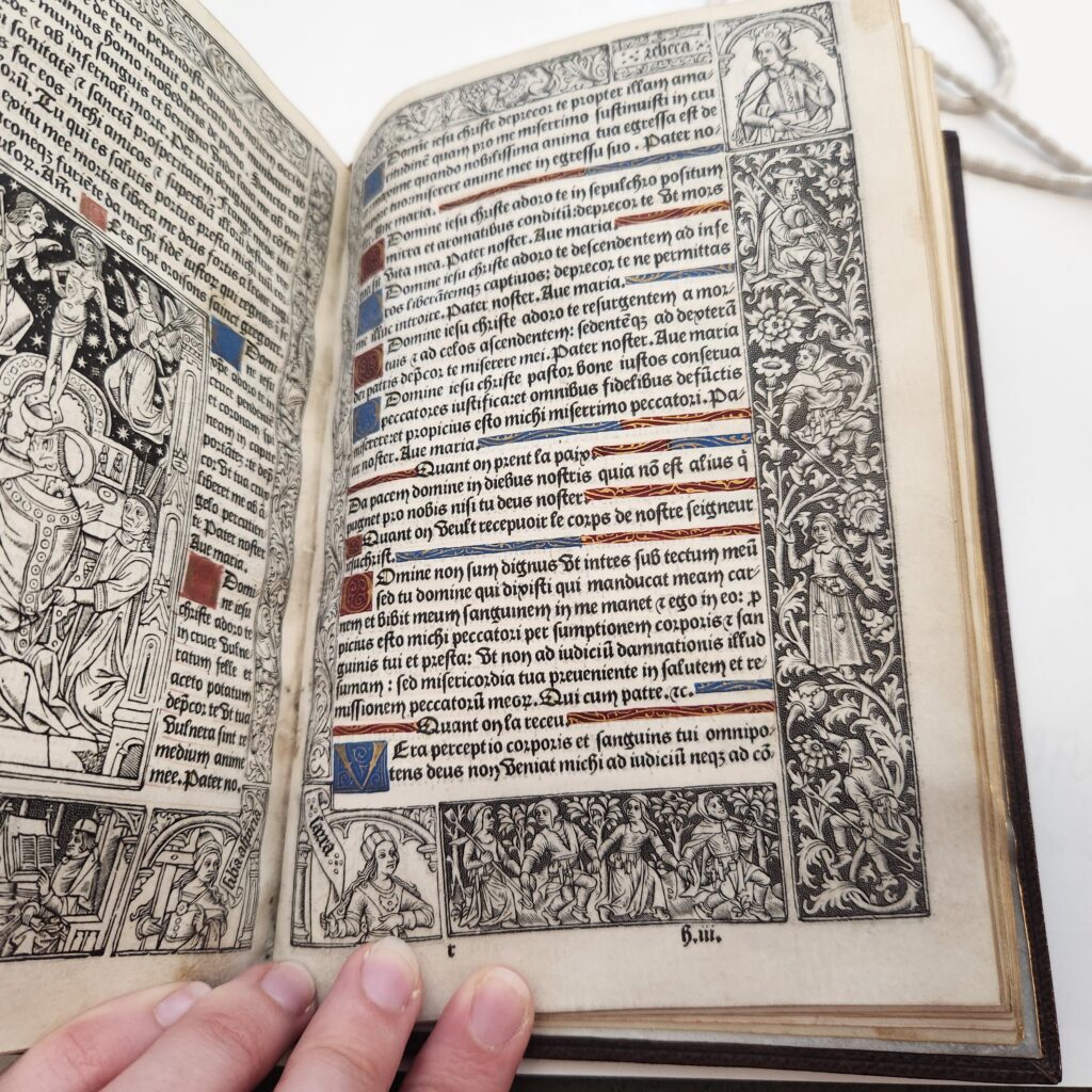
The text block, surrounded as it is by the panels of illustrations on all sides with almost no margin above and a slightly more ample margin below, sits high on the page and overwhelms the reader with its detail. It appears almost unassailable and gives the eye very little room to breathe. Every aspect of the mise en page is beautiful, arresting, and intimidating.
Mise en Texte
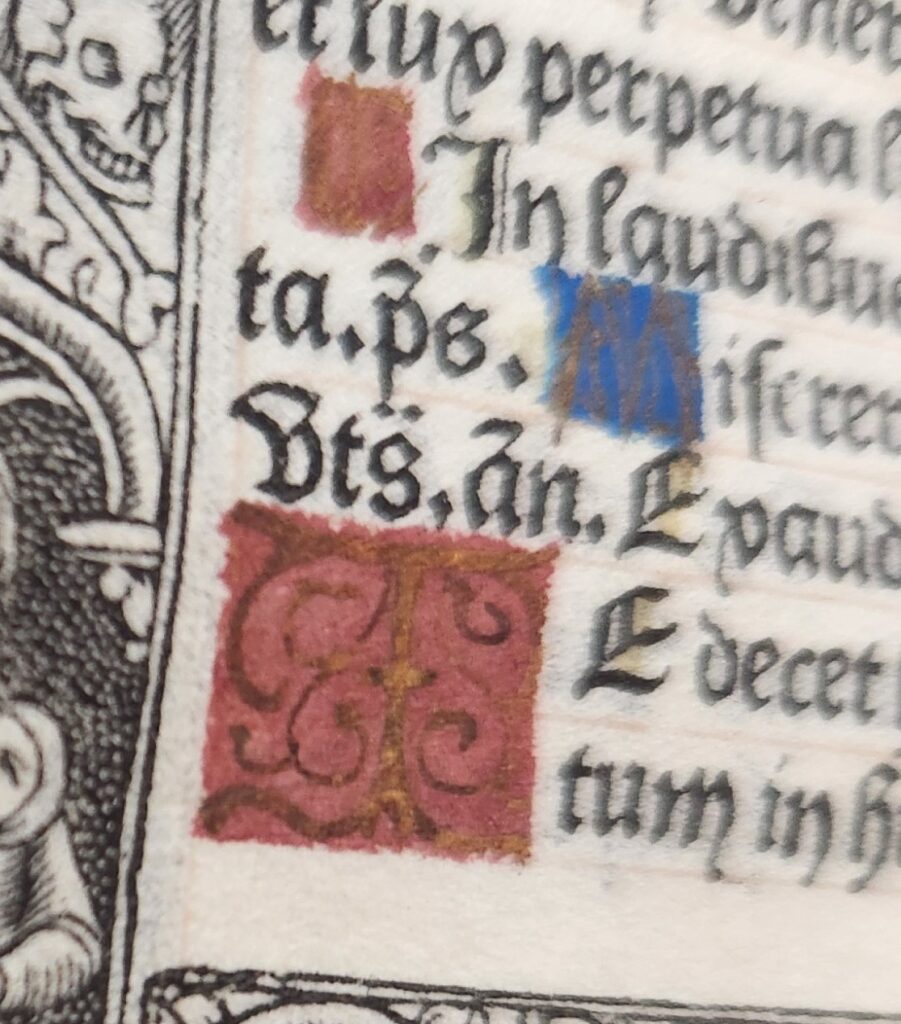
Based on the typeface examples provided by the Incunabula website, I would say that the script of my text is one of the “textura” types. It is ornate, calligraphic, and distinguished by large loops and sharp, angular seriphs. The initial of the first letter of each sentence is capitalized, as are stand-alone words like “Amen”; however, the initials of proper nouns are not. While some of the almanac’s charts and lists contain abbreviations, such as “an.” (for annus, presumably), I have not noticed any in the main body of the text. (Also, there are few accent marks in the French portions.) The letters are daunting to look at and remind the reader of the sanctity of the words. The color of the main script is mostly black; however, the first letter of certain sections are marked by an enlarged decorated initial. The decorated initials always have either a red or a blue background, whereas the letter within is gold. These are, significantly, the national colors of France dating back centuries.
Many lines contain a colorful horizontal flourish as well, which designates a break in a line or paragraph. The flourishes serve another function as well. Like the text columns, each line of the text is justified and begins in the same place on the page; when a particular line does not stretch to the same ending point, the decorated flourish (which always contains gold illustrations) makes up the shortfall. Thus, the flourishes are a type of punctuation, indicating sentence & paragraph breaks and indentations. Apart from that, the text features many periods and colons, although I have not noticed any other examples of “modern” punctuation.
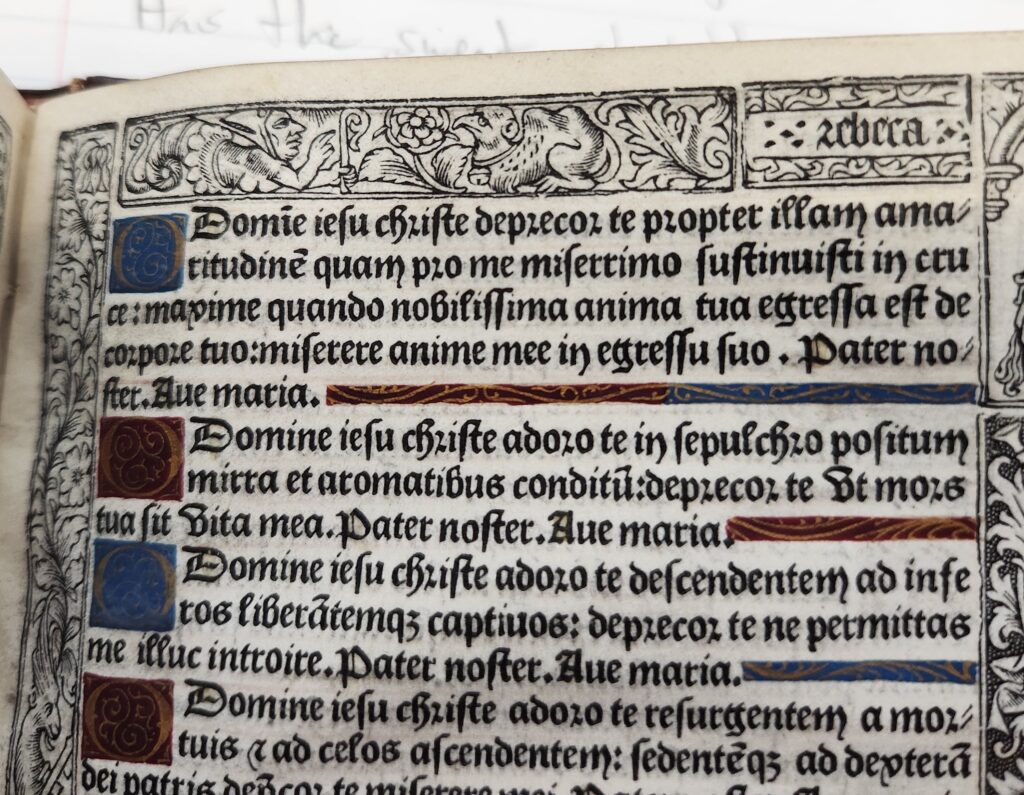
The script, while beautiful and mostly legible, seems intended to make the reader spend time with the prose in front of them and appreciate each aesthetic choice, painstaking as it must have been. Significantly, life forms in this book are not trapped inside the illustrated letters but live in the surrounding panels. This increases the readability of the text, in my opinion, as there are fewer distractions within the words themselves. The pictures and the prose are separated, and thus are each given a narrative of their own.
Although I unfortunately do not have the dimensions of the margins or text block (I will record these during my next trip to Special Collections), I have done my best using online translation tools to string together the first line of the book, originally in French:

Incipit: Philippe Pigouchet completed this present book of hours for Rome’s use on August 22, 1498.
The final line, composed entirely in Latin, translates roughly as follows:

Explicit: I beseech thee, most merciful of fathers, my father and yours: I pray thee lead me to a good end, to a pure confession of repentance, and a worthy atonement for all of my sins. Amen.
