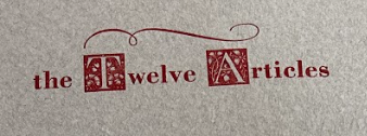
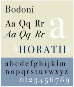
The 12 Articles is an artbook, created on handmade torn cloth paper. The text appears to be applied to the paper with a letterpress. The font type used in “The 12 Articles” is Bodoni, which is a serif typeface that originated in the 18th century. This font style is considered modern and is often used in fine art books.
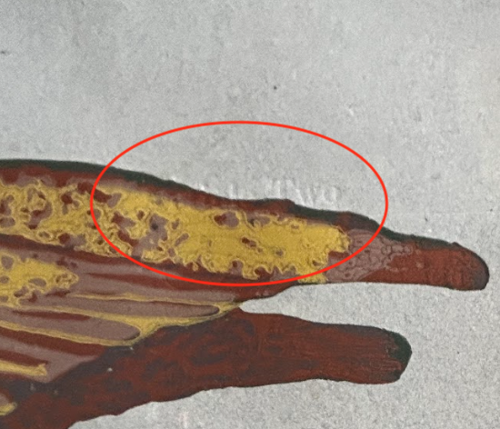
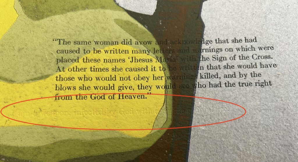
A Mise – en – Text moment I noticed was the artist’s use of embossing, or printing without ink. We see this on the pages of Article Two, where the title of the chapter is embossed and hidden from the unfocused eye. The second occasion where this occurs is in Article 5. The second text block, which has been printed consistently in red ink in the rest of the book, is embossed over the relief print. It’s an interesting idea that tests the reader’s close looking skills.
The narrative of the book begins on the introduction page. From here, I notice that the pages in this book are not numbered. Page numbers are a paratextual element that is useful for the reader as they navigate a text and I wonder why they were not included. The book itself is short; 37 pages in total.
Another paratextual element that the artist used throughout the book is illuminated initials. On the introductory page, there is the initial of an ‘I’ which is centered inside a square shape. The bottom of the square sits about halfway down the page. It is very large in comparison to the text block. The initial is added to the page as a relief reduction print and has 4 layers of color and gold leaf. Something else that we notice at the top of the page is a header, printed in light warm brown, possibly gold ink. There is also a small symbol that appears to be an anchor.
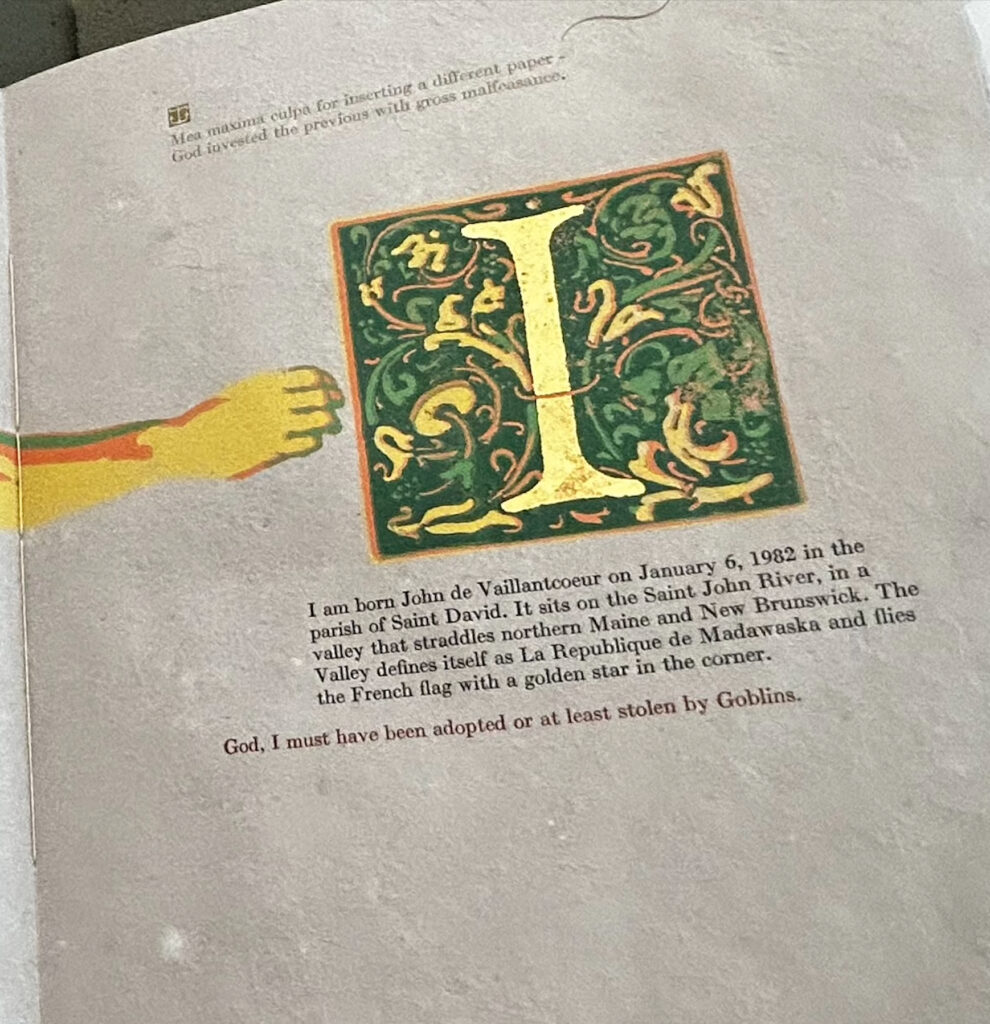
The text block sits below the initial. It is one column and printed in dark black ink. This text block appears to be alighted to the left and it is centered on the square of the initial as well.
There is a second text block, which is only one line of text, printed in red ink. Looking at these two blocks, we can see that the black ink text block is indented and sits further into the page.
Following the introduction is the first chapter, titled Article One. At the very top of the page, there is a simple flourish; two curvy lines. Below this, the text is printed. The first block is printed in red ink and under this block of text, we see the artist using the relief print initial again. All the text elements and initials are balanced, however there is more space on the left margin, than on the right. This margin spacing is consistent on all pages with text printed on them.
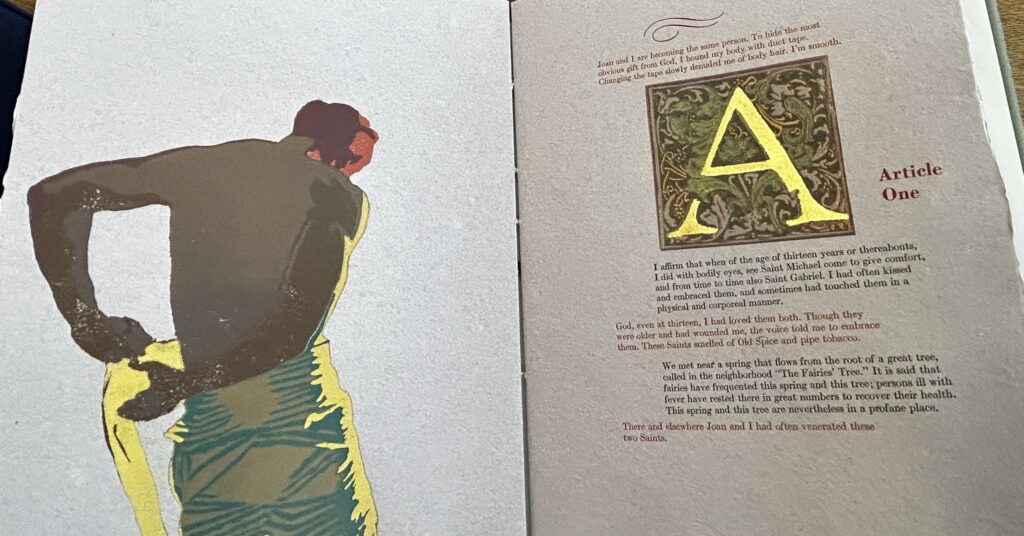
The initial block is centered vertically on the page and to the right of the initial block, the chapter title “Article One” is printed in red ink. This is the only place where I notice that the artist places the title beside an initial. On other pages, the chapter heading is printed with an underline and the double curved line flourish underneath. This is consistent throughout the remainder of the book.
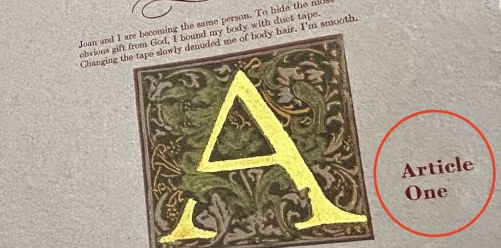
Still looking on the first page of Article 1, there are 3 text blocks that are printed in red and they are aligned left, parallel with the title line. In addition to the text in red, two text blocks are printed in black. The black text blocks are lined very close to the initial block, but not exactly in line with the edge of that block.
The interchange of red and black ink in this book is reminiscent of medieval texts and the use of red rubrics on the page. In “The 12 Articles,” I’ve noticed that the use of rubrication is a way to separate the events occurring in the narrative and the thoughts of the protagonist, as those events are occurring. The use of both the red and black text blocks is consistent throughout each chapter and I often found myself jumping to read the red print before the rest of the text.

Incipit – “God, I must have been adopted or at least stolen by Goblins.”
Explicit – “God made me and I am his instrument, crafted as He sees fit. I can not burn.”
The incipit and explicit text create an interesting relationship. First, the narrator is feeling far away from God, and in the end, he comes to terms with his closeness to God, and the power that it gives him, despite his difficult circumstance. This translation is also evident in the illustration, and in Article Two, we see an illustration of a human figure, with wings. In conjunction with the direct conversation with God, the image of a figure with wings brings the thought of angels and heaven to mind.

