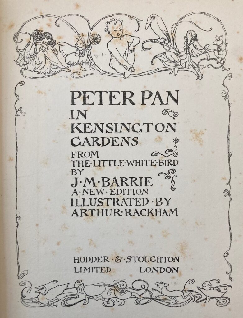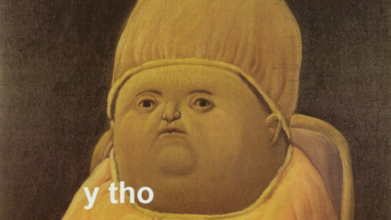
At a glance, PPKG gives off ‘big head, tiny face’ meme vibes. Each page is grandiose – 28.25 x 22.25 cm – but the space isn’t maximized by the text. The text-block is one column about a third of that height and length. It’s left-aligned and justified, without line breaks, giving the impression that the words are contained in a neat, compact box that retreats inwards. The text-to-page ratio is similar to the comically awkward prepubescent stage when a child’s head appears much larger than their face – as if to say, this text still has time to grow into the expanse of the page. Or perhaps, the abundant expanse is meant to be filled with the readers’ imagination.
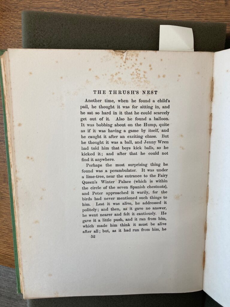
This tidy text-block sits closer to the gutter of the inner margin, leaving a wider outer margin. Likewise, the lower margin is wider than the upper margin, perhaps intending to protect the text-block from the potentially grubby hands that hold the book from its bottom. While the page size implies this book is meant to be shared or shown off, the small text-block suggests it would be hard for two people to read simultaneously side-by-side. The ideal co-reading situation could be a parent reading to a child on their lap. Or, an adult reading alone, transported to childlike fantasy by the largeness of the page.
There are typically 24 lines in the text-block, except in the first page of each chapter, which has 16 lines. It doesn’t take long to read this many lines and turn the page, getting the reader deeper into adventure without much effort. Framed, 7- and 10-line miniatures are nestled into the text block every so often, as well as un-framed miniatures of fairies that float above the chapter titles.
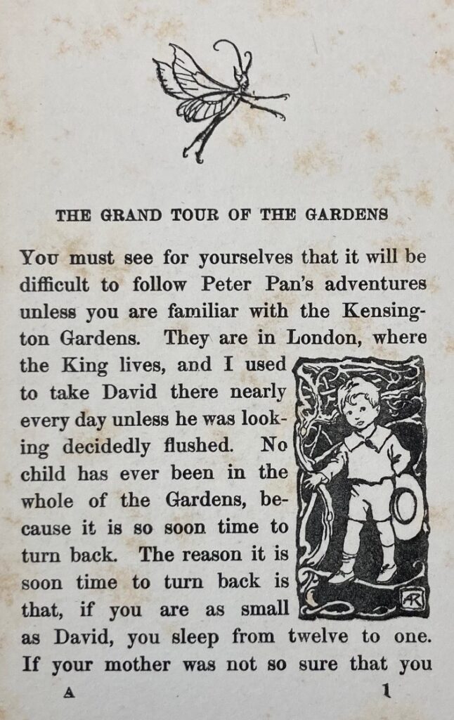
On the first page of each chapter, the chapter title looms just one centimeter above the text-block, center-aligned to it. Surprisingly, the title is a smaller size than the rest of the (~11-point) text. The title fits on one line, with additional spacing on either side, so that it doesn’t run the full length of the text-block underneath it. In this way, the title sits on the text-block like a modest hat, with no intention of distracting or monopolizing the viewer, as if to say: Get on with your reading! The only distinction between the titles and the rest of the text, is that the title is capitalized and contains additional spacing between each word – more a product of readability than overt stylization.
Every page that follows has a heading depicting – not the book title, but instead – the chapter title again. Interestingly, these chapter headings split the title across the verso and recto pages. This gives the impression of being in the midst of an unfinished thought or story (quite literally) and spurs the reader forward.
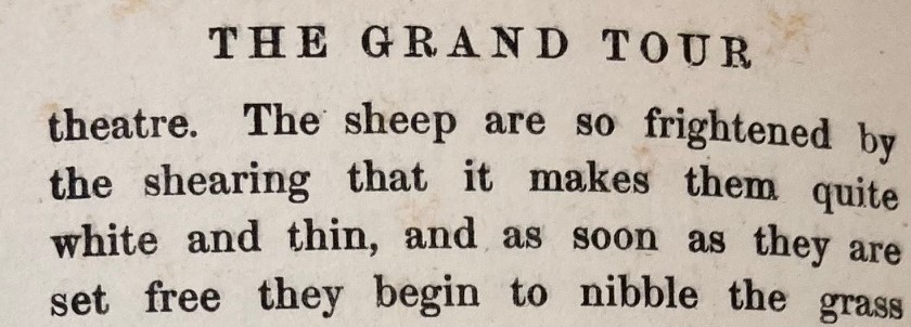
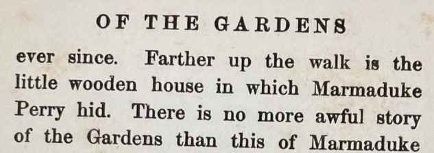
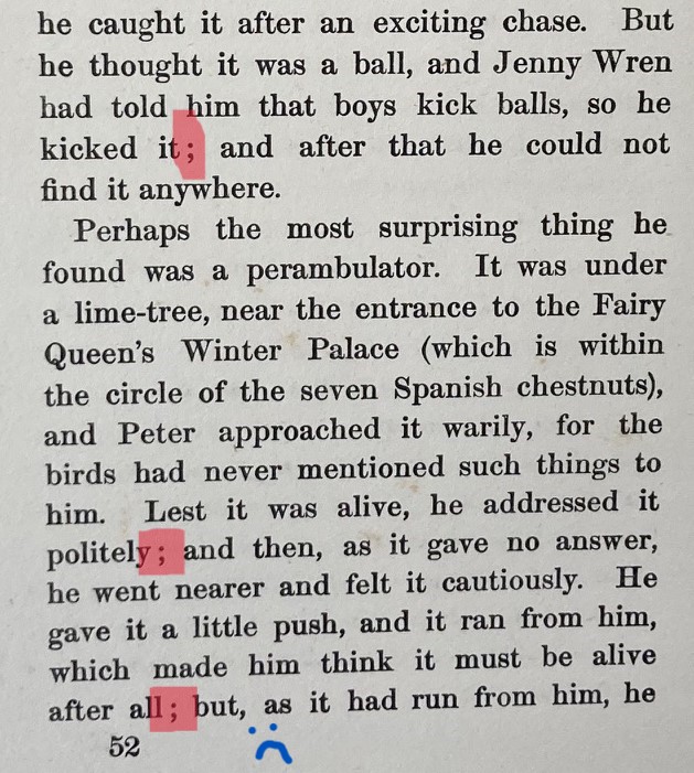
The lines of text are uniform. No words, not even titles/headings, are italicized, bolded, or underlined. The start of each paragraph is indented, except for the first paragraph of each chapter, and there are plenty of commas, semicolons, and periods to guide the reader through the childlike run-on sentences. One pet peeve of mine is that the semicolon is used incorrectly, proceeding conjunctions like “and” or “but”, as if it were just a fancy type of comma (which I guess it is within the childlike imaginary of Peter Pan).
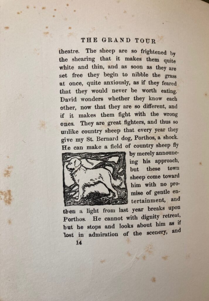
All font colors and in-text miniatures are a solid black. The typeface is Didot, featuring minimal shapes, unbracketed serifs, and strokes of varying thickness. It exudes a handwritten feel, as opposed to typefaces that look painted or computer-generated. Overall, the mise-en-page is classic and modern, meant to give a sense of neutrality to its story’s depiction of posh early 20th century life. Likewise, the conventions of the text are in line with standard American English – no distinct abbreviations or regionalisms, not even British spelling in spite of the story’s London setting. (The writing performs “British sensibilities”, without being British.)
My least favorite mise-en-page feature are the page-numbers, which tailgate the bottom of each text-block, aligned to the outer-margin-side. The page-number is the same size as the text above it, and it’s so close to the last line that it’s difficult to read at a glance. If you want to flip to a specific page, these page-numbers are utterly unhelpful. The book might be saying – this narrative is meant to be read front-to-back, no skipping ahead allowed, page-numbers be damned! Most likely, the page-numbers (and chapter headings) were printed closely to the text-block because it would’ve been easier to print all these details on the same, small plate.
Lastly, the incipit expresses the mise-en-page via its neutral, posh tone of voice:
“You must see for yourselves that it will be difficult to follow Peter Pan’s adventures unless you are familiar with the Kensington Gardens. They are in London, where the King lives, and I used to take David there nearly every day unless he was looking decidedly flushed.”
Immediately, the reader (“You”) is enmeshed as a participant of this fairytale. The matter-of-factness regarding the adventures and “world” of this story serve to lower the barrier for entry into this book, facilitating a stream of conversational exposition that is easy to follow along, whether you’re a child or not.
