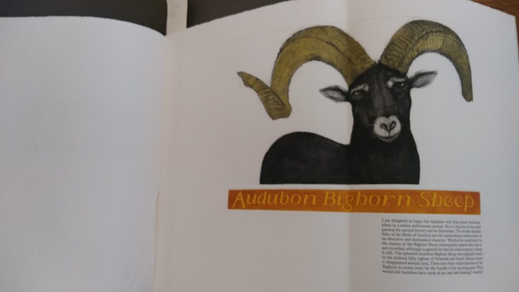
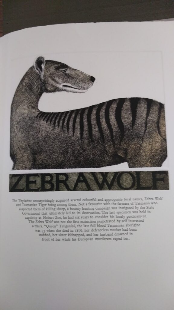
This book is made up of folios, full printmaking paper size folded in half, with 4 pages an extended size folded in (these measurements are detailed in the first blog post). I appreciate that the heft of this book, perhaps “cumbersome” to some book-lovers, is reflective of the heft I feel for extinctions of these animals. Both the etched prints and letterpress type have been printed by the artist, D. R. Wakefield. A printmaker’s sensibility is apparent in the mise-en-page as the margins are equal and generous on the top, gutter side and right side of the printed page. I regret that I am now working off of my photographs (as was suggested we may do) and do not have the exact measurements of margins, text block size and images. However, as I recall, and from work with other print art pages, the 3 equal margins are roughly 2 inches, and the base-de-page margin varies for each animal, but is always at least approximately 3 inches, and often more generous. These same estimations of margins hold for what I believe to be the author portrait (the only left-side print in the book) and the title page, as well as the colophon.
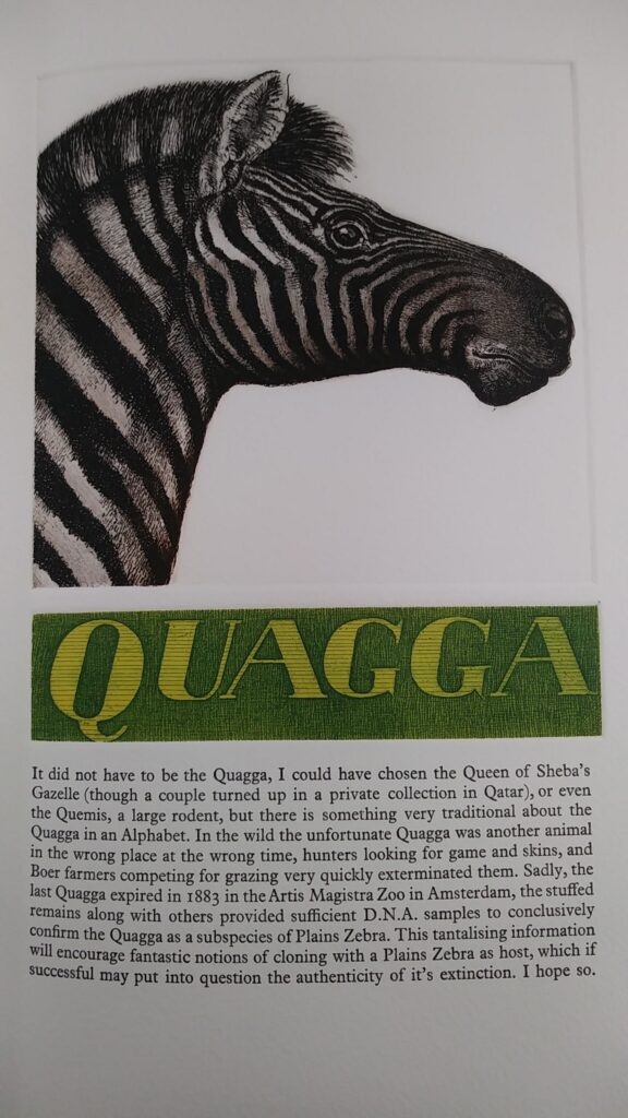
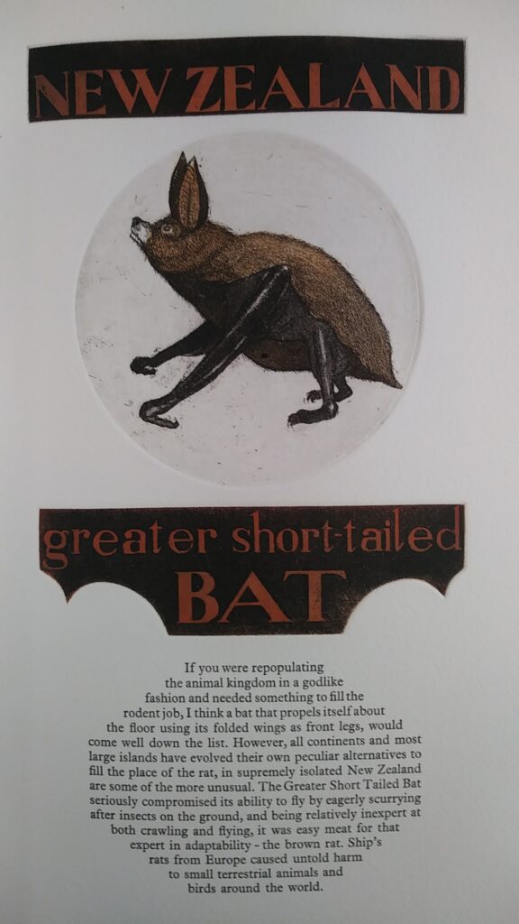
Each extinct animal’s page includes at least one separate etching plate for the animal’s name-title and the single image plate. The image plate impression is rectangular for twenty-one of the animals, for one it is a square turned on point (for the Darling Downs Hopping Mouse); and the three that are circular are the Cuban Spider Monkey, the Madagascar Pygmy Hippopotamus, the New Zealand Greater Short-tailed Bat. As I measured and included in the library catalogue description, there are four folded in pages, to allow for plates to extend horizontally (those four are Audubon Bighorn Sheep, Stellar’s Sea Cow, West Indian Monk Seal, and Yangtze River Dolphin. Nine of the images with text block could be viewed as both being one column wide, that is, the image plate, the title plate(s), and the letterpress text block are each the same width on the page. These six are: the Hispanolian Hutia, the Indefatigable Galapagos Mouse, the Japanese Wolf, the Pig Footed Bandicoot, the Quagga, the Ruffous Gazelle, the Toolache Wallaby, and the Vietnamese Warty Pig. There are three pages with text blocks that, in only one line, at some point, fills out the same column space as the image; however, the text block is shaped into some trapezoid or parallelogram shape instead of a block. These variations are the Eastern Elk, New Zealan Greater Short-Tailed Bat, and the Zebra Wolf.
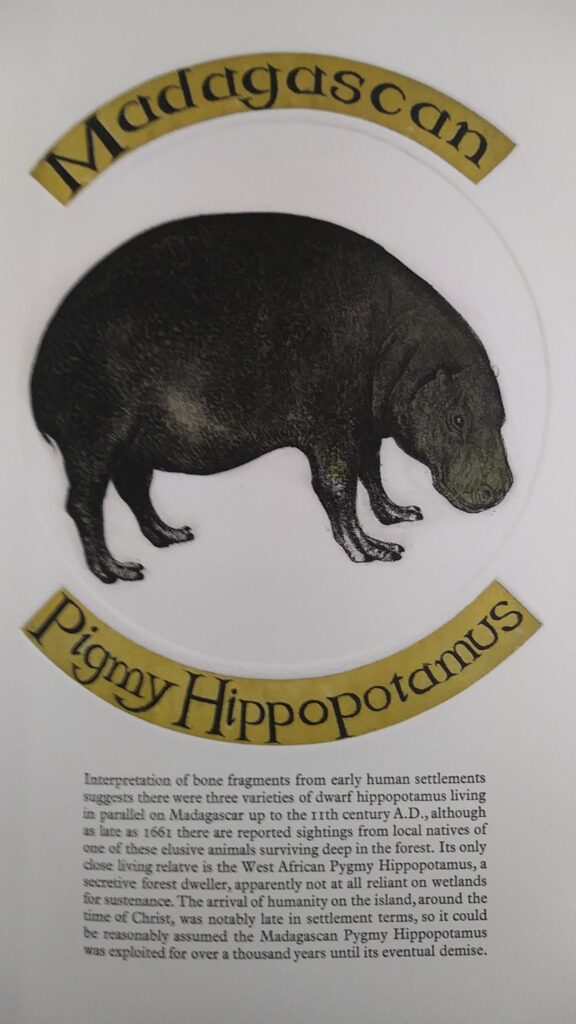
The name titles for each animal are etched plate(s) rather than letterpress text. As I have looked at the options for making these name plates, my best guess is that they are photogravures, digitally laid out in image or word processing, photocopied onto a transparent medium, and then exposed by light onto a coated steel plate. This has given the artist a wide range of fonts and styles (script, italic, and regular) to combine within the book for these varied titles. Except for the Hispanolan Hutia, which is titled in script, all the other titles show serifs. Seeking consistencies among the title etchings, there are thirteen titles in all capital letters, and thirteen in mixed capital and small letters. Only one animal’s name has an “illuminated” capital, and it is very minimalist, just that the inside of the “O” in Orient Cave Rat is colored a lighter green. Thirteen of the animal titles do have a larger first letter, extending beyond the line height of the rest of the title: Audubon Bighorn Sheep, Cuban Spider Monkey, Eastern Elk, Falkland Islands Dog, Hispanolian Hutia, Japanese Wolf, Kenyan Oribi, Madagascan Pygmy Hippopotamus (where all three first letters of its name extend beyond the single line height), Orient Cave Rat, Quagga, Rufous Gazelle, and West Indian Monk Seal. I did attempt to research the font types used in the animal name titles, but the etched backgrounds made it hard for the AI web-site to “read.” More on this use of AI in the mise-en-text of the letterpress words.
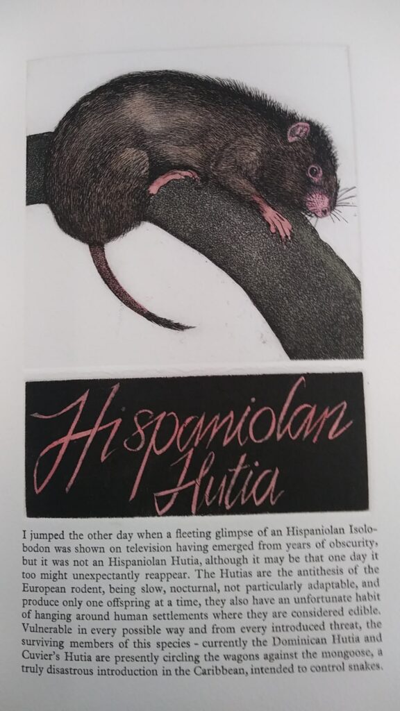
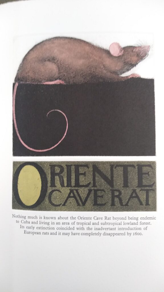
The color combinations of the animal name titles are varied, but there is some repetition to give a sense of rhythmic return and relationship of the pages. A green and light green is repeated for Bali Tiger, Lesser Mascarene Flying Fox, Madagascan Pygmy Hippopotamus (letters darker in this instance), Orient Cave Rat (with the lighter in the “O”), Quagga, Vietnamese Warty Pig, and Yangtze River Dolphin. The other dominant color combination is an orange, reddish rust, with black. There are five in combinations of black and gray. There is a nice parallel between the animal image and the title colors – but this seems best saved for the word and image dynamics blog posting.
Page numbering is a missing mis-en-page element in this book – and that makes sense, given that it is an “alphabet” book, so the ordering is relying on the first letter of the named animal to organize the twenty-six main pages. As mentioned earlier, the animal pages are all printed on the right side of each folio. The dominant feature on these pages is the animal portrait, followed by the name titles, and the letterpress blocks taking up the least amount of space on the page. The blank spaces between the image plate marks and the edges of the name title plates appears to be about two or three letterpress line heights. So although the size, shapes, and colors of the image and title impressions vary page to page, there is a consistency in the way the etching plates are related to one another by white space.
The letterpress blocks of text appear to have been printed after the more dominant elements already described. Twenty-one of the texts are right and left justified, in a neat rectangular form. Five of the text blocks are irregularly shapes, yet justified to the edges of their geometry. The New Zealand Greater Short-tailed Bat is the most complex of these text block shapes. One is the square turned on point for the Darling Downs Hopping Mouse, and the other three are trapezoids as in the example of the Orient Cave Rat shown as an example. Within the text there is a modern English usage of capitalization and punctuation. Each animal has one paragraph of text. There is no paragraph indentation. The text appears to me single spaced lines, yet the lines fell slightly generous in spacing between them, so I am not certain how to report this, but the line spacing is consistent throughout the book, so any of these photographed text examples portray the spacing. All of the letterpress text is in black ink.
The letters are serif forms. I have uploaded several images to the web-site with an A.I. search capacity called, “what the font.” ( https://www.myfonts.com/pages/whatthefont , accessed 10-17-23) For the letterpress text, several options came up, and close looking led me to these choices: Plantin Roman or News Plantin Roman, Roman Ionic or 1689 GLC Garamond Pro Normal. In an effort to further refine the options, I have looked up the most typical fonts utilized by letterpress artists in England. Three types of businesses and their suggested fonts came up in a 1957 article which is “remediated” at this web-site: https://britishletterpress.co.uk/type-and-typography/choosing-typefaces/
My reading of the information suggests that Plantin is the likely font used by D. R. Wakefield. Both Class B and Class C printers are suggested to use Plantin (it overlaps these two categories). Plantin with caps and italics is one of three typefaces advised for a class C printer (which includes the printing of books). Plantin is the only font that whatthefont identified from the up-loaded samples and is listed in this font-by-business class description.
Variety in mis-en-page and mis-en-text of these pages feels to me reflective of the diversity we lose with each animal extinction.
Incipit from the Audubon Bighorn Sheep page: “I am delighted to begin this Alphabet with John James Audubon, albeit in a rather unfortunate context.”
Explicit from the Zebra Wolf page: “Queen Truganini, the last full blood Tasmanian aborigine was 73 when she died in 1876, her defenseless mother had been stabbed, her sister kidnapped, and her husband drowned in front of her while his European murderers raped her.”
