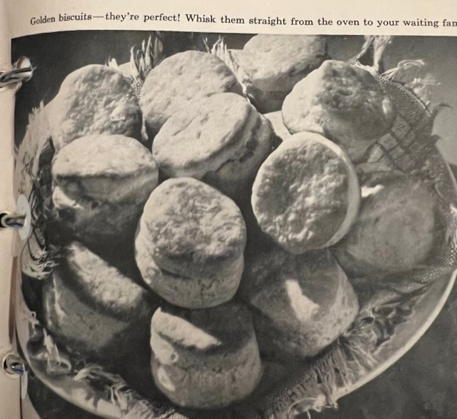
Cook books are interesting to me because they are meant to be used, not just as reading material, but as a guidebook on how to make something. Therefore, the way a cookbook is put together and laid out has to be practical. The expectation is that someone who is cooking from the book should be able to glance between the recipes and what they are cooking, and not get lost in deciphering meaning or in dense pockets of text. Therefore, the mis en page and mis en texte should be simple and easy to follow. Like mis en place in cooking, everything should be in place.
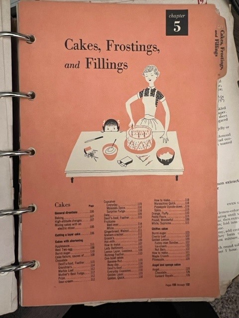
To accomplish this, the different “chapters” of this book are all set up essentially the same way. The first page is a title page with an illustration below it and an index that extends onto the back of it. The paper used for the title page is thicker, and is faded pink in color with a tab that extends out about half an inch from the rest of the pages. On the back, there is a quippy paragraph about the subject, and the continuation of the index. The page opposite has a colored photograph of one of the recipes to be found in the following pages of the chapter.
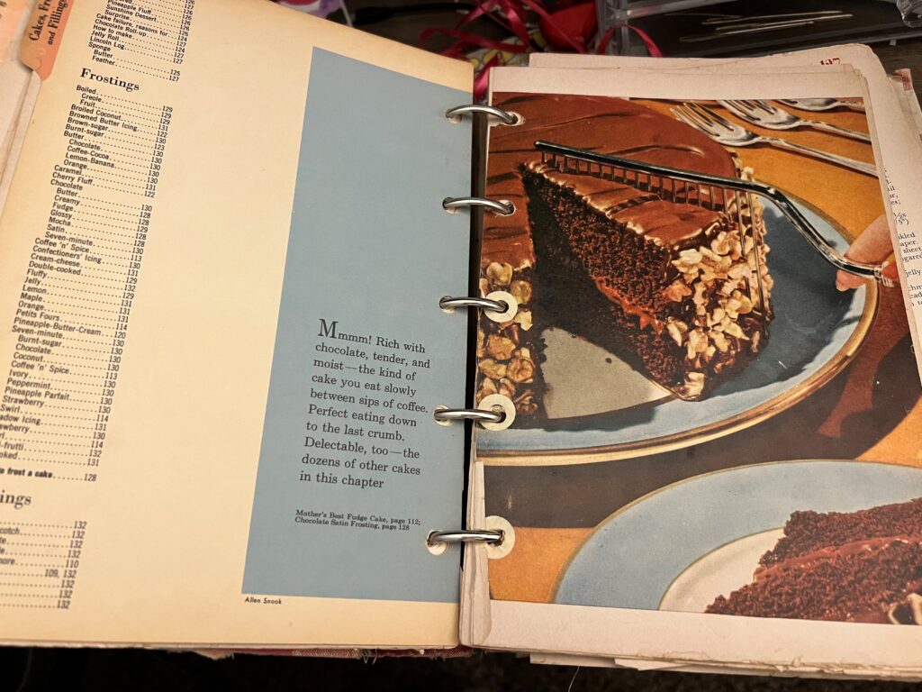
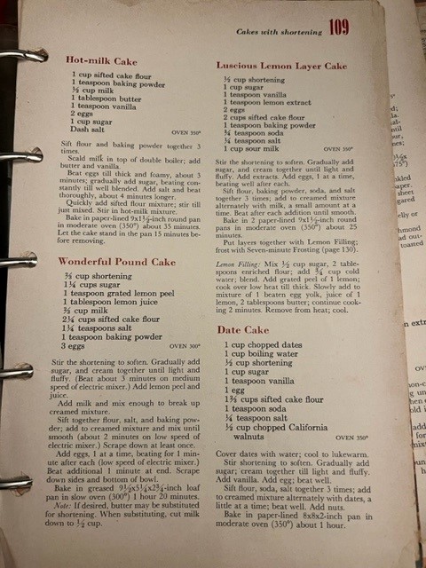
Within the chapter, the text is split into two columns which sit justified on aged creamy white paper that is splotched and browned with age. The paper itself is glossy and old book smell clings to it. The font looks to me like Times New Roman, with the color of the header and body of the text in black. Each recipe name is written in bold red. The ingredients listed for each recipe is bolded and indented, while the instructions are not. The paragraph that starts each page is indented along with paragraphs that follow, however; the first paragraph that describes the “how to” of the recipe is not.
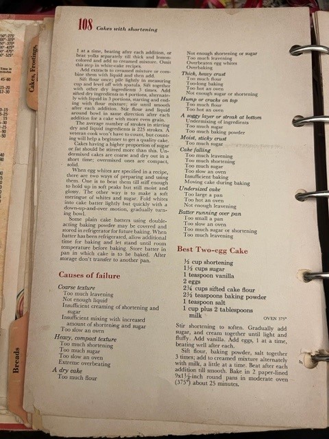
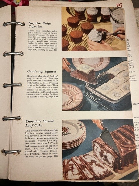
The page numbers and sub-categories of the chapter are located in the upper corners of both verso and recto pages and are left and right aligned accordingly. The numbers are typed in bold red, and the words bold in black. The margins of the page are very small, only about a half inch wide on the sides, 3/4″ on the bottoms and 1 and 1/4″ on the top.
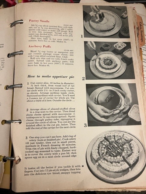
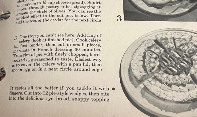
Flipping through, I can see that every 2-4 pages there are photographs or pictures of either a recipe, or a method. For example, on page 67 there are numbered photos that show the steps of “how to make an appetizer pie”. Occasionally, there is a larger photo that will take up the entire lower half of a page, or there will be more detailed step by steps given in photos. There are also a few sections that go in to great detail about why certain foods are important, or how the finished food should be served.
I feel like this cook book does a pretty good job of making the recipes easy to read and follow. The simple block text (again I think is Times New Roman) and the two columns make the recipes easy to read and follow. Bolding the ingredients helps to ensure that you do not miss what you need. I feel like many of the recipes instructions could have more details, but that could just be me. The spacing, punctuation and margins again make this easily digestible. I am planning to cook a few of the recipes to see if this is true in practice. Perhaps I’ll bring a treat or two to the symposium?
Based on the condition of the book, I believe it has been used to make a number of dishes that I like to image brought joy to many people. I find many of the “quippy” header paragraphs and photo explanations to be pretty funny, and it just reminds me of how much our culture has shifted. It is so clear that the women who would have been cooking from this book lived in an era where their table settings and food offerings at cocktail parties were of utmost importance. Sentences like, “It tastes all the better if you tackle it with fingers” and “Golden biscuits – they’re perfect! Whisk them straight from the oven to your waiting family”, show the pressures put of the woman in the household to serve their families, and the expectations for their meals to be delicious.
