Pet Blog Post #2: mise-en-page/mise-en-texte
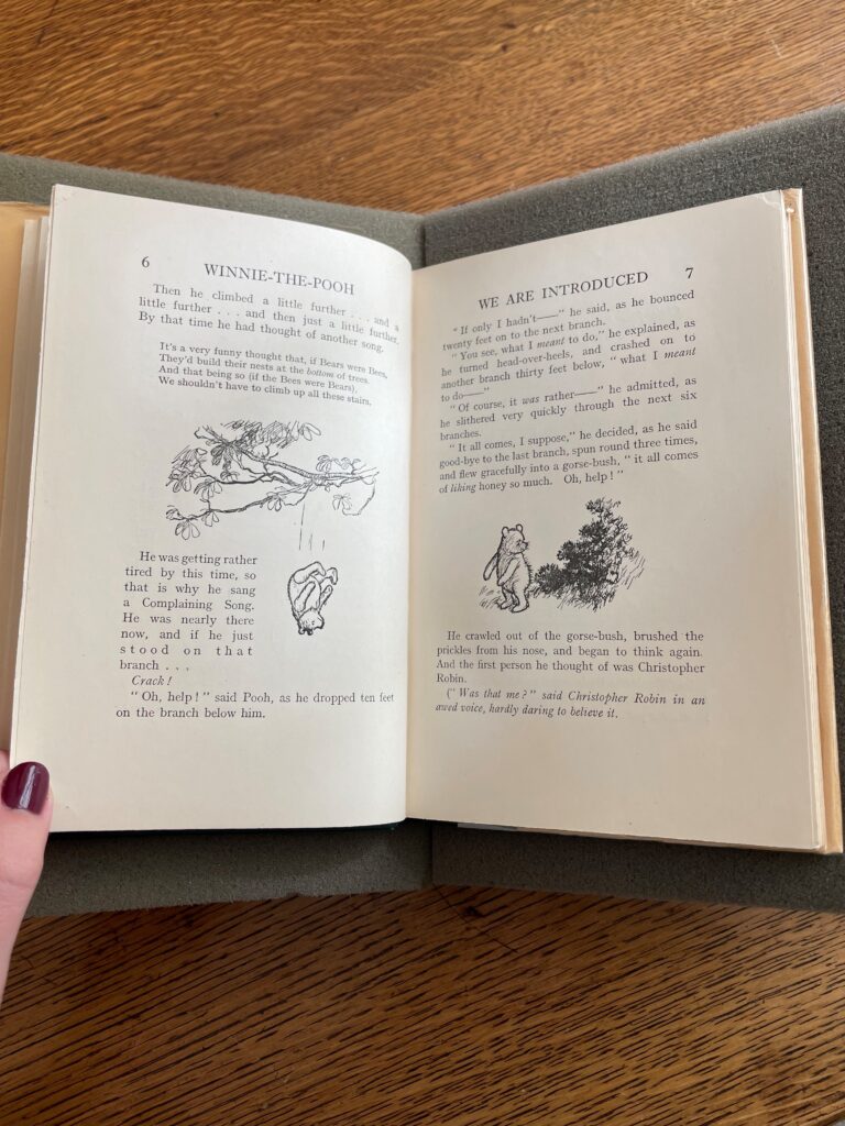
As explored in my earlier blog post, Winnie-The-Pooh is a smaller book – perhaps not pocket-size, but certainly easy to hold in one’s hands, especially the hands of a child. A given page is 18.75cm in length and 12.5cm in width. The text is written in one column per page. While there are quite fun ways in which the text might interact with an illustration (illustrations range in their positioning throughout the book, some above/below a text block, some next to, some surrounding, and some within it), the text remains in one column; however, there are times when seemingly a new text block is introduced, as seen on page 5 in the gallery below, which I will discuss later in this post.
No matter how the text and illustration interact with each other, they exist within margins. When an entire page is dedicated to text without illustration, the full text block measures 13cm in length and 8.5cm in width, and it consists of 29 lines of text. Certainly, each page varies in the amount of text it may offer should an illustration be included, but whether a page’s content includes all text, all illustration, or both, it is contained within this invisible box, 13cm x 8.5cm. The photos below show how this format is adhered to, across various pages.
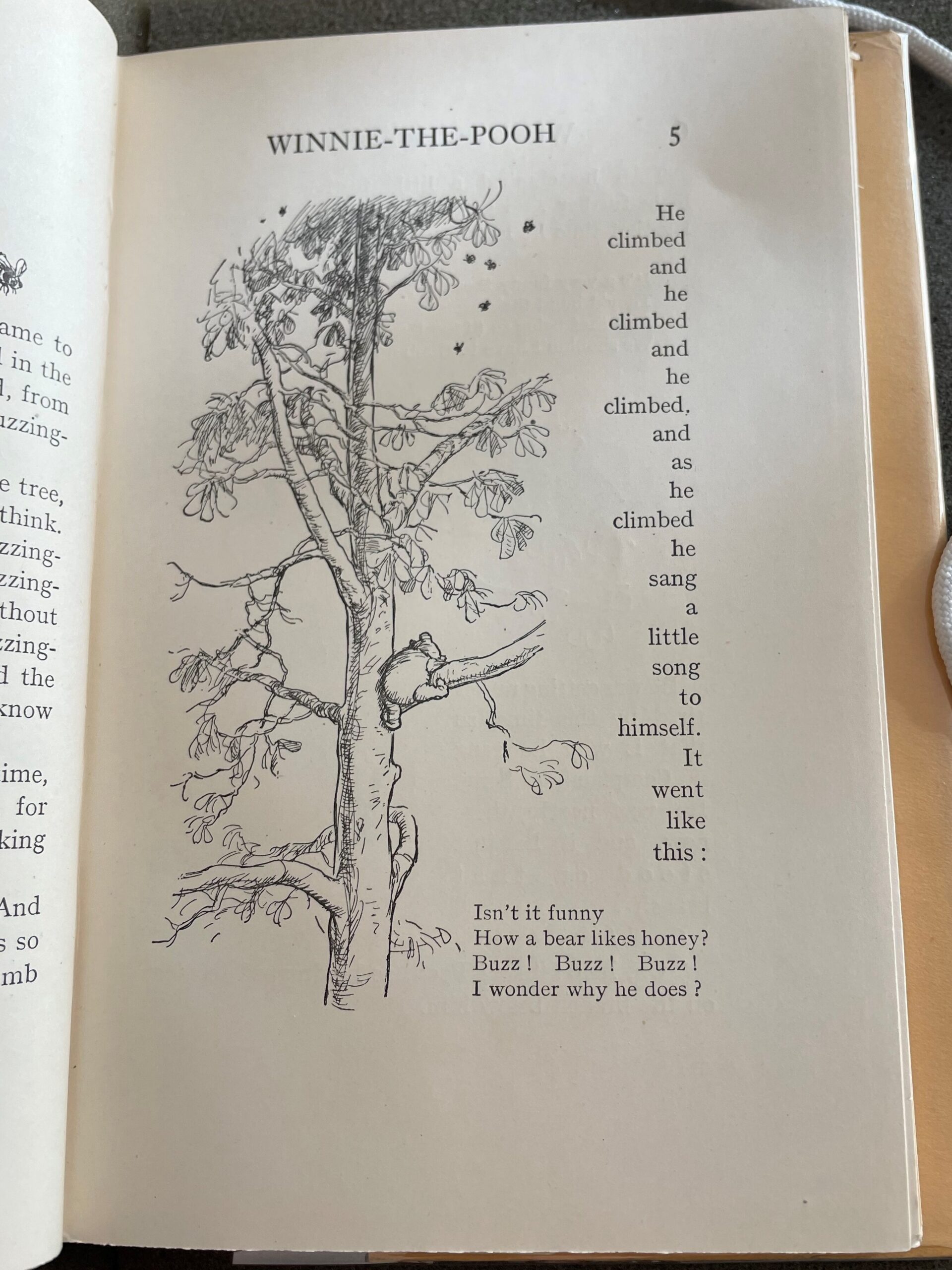
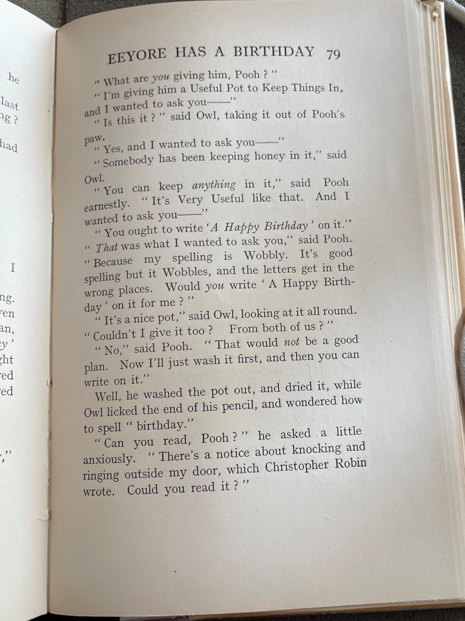
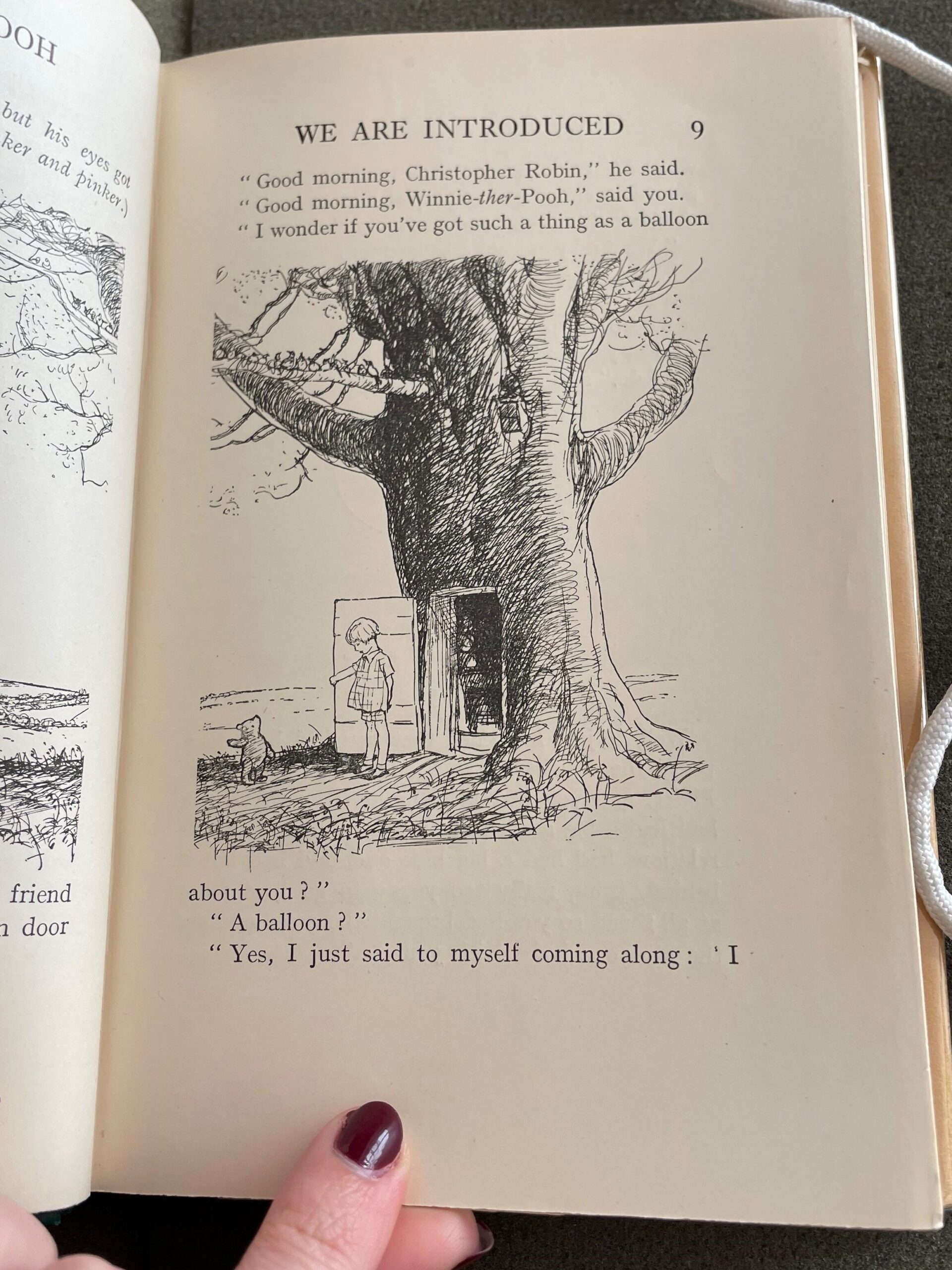
The justification of the text – which makes for a neat, organized, legible view on the page – is set within margins of unequal dimensions. The outer margin measures 2.5cm, while the gutter is just over 1cm. Most of the white space is concentrated on the bottom of the page, as the lower margin is 3.5cm and the upper margin is 1.75cm (measured from the header to the page’s top edge). There is quite a bit of white space on each page. In a class meeting earlier in the semester, we had discussed the function of wide margins to allow for notetaking and annotations alongside the text. As Winnie-The-Pooh is a children’s book, I question whether the white space is intended for such a reason, or rather if it is aiding in the book’s readability, making the text appear more centralized and digestible, the illustrations more eye-catching.
The header on verso/left pages is the book’s title, Winnie-The-Pooh, and the header on recto/right pages is the respective chapter title, though a reduced version. Interestingly, every chapter is introduced by the chapter number, expressed in Roman numerals, and a short line, beginning with “In which,” to detail what is to come. For example, the prefacing line of the first chapter is as follows: “In which we are introduced to Winnie-The-Pooh and some bees, and the stories begin” (p. 1). Yet, for each recto page in the first chapter, the header only reads, “We Are Introduced.” Certainly, the full line would not fit in the header, but I find this strategy fascinating, given that “We Are Introduced” alone does not appear on the chapter’s introductory page, and such is true for every chapter. Nevertheless, I stumbled upon a recto page in Chapter I on which the header read “Winne-The-Pooh” rather than “We Are Introduced.” I did not see this occur anywhere else in the text, and I wonder if this was perhaps an error?
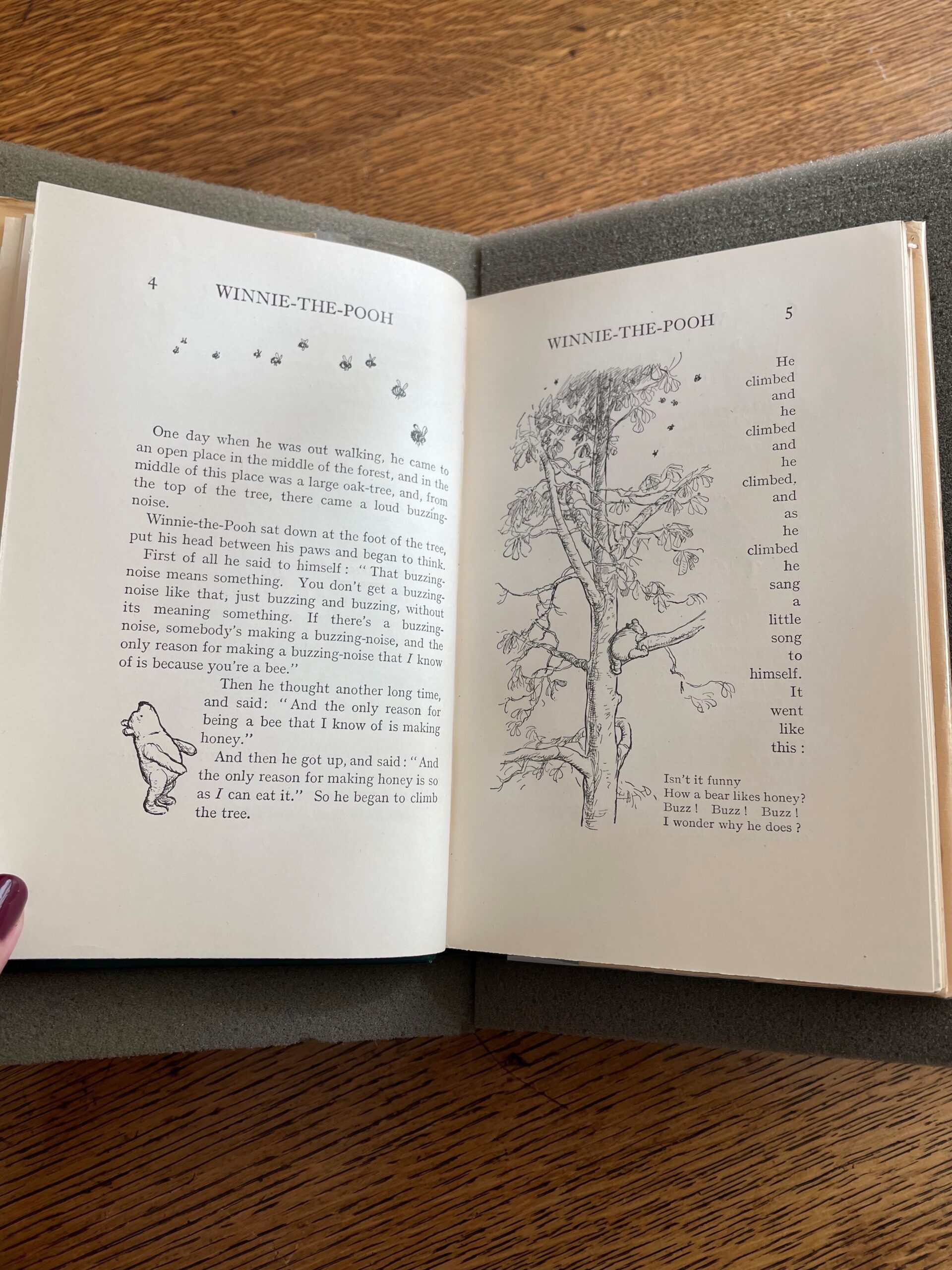
With each new chapter, a large initial begins the first word of the sentence, guiding readers’ eyes and dramatically introducing the chapter. While the remaining letters of the first word are the same font size as the majority of the text on the page, they are in capital letters, perhaps to ease the dramatic emphasis from initial to text block or to merely look nice. On new chapter pages like the one shown here, the upper margin increases to just under 4cm; compared to the usual upper margin of 1.75cm, this helps make clear the start of a new story, especially since the chapters in the book can stand alone rather than necessarily build off one another in terms of their plots.
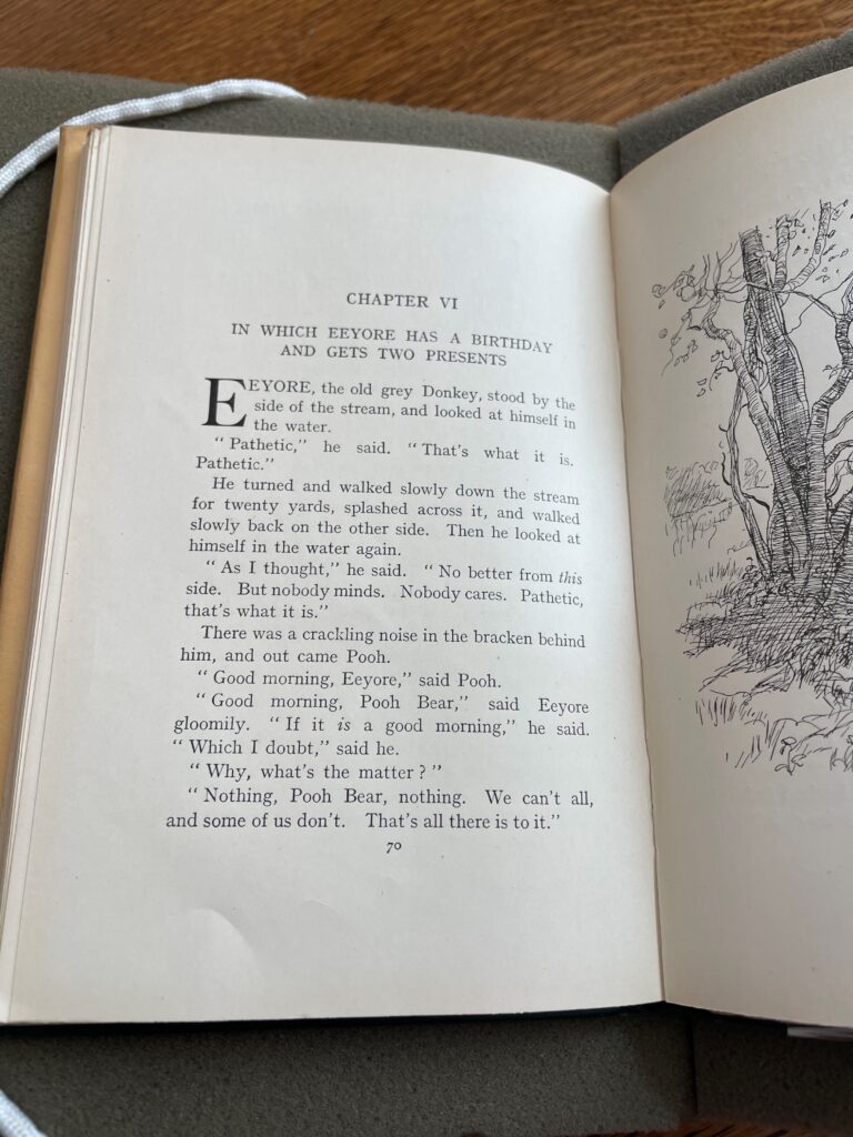
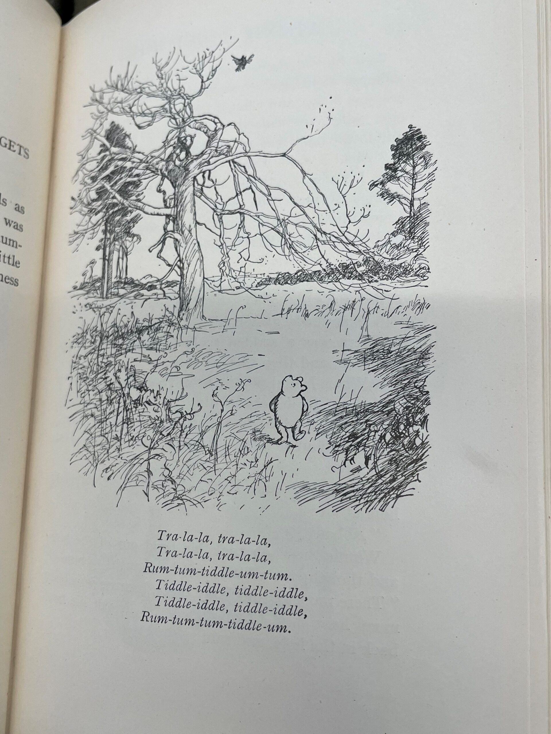
Diving into mise-en-texte, I am not quite sure the font used for the text, though it is a font with serifs. Perhaps serifs can be associated with a certain level of formality; the font type and size is otherwise readable, written in black ink. At times, the font size changes. This seems to occur when the text does not pertain to narration or dialogue – as typically found within the text block – but is some other form of verbal expression, like a song or the thoughts of the character depicted in an accompanying illustration. The font in such cases is not only smaller, but also italicized. As I alluded to in the beginning of this post, it seems as though these expressions exist within a different column of text – or perhaps just the size change and placement is throwing me off!
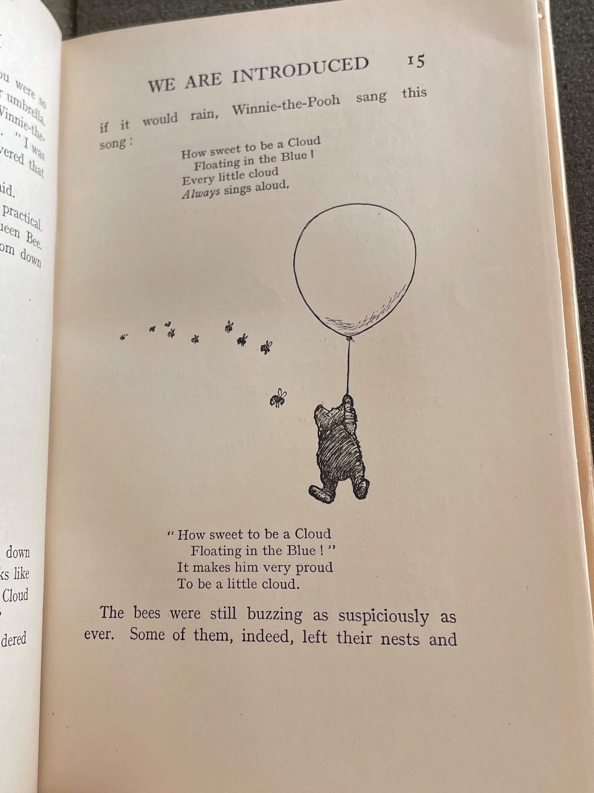
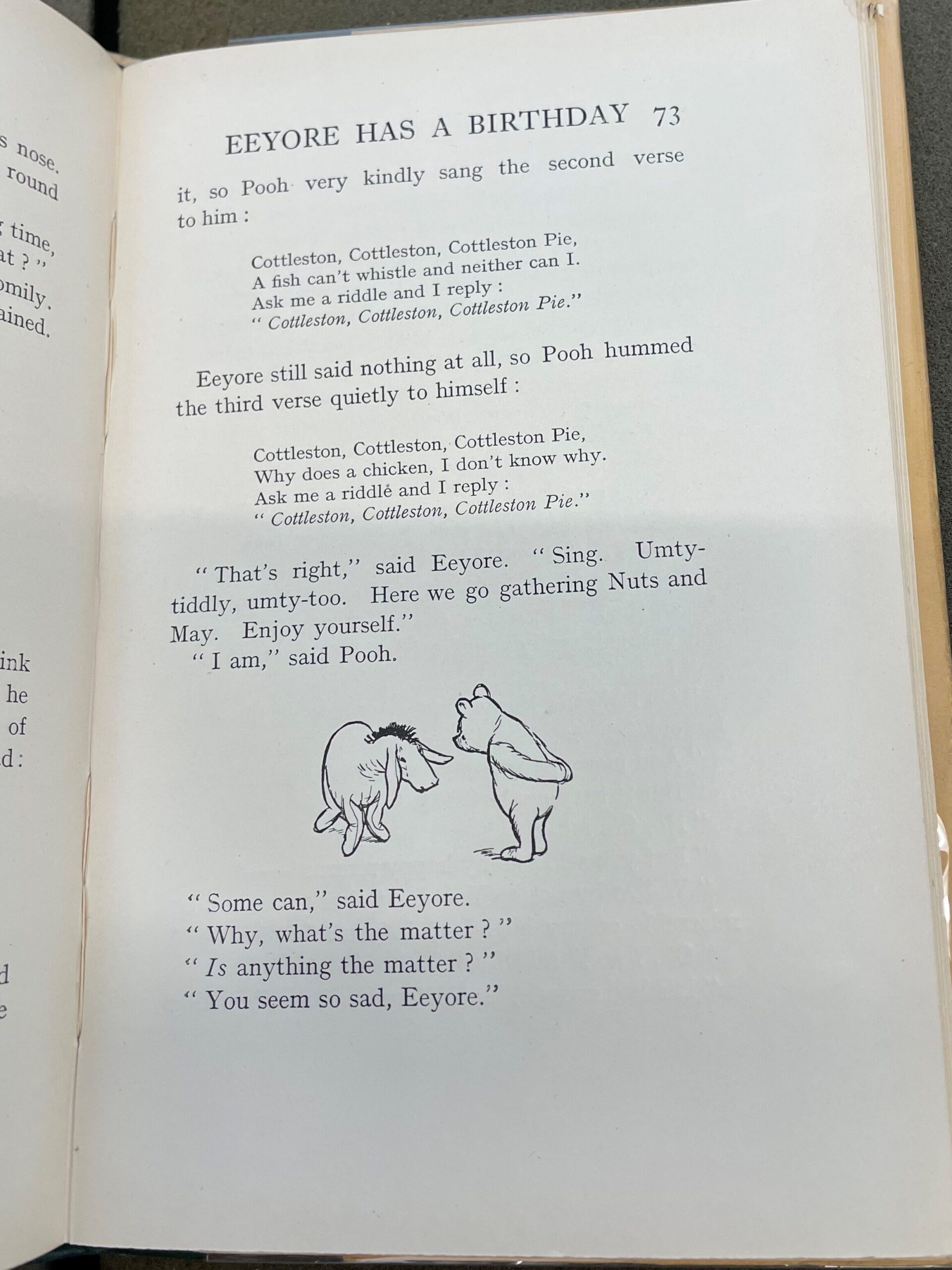
There is an indentation with each new line of dialogue, and being that dialogue carries along much of the book’s stories, the indentations are noticeable on seemingly every page. The text is punctuated, and interestingly, I noticed certain trends in the spacing between punctuation marks and words. For example, when a question mark or an exclamation point is within a quotation, there will be a space between the quotation mark and the question/exclamation mark; this space does not occur when a quotation mark follows a period or a comma. I am not quite sure why this is, but maybe it has something to do with common writing practice in England in 1926.
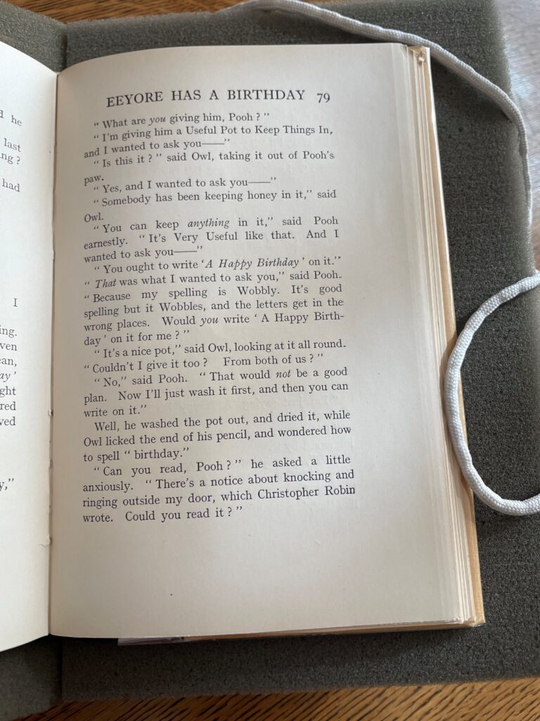
Noticeable also is the amount of times that words are italicized for emphasis in sentences. I had included a photo of page 79 earlier in this post, and I am placing here it again because it contains many italicized words. In my limited experience, I do not see/notice italics for accentuation utilized this frequently across modern books, so I thought it was something to take note of. Maybe it aids in conveying a sentence’s meaning, or a character’s intended meaning when occurring in dialogue, given that both the narration and the dialogue is written in quite simple sentence structures.
Winnie-the-Pooh is notorious for creatively making up his own words or spellings, and this book is not shy of his linguistic inventions. Readers may come across unique words like “Woozle” or “Heffalump,” which are the names of creatures commonly spoken by the characters. I noticed also that certain words in dialogue and narration are capitalized. For example, on page 41, Pooh accuses himself of being a “Foolish and Deluded” bear, or, on page 40, the narrator describes Piglet as “glad to be Out of Danger again” – note the capitalizations. This is another textual element which I do not quite know the reason behind. My first thought, again remembering that this is a children’s book, is that maybe the words are capitalized to trigger a child’s eyes – maybe they are important words/phrases a child ought to be recognizing and remembering? Or perhaps this stylistic choice, too, is to enhance a sentence’s meaning.
The illustrations throughout the book, all black ink, significantly influence how the text is formatted and digested on each page. I will have more to say about the illustrations in the next blog post, but in concluding my discussion of mise-en-page and mise-en-texte, I will state the obvious, in that the book does not contain color. Text and illustrations are created through black ink along a white page. Winnie-the-Pooh’s iconic yellow fur is ingrained in my mind, yet not present in the book, which makes me want to pursue a small quest into the history of his character’s illustrated development. A modern book (published in 1926), the book was produced via a printing press, and while we have certainly seen much older books with extravagant color, they were produced via wood block or even by hand. I wonder if it was common yet at this time for books to be printed in color from a printing press? If this line of thought is completely inaccurate or just wrong altogether and the lack of color was a deliberate choice by E.H. Shepard, I’ll be eager to explore the effect of this choice (I have some ideas) in the next blog post, alongside a discussion of the harmony between text and image on the page.
Incipit: “Here is Edward Bear, coming downstairs now, bump, bump, bump, on the back of his head, behind Christopher Robin” (p. 1).
Explicit: “He nodded and went out . . . and in a moment I heard Winnie-the-Pooh – bump, bump, bump – going up the stairs behind him” (p. 158).
