The Twelve Articles by Jeffery Morin was published in 2001 by the artist’s own printing company, sailorBOYpress located in Stevens Point, Wisconsin. This is a handmade art book, and this particular book is number 31 in an edition of 40. It is a very rare book and work of art.
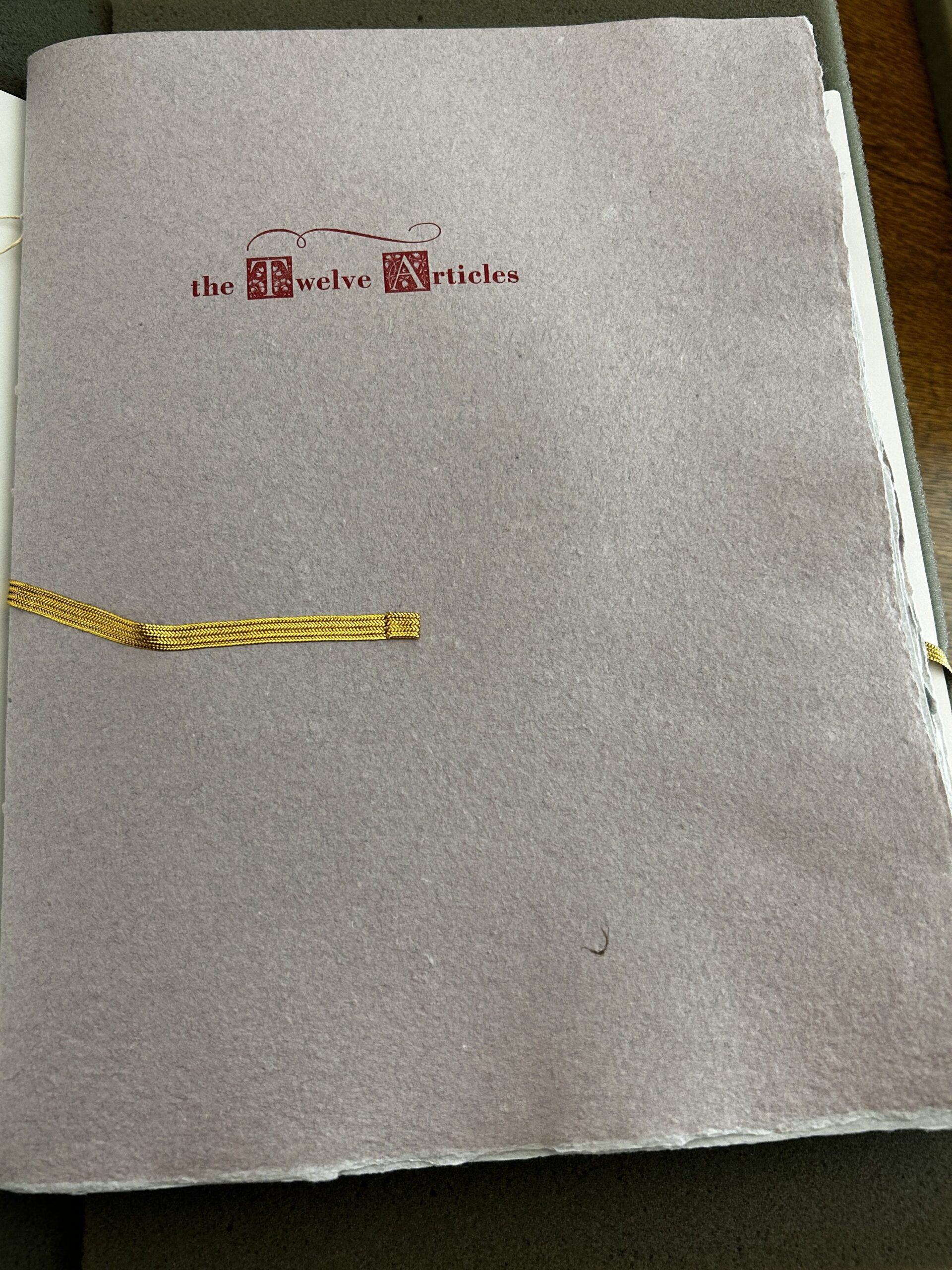
In this book, Morin weaves the story of John de Vaillantcouer and St. Joan of Arc. John is the main protagonist in this story and is suffering from Acquired Immunodeficiency Syndrome (AIDS).
The cover of this book is very simple. The title is pressed into the front page in crimson red ink. There are initials for the capital letters “T” and “A”. These initials are very tiny, however incredibly detailed, with floral embellishments and flourishes.
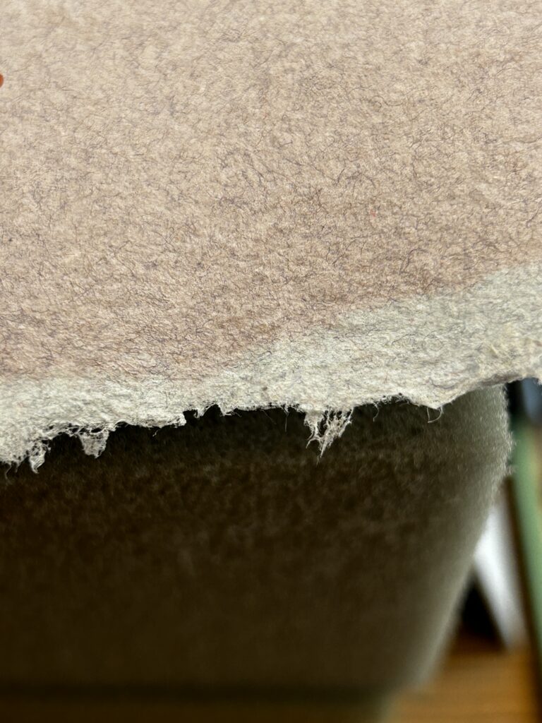
This book is created on handmade torn cloth paper. While the main color of the page is a light grey-blue shade, the tone is imperfect and there are areas that are a warmer grey color. Some pages are a light grey-blue on one side of the page, and on the other side, a warm and dusty pink color. Upon close inspection, one can see the individual fibers that make up the pulp.
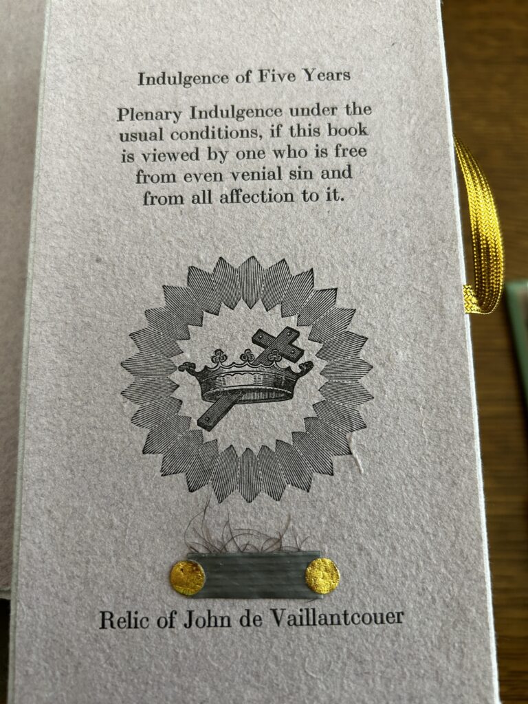
Attached to the front of the cover is a gold ribbon that wraps horizontally around the book. At the end of this is a card. This card is a thin piece of board with a piece of the same handmade paper pasted to it. Printed on this card is a Plenary Indulgence that excuses the reader from sin for 5 years. In the Catholic tradition, an indulgence is granted to those who satisfy a set number of conditions, and with the indulgence, their sins are forgiven as if they were baptized. On this card, we also see a bit of human hair secured to the card; a relic of the John de Vaillancourt protagonist in this story. This bit of hair is what survives this person. Above the relic, there is an illustration of a crown and cross.
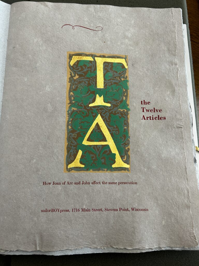
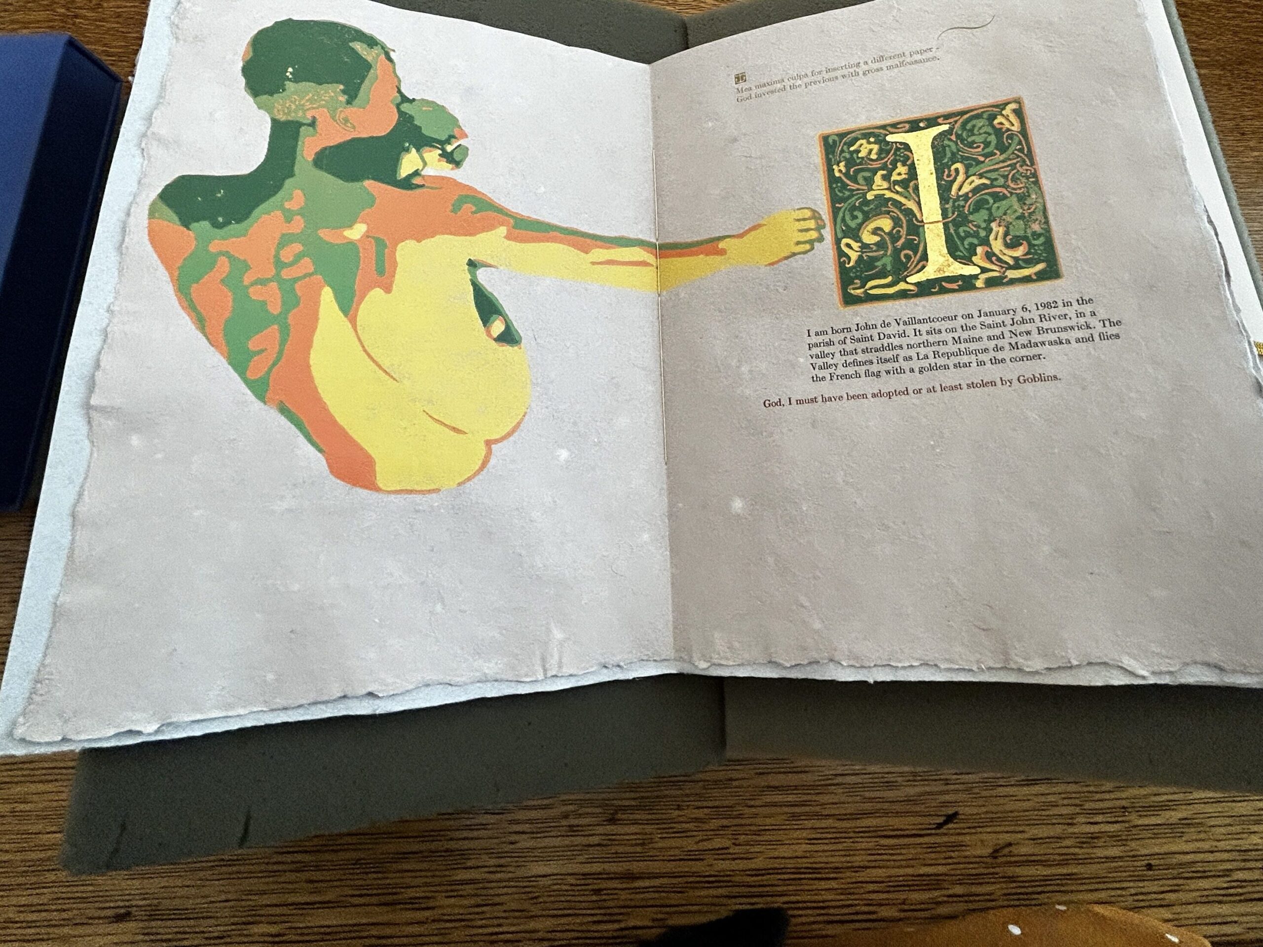
The next page in the book is the title page. This page is decorated with two initials. Upon close inspection, you can see the texture that is created by the layering of ink. These initials are printed on the page via traditional woodblock printing. There are five identifiable layers, the best being a yellow ocher color, then an earthy brown, a muted blue-green, and then a Kelly green color. The last layer appears to be gold leaf, on the actual letters. We continue to see embellished initials sprinkled throughout the rest of the book. The next place we see one is in the introduction. In the text, John de Vaillantcouer introduces himself and the predicament he finds himself in. The initial “I” refers to John who speaks in first person. It also refers to “Introduction.”
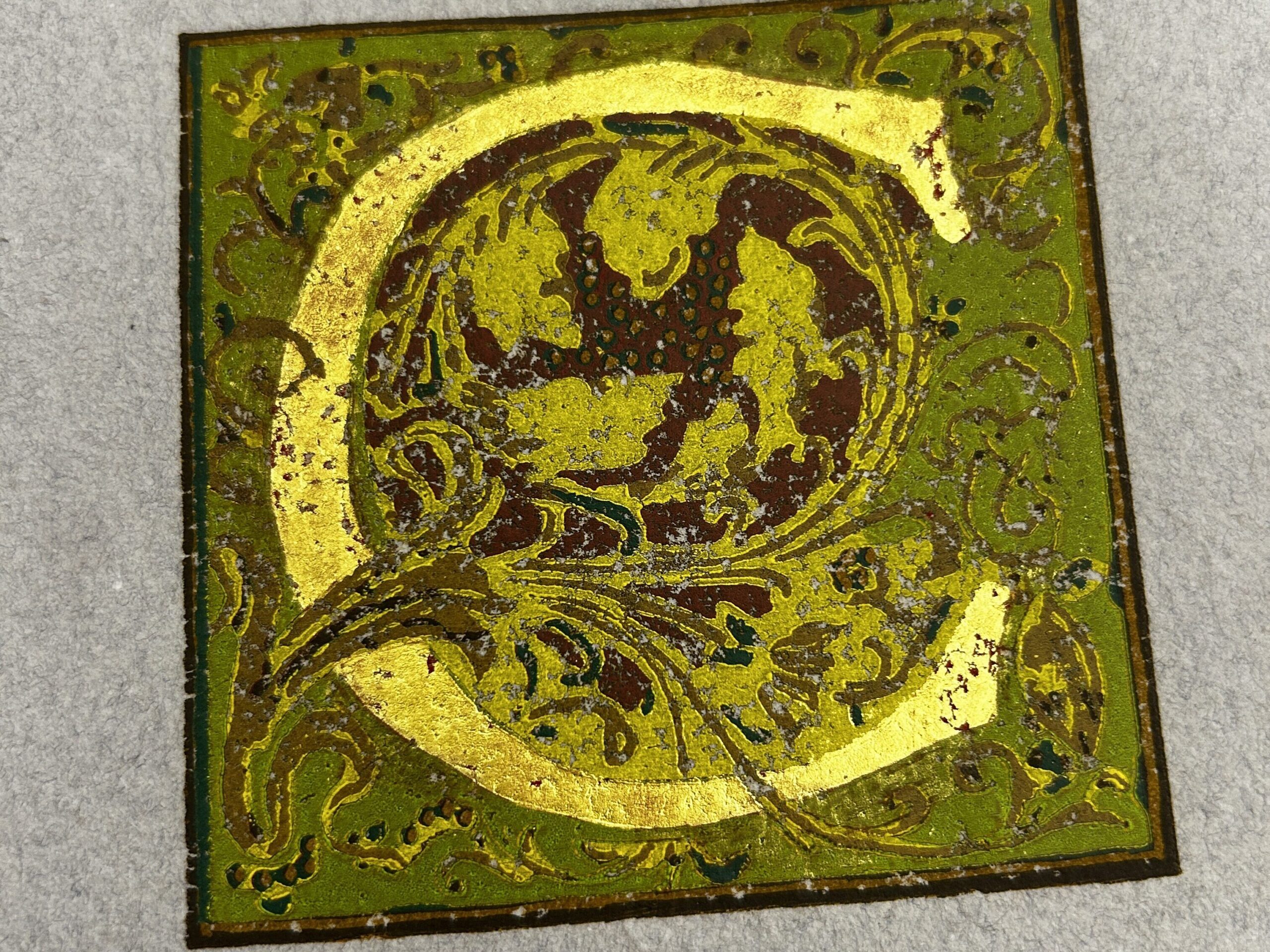
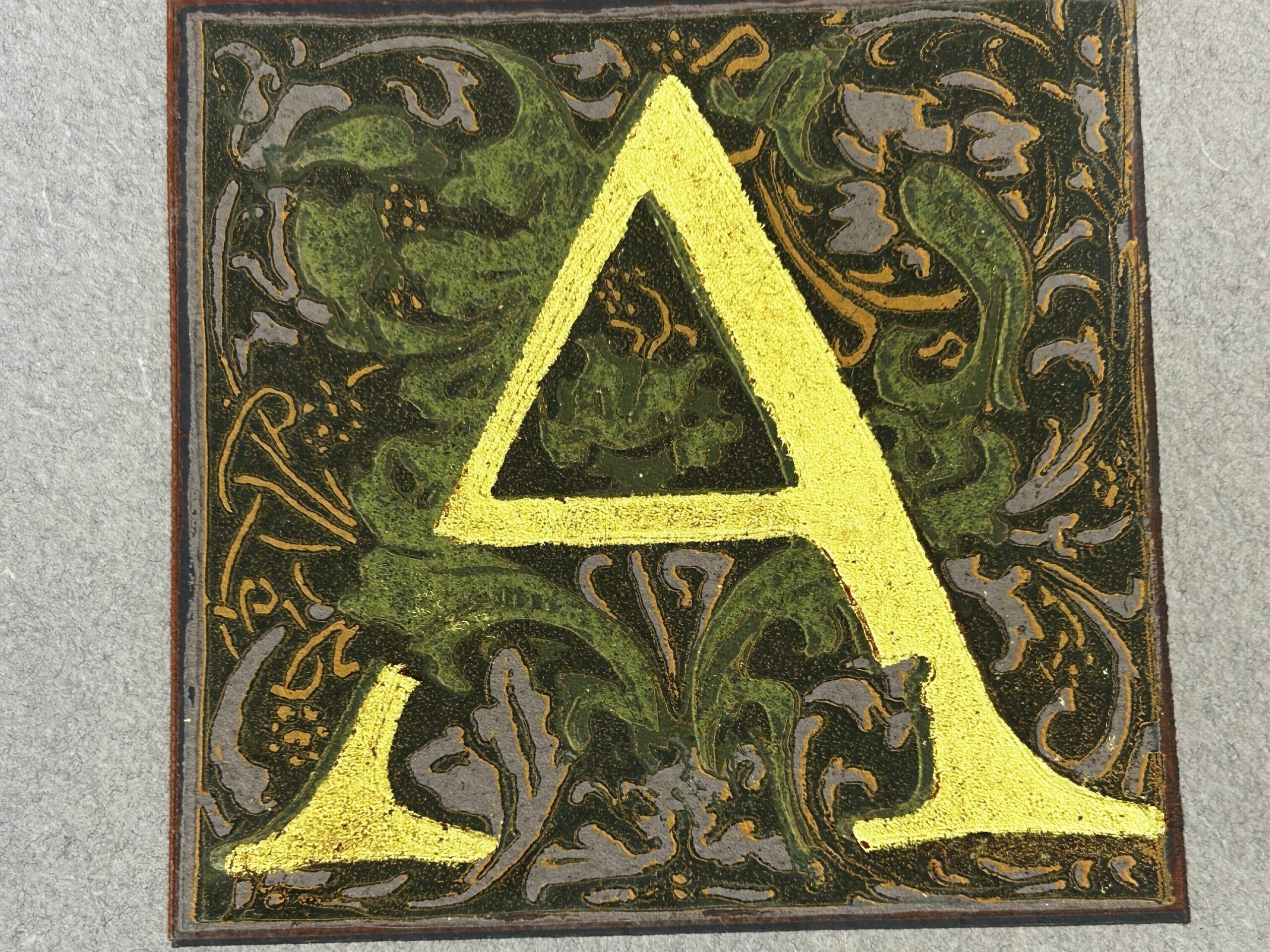
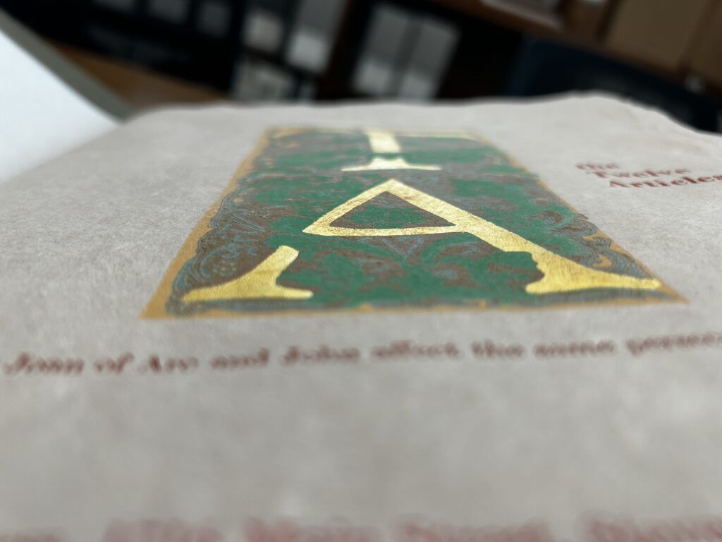
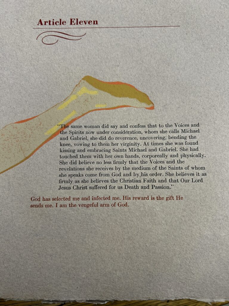
On each leaf in “The Twelve Articles”, there is an illustration. On one side of the leaf, there is a block of text and on the other side, there is a block print of a man, which is assumed to be John. As we flip through the book, the illustration is usually separated from the text, on some pages, the illustration takes up more space on the page, and the text is printed over the illustration. This creates an interesting relationship between the word and image and forces the reader to become really intimate with the book. You have to get close, nose to page, to read the text.
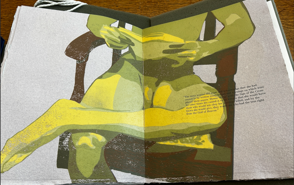
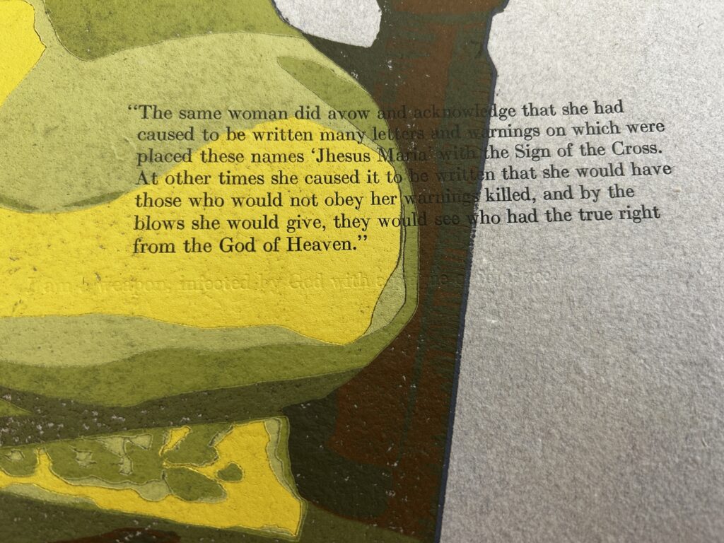
In Article 6, the illustration block print takes up both pages and the text block overlaps the image. This Article doesn’t appear to be labeled upon first inspection. After a close inspection, Article 6 appears, embossed into the illustration above the block of black text. Below the block of text, there is another line of text that is embossed into the illustration. No ink is used in this row of letters, so it is nearly invisible to the eye. This embossed text reads, “I am a weapon infected by God with a plague of injustice.” This invisible text is like a secret between John and the reader.
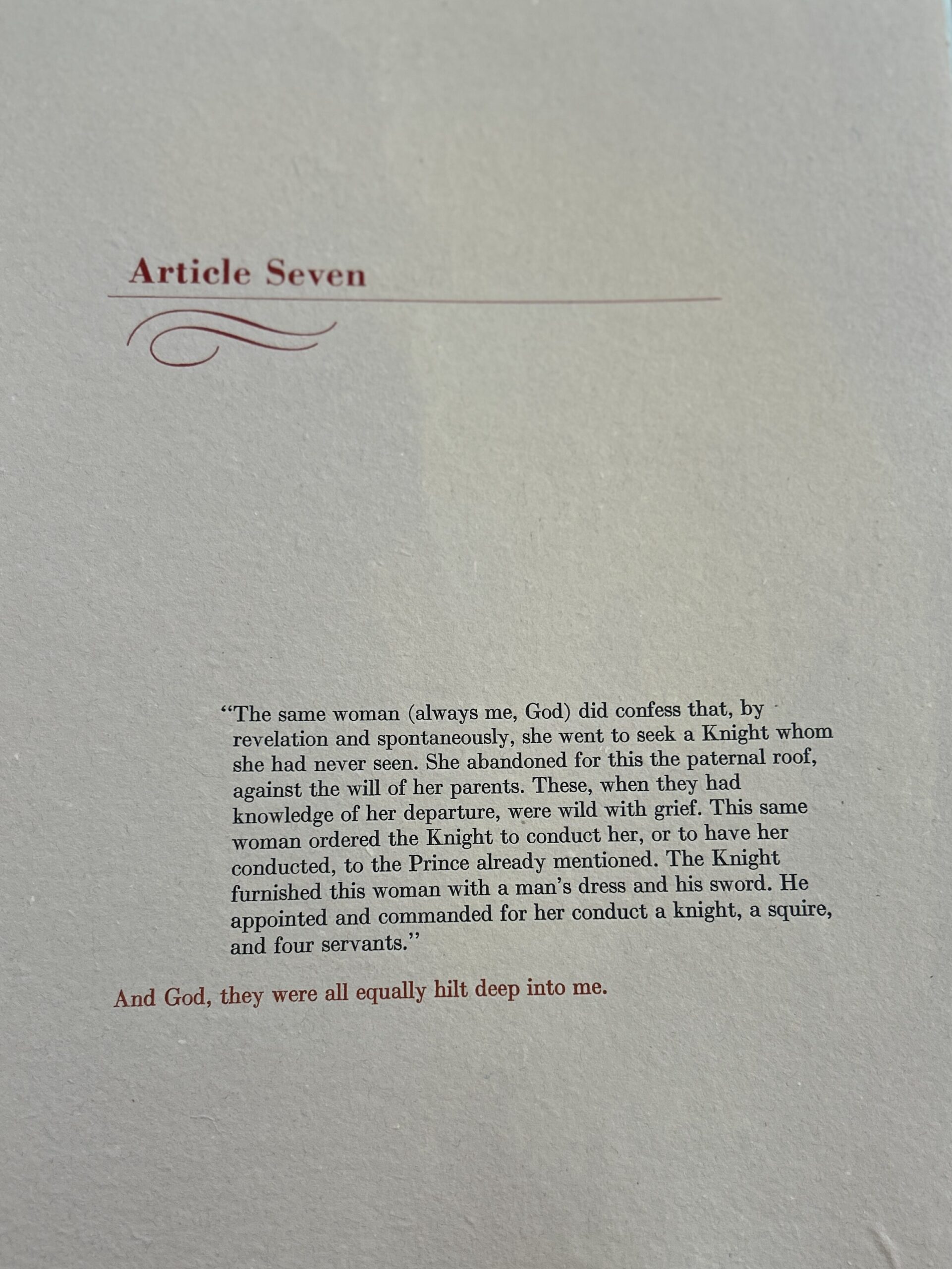
The font in this book is Bodoni and is arranged by hand and pressed into the page with black or red ink. The title of the articles is always printed in red and the body of the text is in black ink. In each article, there is a line of red text that follows the body of black text. This line often appears to read as the thoughts of John de Vaillancourt. It creates an interesting experience for the reader and as I went through the book a few times, I thought that the red text could be perceived as a second story.
What drew me to this book was the handcrafted feel of the book. It is not bound with a hard cover, it is simply sewn together, and the thread is visible through the outside of the book as well as the inside, between leaves and in the center of the book. Right away, I knew that the material used in this book was handmade paper. It has a course, toothy texture, and grey-ish colors that tell me the pulp was made of recycled material. I quickly identified the images on the page to be some form of relief print, which I have a personal connection with. All of these components drew me in and told me that I needed to befriend this book.
Physical Description: Edition 31 of 40, 48 pages (un-numbered), 9 inches by 11.5 inches
Material: Handmade Torn Cloth Paper, Black and Red Ink, Block Printing Ink, Gold Leaf, Thread, Gold Ribbon
Signature Statement: (Not Sure but In Progress of Researching!)
