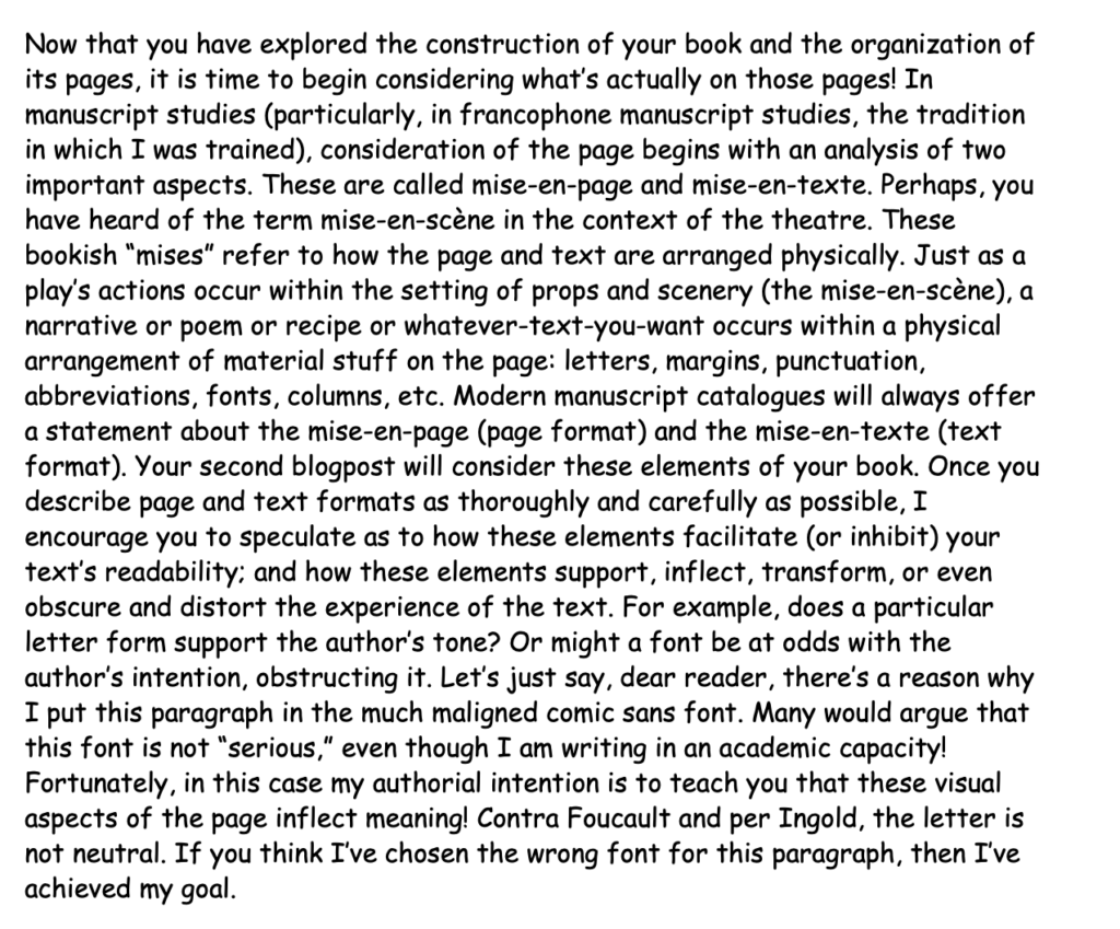
Let’s start with mise-en-page, and shift up our font!
Mise-en-page or page format refers to how your text sits on the page. You should write a careful, detailed description of this. Even if you have an apparently neutral page…
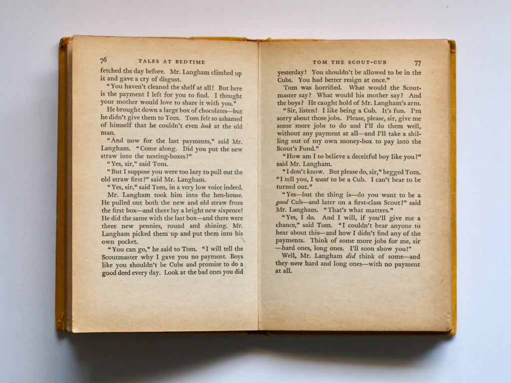
…in reality there are several elements creating that experience of neutrality. Neutrality is a convention produced by several visual elements including:
-Page dimensions
-Page justification (how the area of the text or “text block” sits within the margins, which have dimensions themselves)
-Text block format (how many columns per page? how many lines of text per column? do any lines, such as the first, have any distinct elements?)
-Paratextual elements breaking down the text block (e.g. initials, chapter headings or rubrics, headers or footers, etc.).
On the above “standard” page, the text is set in one column. This column is set within a particular justification. That is, it is framed by margins of unequal dimensions. The outer margin is wider than the inner margin (or gutter). The lower margin (or bas-de-page) is wider than the upper margin. In the upper margin, there is always a header. On verso pages (left page in the opening), the book’s title appears. On the recto pages right page in the opening), the chapter title appears. The titles are center aligned. This means these words are aligned with the central axis of the page and the text block itself.
There are other ways that a text can be aligned however. Intuitively, you know this if you have ever used Microsoft Word!
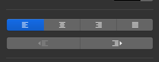
In Word, you select left aligned text, center aligned text, right aligned text, or justified text. This very text that you are reading now is left aligned. Justified texts space individual words so that they fill up the entire length of the textblock. The computer does this automatically for you, but printed books (and manuscript books) would have to do this by hand, placing words one by one.
In our example book, the page numbers in the header are left aligned on verso pages, such that they align perfectly with the left edge of the text block. The page numbers in the header are right aligned on the recto pages, such that they align perfectly with the right edge of the text block. Thus, the page numbers always frame and emphasize the text’s outermost edges. This focuses your eye and works to produce that experience of a neutral page. What about the text itself? We will return to this in a moment.
Another notable element of our “neutral page” is that there are few paratextual elements. That is a big reason why it appears so “normal” and “neutral.” But this is an intended effect. The very large bases-de-page are a part of this page style. Other formats are possible.
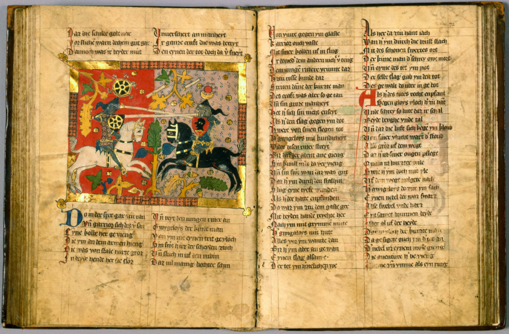
Consider the above opening of an illuminated manuscript. It has a related but distinct mise-en-page. Like the modern book, it has very narraow gutters and wider outer margins, very wide bases-de-page and thinner upper margins. The modern book’s text block has 27 lines per page; the medieval book has 28 (very close indeed)! This medieval text block, however, is broken into two columns. There is a space between the two columsn of text that is empty and separates them. The first initial of each line is also colored with red and placed slightly away from the main line of text (if you look carefully, you will see that initial columns have been ruled separately from the main columns). Two-line initials also puncutate the text and break it into smaller chunks, whereas there are no large initials in the modern book. These initials are blue and red; there are no colorful elements in the modern book. Of course, the last distinguishing feature of these medieval pages is large framed miniature. It is two-columns wide and about 18 lines long. It is aligned with the text block. These elements of the mise-en-page support a specific visual experience of reading.
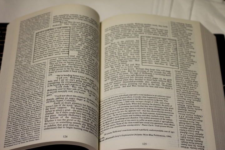
But it is not just medieval books with the weird formats! Modern books can subvert “neutral” or anticipated page forms too. The above image is an opening from Mark Danielewski’s experimental novel House of Leaves. We expect a neutral form, but we get soemthing else that transforms our experience of the text. In fact, the above mise-en-page is a pretty direct reference to the form of certain glossed books, especially bibles, such as the 1485 incunable shown below:
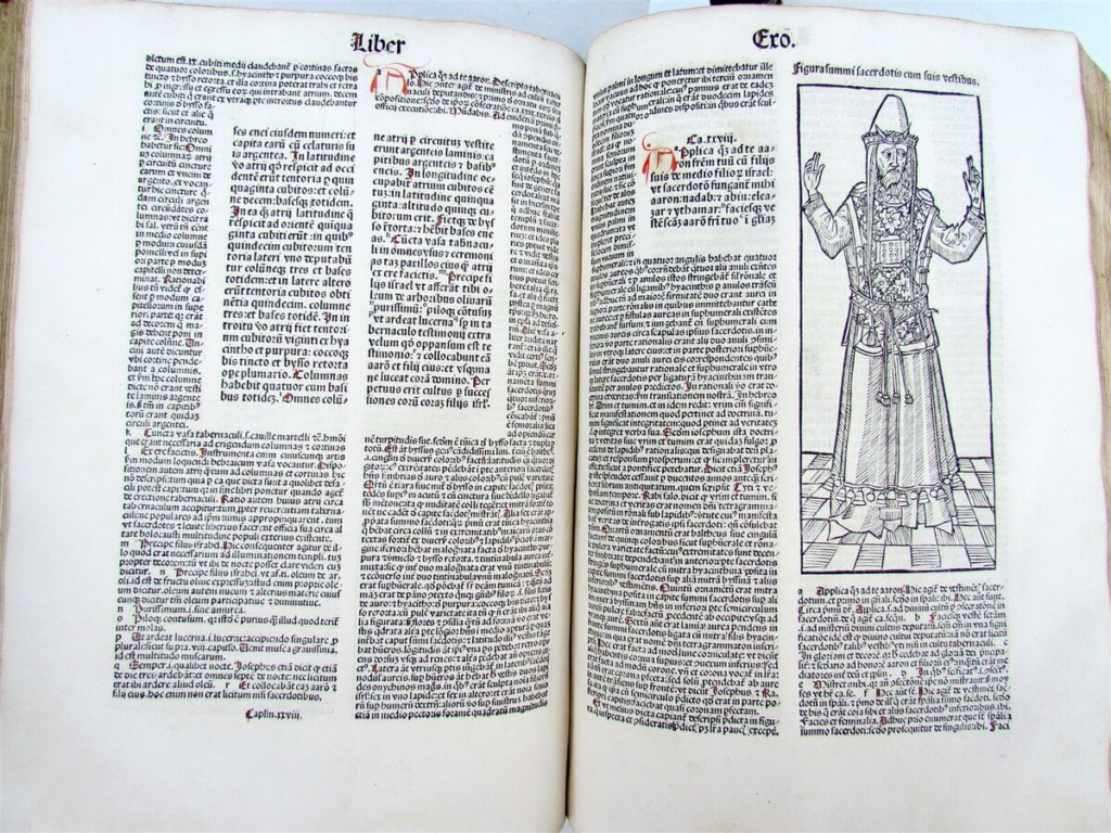
Glossed Bibles place the Holy Word in the center and all the ways one could interpret it on the outside. Reading them can make one feel dizzy and feel awe at an excess of meaning. Danielewski’s mise-en-page supports a similar experience, in which one feel frequently overwhelmed because the plot is so cryptic but so clealry meaningful. It is hard to see in the photograph but the central text of House of Leaves is printed backwards; one must read it in a mirror. Other text is printed upside down! Danielewski’s page suggests not only the limitless potential for meaning-making and interpretation, but also interpretative impasses, breakdowns, and impossibilities. But now we are getting into issues of mise-en-texte!
The text format or mise-en-texte is closely related to mise-en-page. Like the page itself, the text contains visual elements that can be described. Your text will have, for example:
-A script or font
-A color or colors
-An alignment (see above) ((it might be even be printed backwards if you are working on a weird text like House of Leaves!))
-Punctuation and other breaks (such as paragraph breaks, indentations
-Abbreviations
-Particularities of spelling or various regionalisms
I have no expectation that you all become paleographers (academics trained to recognize various letter forms and scripts). But there are many visual elements of the text format that you can identify. For instance, you should be able to identify and consider various breaks in the text. Is your text punctuated? Does it contain line or paragraph breaks? Many medieval manuscripts do not contain paragraph breaks but “pilcrows” (i.e. ¶) instead. How does one textual format support readability or interfere with it? And how do certain textual choices support a certain experience of the text? Remember my comic sans? Well, how do the letter forms in your book support the text or interfere with it?
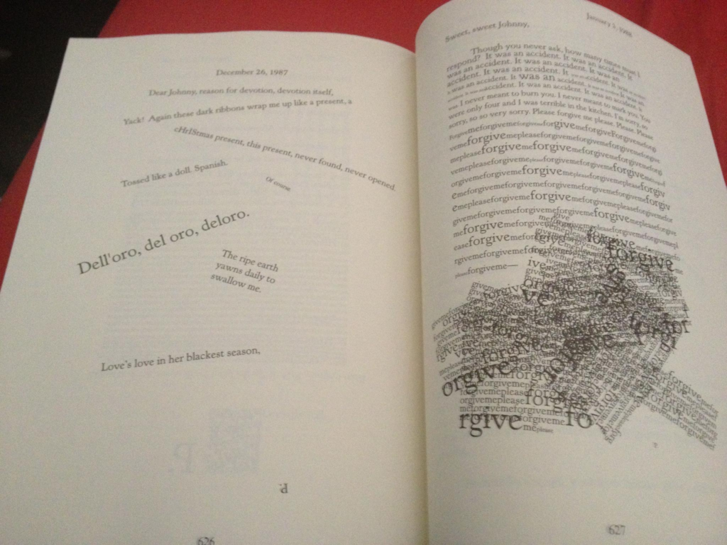
Sometimes, as in House of Leaves or the first paragraph of this blog post, interference can be the point. Remember, most elements of the page and text break down the text into smaller pieces, making it easier to digest. When ease of reading is not the point (again, see above), consider why this might be. Many texts are so “neutral” the elements of mise-en-page and mise-en-texte are almost invisible. Your goal is to see them, describe them, and hopefully critique them a little too.
So, your assignment is to write a post describing the mise-en-page and mise-en-texte of your pet book. If you would find it helpful, the following pages include some descriptions of common type faces and scripts or hands in medieval, early modern, and modern books:
Common early modern type faces
If you suspect your text is abbreviated or in a form of shorthand (as most medieval and early modern texts are) and this is something you would like to describe, email me. We can talk through it (and I have posted standard medieval abbreviations to the General Resources of Moodle). If you do not want to get into the nitty-gritty, simply consider in your reflection how abbreviations would change the experience of reading a text. Some modern texts might have abbreviations of a kind too or certain particularities of spelling. For instance, this first edition of Alice Walker’s The Color Purple includes spellings, abbreviations, and other textual elements to evoke particular Black Vernacular Englishes:
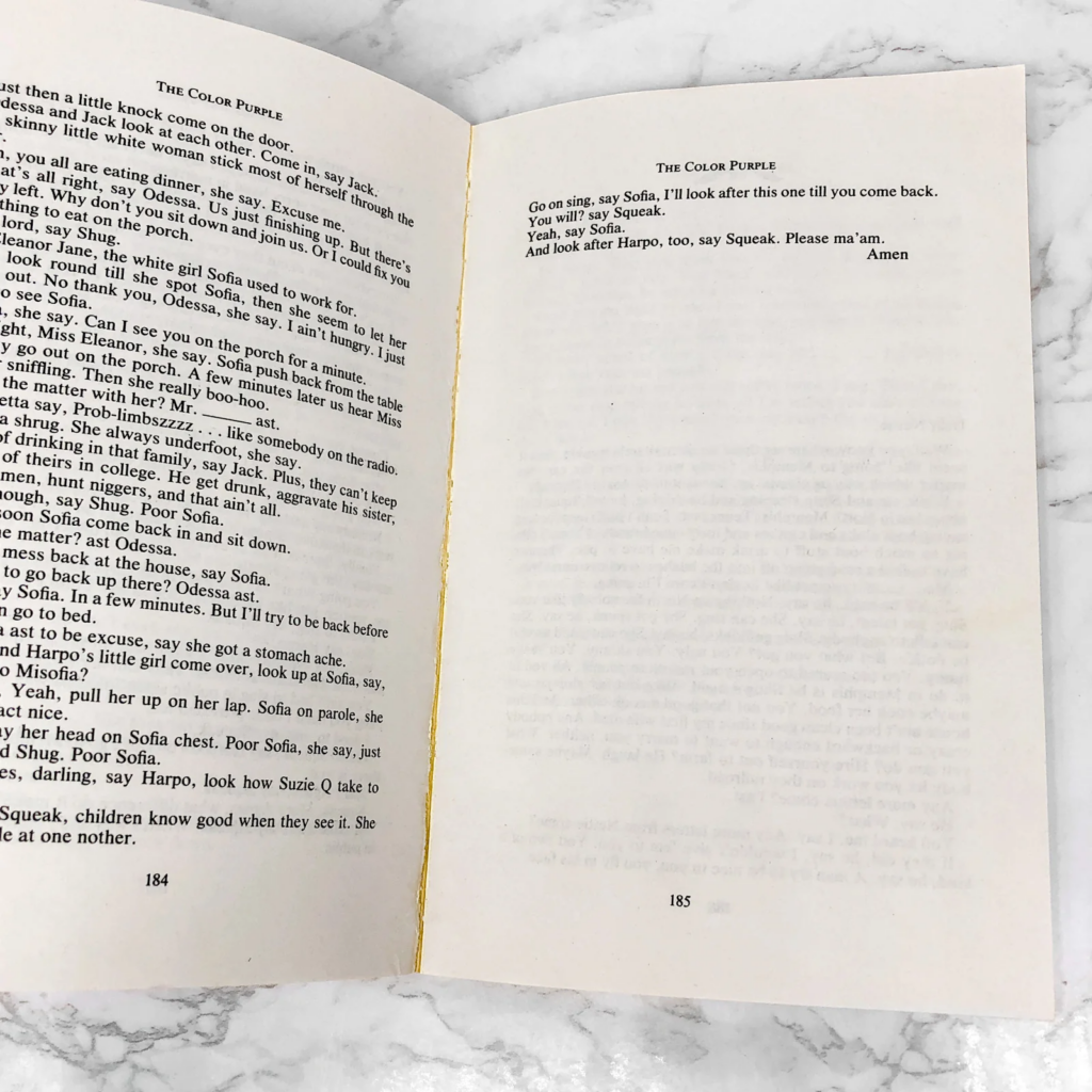
There are other interesting aspects of this page. The page numbers are centered in the base-de-page. The text does not include indentations. Certain words like “Amen” are aligned differently with the textblock than is “standard.” These elements contribute to a distinct experience of the story and its characters.
Conclude your blogpost by transcribing the first and last lines of your book’s main text. These elements of the text are called the incipit and explicit. They are another standard element of a rare book library catalogue entry.
As in the first blogpost, write discursively. Push yourself to think about how these very small visual elements of the page create your mental image of a “text.” If you are feeling stuck, try to imagine what it would mean for your text or page to appear in a different format. If The Color Purple were printed like House of Leaves or vice versa, would they really be the same “texts” any more? Or… are the following logos really the same logo in Comic Sans as their referents?

To summarize, document the mise-en-page (e.g. page size, text block dimensions and justification, dimensions and descriptions of certain paratextual elements (e.g. initials, rubrics, miniatures), etc.). These last elements are usually measured in terms of line and column numbers (e.g. a two-line initial or a 14-line illustration); document the mise-en-texte (e.g. line breaks, paragraph indicators, text color and font, capitalizaton, punctuation, abbreviation, etc.). Transcribe to the best of your ability the incipit and explicit of your book. Consider how these elements create your idea of the “text,” or distort it; and how they support (or don’t support) readability. Feeling bold or want to say more? Consider how these elements were made (e.g. Is your manuscript ruled? How? Is your book printed? How were the elements set in a matrix prior to printing?). Above all, look carefully and completely. Think carefully and critically. And don’t forget to have fun!
